Become a MacRumors Supporter for $50/year with no ads, ability to filter front page stories, and private forums.

davidjearly

macrumors 68020
Original poster
Sep 21, 2006
2,267
378
Glasgow, Scotland
Hey,

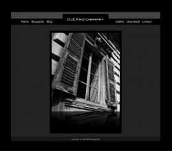
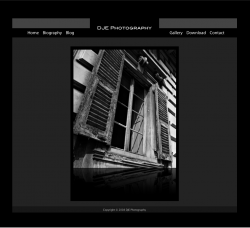
I'm in the middle of redesigning my personal photography site.

I've posted two mockups of my front page that I would really like to get some feedback on, particularly the header and navigation bar.

If you can't be bothered going into detail, a simple I like it will do, although do please explain what you don't like.

Thanks,
David
 

Attachments

  • Picture 1.png
    Picture 1.png
    294 KB · Views: 139
  • Picture 2.png
    Picture 2.png
    293.4 KB · Views: 103
Looks nice - clear crisp layout with good navigation.

I'd suggest putting the DJE Photography in the gray bar, and maybe having a smaller black box (if any) around it, so that it'll still show grey around it.

Does that make sense?
 
Looks nice - clear crisp layout with good navigation.

I'd suggest putting the DJE Photography in the gray bar, and maybe having a smaller black box (if any) around it, so that it'll still show grey around it.

Does that make sense?

Thanks for the feedback. I'll try what you have suggested.

Any others?
 
I like the neat and crisp presentation.

I hate nitpicking, so please forgive me. I would think that the Gallery and Download section would be on the left instead of Biography and Blog.

To me, since I naturally read left to right, it seems you are placing more emphasis on who you are and what you have to say, than your Gallery (work) and things you have to download.

If this is a blog, then forgive me, the layout makes sense. If this is a portal to your work, then I think the navigation layout is backwards.

Just my $.02

edit: I say naturally read left to right meaning I only know languages that are read left to right.
 
I 2nd the suggestion.

Separates the company from the links.

Thanks!

I like the neat and crisp presentation.

I hate nitpicking, so please forgive me. I would think that the Gallery and Download section would be on the left instead of Biography and Blog.

To me, since I naturally read left to right, it seems you are placing more emphasis on who you are and what you have to say, than your Gallery (work) and things you have to download.

If this is a blog, then forgive me, the layout makes sense. If this is a portal to your work, then I think the navigation layout is backwards.

Just my $.02

edit: I say naturally read left to right meaning I only know languages that are read left to right.

You make a very good point. I guess I only designed it that way based on what my brain sees on a lot of the websites I visit.

However, when you think about it, you are 100% correct. I will definitely incorporate this change into my next update.

Thanks for the insightful feedback.
 
I like the first one best. Having the gray bit over the company name unites the two sides very effectively. In the second image, the three elements aren't nearly as united.
 
Why the reflection on your photo? I think it takes away from your presentation. Let your photo speak for themselves, plus reflections are soo, 2007 :)
 
Register on MacRumors! This sidebar will go away, and you'll see fewer ads.