How do I set up a single spot colour in a grayscale image? Do I apply it in photoshop somehow or do I import the image to Illustrator as grayscale and apply it there somehow? Thanks
Got a tip for us?
Let us know
Become a MacRumors Supporter for $50/year with no ads, ability to filter front page stories, and private forums.
Spot colour in grayscale image
- Thread starter irishgrizzly
- Start date
- Sort by reaction score
You are using an out of date browser. It may not display this or other websites correctly.
You should upgrade or use an alternative browser.
You should upgrade or use an alternative browser.
How do I set up a single spot colour in a grayscale image? Do I apply it in photoshop somehow or do I import the image to Illustrator as grayscale and apply it there somehow? Thanks
Are you trying to make the entire image into that spot color, or does it need to be gray in places and spot in others?
Are you trying to make the entire image into that spot color, or does it need to be gray in places and spot in others?
It's going to a job that's only using to spot colours a spot blue for the logos and graphic elements, and a spot black for the text and photographs. The images need to be made of tints of a spot black.
Make the image cmyk & add alpha channels made as spot colours. Simply move elements to the spot channels as required.")
If the images are just going to be black, leave them grayscale. If you needed to integrate a spot color, you'd want to set up a spot channel in Photoshop. If you needed a black+spot image, a duotone would be your best bet.
Agreed, if it's going to only print in black, then leave it as grayscale.
One other way to change the image to spot color if needed is to use the Duotone color mode and set the images as monotone with whatever spot color you need. You can manipulate the ink coverage (like the Curves scale) in there as well.
One other way to change the image to spot color if needed is to use the Duotone color mode and set the images as monotone with whatever spot color you need. You can manipulate the ink coverage (like the Curves scale) in there as well.
converting greyscale image to single spot colour
I know this is a very late reply, but for future reference this is my preference for changing greyscale to a single spot colour, step-by-step...
you can fiddle around with the contrast, curves etc as you please.
I know this is a very late reply, but for future reference this is my preference for changing greyscale to a single spot colour, step-by-step...
- open the greyscale image in photoshop
- image > mode > multichannel
- open the channel palette > you should have a single channel 'black' > highlight this then choose 'channel options' from the menu
- click on the colour sqaure, choose 'colour libraries', choose the correct spot colour, in my case it's 'pantone cool grey 11'
- click 'ok' change solidity to '100%'
- click 'ok'
- now save as a photoshop file, and now this can be imported into Indesign/quark etc.
you can fiddle around with the contrast, curves etc as you please.
-----------------
I get the follow error msg when I try to import the psd file into Illustrator or Indesign "Unsupported colour mode or depth. Only RGB, CMYK, Grayscale, and Bitmap are supported".
However if I save as grayscale file in PS then import the file into Illustrator I can then apply a spot colour.
The above will work and is definitely the way to go if you're mixing spot colours and CMYK in the same (raster) image.I know this is a very late reply, but for future reference this is my preference for changing greyscale to a single spot colour, step-by-step...
- open the greyscale image in photoshop
- image > mode > multichannel
- open the channel palette > you should have a single channel 'black' > highlight this then choose 'channel options' from the menu
- click on the colour sqaure, choose 'colour libraries', choose the correct spot colour, in my case it's 'pantone cool grey 11'
- click 'ok' change solidity to '100%'
- click 'ok'
- now save as a photoshop file, and now this can be imported into Indesign/quark etc.
you can fiddle around with the contrast, curves etc as you please.
Plenty of print processes do demand this approach, for instance in packaging or securities printing.
If purely sticking to mono- or duo- or tri-tone, etc, then the monotone method works fine.
Open your grayscale image
Image>Mode>Duotone
Click on the swatch to choose your colour, if a Pantone then click the 'Color Libraries' button and you can key in a PMS ref.
Save the resulting file as a PSD format file
It can now be placed in an Illustrator or InDesign file. When you place it, it will automatically add the colour swatch chosen in the PSD file to your swatches in the AI or ID doc.
You can then output to PDF 1.4 or above, or separated PS if needed.
All methods mentioned are valid though (this one, the multichannel method, the additional channels on a CMYK, or placing the greyscale and applying a colour in AI) - except for the guy that suggested converting it to RGB
Not sure why you're getting the error message.
Sorry, another, simplified way of doing it is to simply allocate one of your spare CMY channels to the spot colour, i.e. copy the content of your grayscale channel into the cyan channel of a CMYK image, leaving all other channels empty.
Then place this in the AI document, make everything that's intended to be blue>Cyan, everthing that's meant to be black>Black then output the file to PDF.
Then it's just a case of telling the printer to print everything that's Cyan>PMS Reflex Blue or whatever.
Okay, not very elegant and harder to preview/proof but it is a simple way to achieve this and makes a file that pretty much any printer can handle.
all of this is too complex. If you just want the image to be all one spot color in your layout, simply make it a grayscale or 1-bit, save as a PSD or TIFF, place in Illustrator, select the image container and select the spot ink swatch you desire. Done.
Attachments
Last edited:
all of this is too complex. If you just want the image to be all one spot color in your layout, simply make it a grayscale or 1-bit, save as a PSD or TIFF, place in Illustrator, select the image container and select the spot ink swatch you desire. Done.
Agreed. Here is how it can be done in Indesign (my preferred program) ...
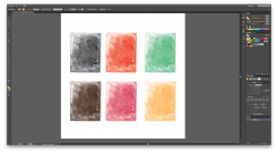
Both images grayscale.
Mask as needed.
Place in Indesign.
Assign spot color to image you want in spot color.
Multiply.
Attachments
Agreed. Here is how it can be done in Indesign (my preferred program) ...
Both images grayscale.
Mask as needed.
Place in Indesign.
Assign spot color to image you want in spot color.
Multiply.
absolutely on the InDesign is preferred, much more appropriate place to do layout and for printing.
absolutely on the InDesign is preferred, much more appropriate place to do layout and for printing.
The only thing i use Illustrator for is editing vectors. Once that's done, then Copy/Paste into InDesign where 99% of my work is done.
It's actually quite easy to do in Preview, using Instant Alpha and/or Smart Lasso to isolate the element(s) you want to keep in color. Then copy them, reload the original photo and set it all to greyscale. Now paste the coloured elements and they'll appear seamlessly on top of the greyscale image. There are also any number of apps on the App Store that will do this effect for you easily.
It's actually quite easy to do in Preview, using Instant Alpha and/or Smart Lasso to isolate the element(s) you want to keep in color. Then copy them, reload the original photo and set it all to greyscale. Now paste the coloured elements and they'll appear seamlessly on top of the greyscale image. There are also any number of apps on the App Store that will do this effect for you easily.
I had no idea this could be done in Preview.
But can a Spot Color be applied?
Or is the colored part of the photo going to separate as CMYK?
This is a key part of the question.
It's actually quite easy to do in Preview, using Instant Alpha and/or Smart Lasso to isolate the element(s) you want to keep in color. Then copy them, reload the original photo and set it all to greyscale. Now paste the coloured elements and they'll appear seamlessly on top of the greyscale image. There are also any number of apps on the App Store that will do this effect for you easily.
Yeah. How does this achieve the spot color need as described in the original question?
all of this is too complex. If you just want the image to be all one spot color in your layout, simply make it a grayscale or 1-bit, save as a PSD or TIFF, place in Illustrator, select the image container and select the spot ink swatch you desire. Done.
Yep, what he said. For straight up spot color images the monotone method in Photoshop definitely works, but the easiest way by far is to just place the grayscale image in Illustrator or InDesign, choose the direct selection tool (the white arrow), click on the image and then click on the PMS color from the swatch palette to assign it to the image (make sure you're assigned the FILL color, not the stroke color). Done deal.
Incidentally this method should also work in Quark AFAIK (though it is (was?) slightly different in that you assign the color from the colors palette to the picture, not to the background. At least that's how it was up to v6. Haven't used Quark much since then.)
This does work, however the grayscale image becomes hugely desaturated and washed out the second I apply the spot colour swatch (my pantone 306U is quite a bright colour anyway). Is there a way round this, I want the artwork to 'pop' and not be hugely washed out.
This does work, however the grayscale image becomes hugely desaturated and washed out the second I apply the spot colour swatch (my pantone 306U is quite a bright colour anyway). Is there a way round this, I want the artwork to 'pop' and not be hugely washed out.
You chose the Pantone U color, uncoated paper simulation. I have had a rule for 20 years to only pick the C or coated book in all software. Saves headaches in separations. The desaturation you are seeing is the screen simulation of what happens to ink when it hits uncoated paper, at least a basic idea of the performance. All papers will perform in different ways.
Ahh ok but illustrator would not be taking account of the paper type and finish would it I guess so perhaps it wont look quite that washed on a matte laminate paper. Is there a way to say add another channel to get more of a distance in terms of light and dark?
Ahh ok but illustrator would not be taking account of the paper type and finish would it I guess so perhaps it wont look quite that washed on a matte laminate paper. Is there a way to say add another channel to get more of a distance in terms of light and dark?
Illustrator is taking the paper into account, at a least in general terms, when you choose from the uncoated book. Choosing spot inks in the software, i.e. Pantone Formula Guide, is for printing on offset presses or digital offset that have spot color ink capabilities. What is the intent here? Print on offset, digital output [plotter, etc.] or screen [web, etc.] ? This intent has an effect on how you will choose colors - CMYK/Pantone, HSB, Index or RGB. [Most people will be using RGB for screen and CMYK/Pantone for print]
If you want to know more like what it would look like on a matte coated paper, choose from the coated swatch book.
And note, what you see on screen is only an approximation of the final color, unless you are using a quality display that is calibrated both to a known color standard, and the output devices you are proofing with are calibrated to that same standard, and certified to do so. Even then, going to press will still be a little different. This is why designers and print shops all have a collection of printed Pantone swatch books, so that they can see what the final color on paper will look like with more accuracy.
This does work, however the grayscale image becomes hugely desaturated and washed out the second I apply the spot colour swatch (my pantone 306U is quite a bright colour anyway). Is there a way round this, I want the artwork to 'pop' and not be hugely washed out.
AFAIK it shouldn't really matter because the levels in your original grayscale image should remain the same whether you use U or C.
You chose the Pantone U color, uncoated paper simulation. I have had a rule for 20 years to only pick the C or coated book in all software. Saves headaches in separations. The desaturation you are seeing is the screen simulation of what happens to ink when it hits uncoated paper, at least a basic idea of the performance. All papers will perform in different ways.
Makes sense, and I usually pick the coated version as well. To me it's irrelevant which version is used because what actually matters is for the image to print on the intended color separation. I just chose to use coated all the time. Since ultimately PMS spot color matching is based on checking against a corresponding Pantone swatch (be it U or C), it doesn't really matter to me too much if an uncoated spot color can be simulated or not. Of course, others' miles may vary.
Makes sense, and I usually pick the coated version as well. To me it's irrelevant which version is used because what actually matters is for the image to print on the intended color separation. I just chose to use coated all the time. Since ultimately PMS spot color matching is based on checking against a corresponding Pantone swatch (be it U or C), it doesn't really matter to me too much if an uncoated spot color can be simulated or not. Of course, others' miles may vary.
It should matter to a degree, since the U and C books are viewed as different colors technically to the software, they separate as two plates, not one, unless pre-press looks for not just identical duplicate colors, but also near-name duplicates and replaces one of the colors, such as the U, and makes all of the them the same, like C. Its a headache for pre-press, and takes time, which takes money, your money.
My goal in all the jobs I send to print is that the pre-press people would have a very straight-forward experience with my files. Best complement I ever got from a printer was that the files I gave them were the simplest and cleanest they ever saw. The goal is always to make as little confusion for the pre-press and printer as possible. Makes your life easier, your time-billing from them cheaper, and your relationships with your venders stays strong, which often translates into preferential pricing over time.
Register on MacRumors! This sidebar will go away, and you'll see fewer ads.