Become a MacRumors Supporter for $50/year with no ads, ability to filter front page stories, and private forums.

lveselovsky

macrumors newbie
Original poster
Aug 7, 2017
8
6
Slovakia
I have just released an app for remote control your Spotify Connect devices from your Apple Watch:

https://itunes.apple.com/us/app/spotwatch-remote/id1271200025?ls=1&mt=8

From your Apple Watch you can:
- Control music: play/pause, previous, next
- Volume control with buttons or with the Digital Crown
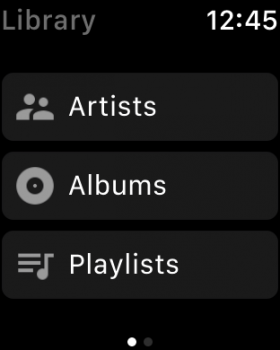
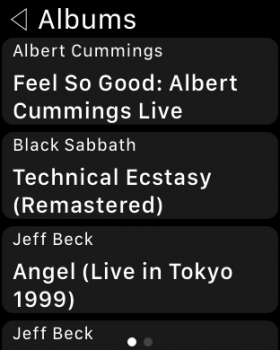
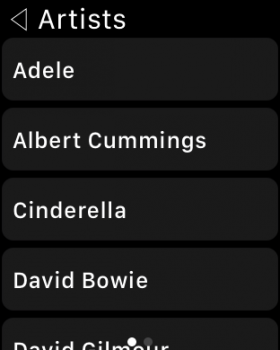
- Play songs from your artists, albums or playlists

Note:
Requires a Spotify Premium account and some Spotify Connect devices.
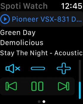
Simulator Screen Shot 15 Aug 2017, 12.45.41.png Simulator Screen Shot 15 Aug 2017, 12.45.50.png Simulator Screen Shot 1 Sep 2017, 10.11.41.png Simulator Screen Shot 1 Sep 2017, 10.11.56.png

Cheers
lubak
 
Last edited by a moderator:

mrruin

macrumors newbie
Sep 22, 2017
5
0
nice app, I just bought it. A Couple of things:
- the volume control seems to be coupled with the spotify web player volume. If you listen on web player with very low volume you will have only very low volume output on the iphone. Really weird and it seems on watchOS 4 I cannot seem to change volume at all.
- my artist list, which is pretty long, the A-Z listing is split up several times. So you have kind of 5 shorter sections of artists sorted A to Z but not one complete list with artists from A-Z if you know what I mean.

Other than that it looks great, buttons are maybe a little small, dunno if this can be improved at all. Volume could only be changed on the digital crown, do you really need the buttons? Would free up some screen estate maybe.

Good work.
 

lveselovsky

macrumors newbie
Original poster
Aug 7, 2017
8
6
Slovakia
nice app, I just bought it. A Couple of things:
- the volume control seems to be coupled with the spotify web player volume. If you listen on web player with very low volume you will have only very low volume output on the iphone. Really weird and it seems on watchOS 4 I cannot seem to change volume at all.
- my artist list, which is pretty long, the A-Z listing is split up several times. So you have kind of 5 shorter sections of artists sorted A to Z but not one complete list with artists from A-Z if you know what I mean.

Other than that it looks great, buttons are maybe a little small, dunno if this can be improved at all. Volume could only be changed on the digital crown, do you really need the buttons? Would free up some screen estate maybe.

Good work.

You are right with volume buttons.
What do you think about this ?

IMG_0018.PNG
 

Spainask27

macrumors member
Oct 8, 2016
44
65
Seasons 2 here. Just bought the app, and I can see my playlists and albums, but when it comes to artist I get an infinite loop.
 

Spainask27

macrumors member
Oct 8, 2016
44
65
Any solution? I’m disappointed bc what made my buy the app was the option to browse by artists.
 
Register on MacRumors! This sidebar will go away, and you'll see fewer ads.