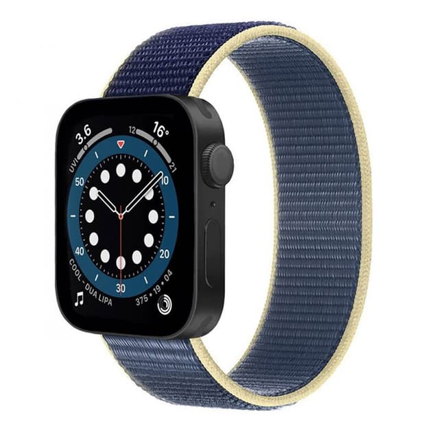
The swedish retailer Elgiganten posted a photo of the Apple Watch 8 today.

Got a tip for us?
Let us know
Become a MacRumors Supporter for $50/year with no ads, ability to filter front page stories, and private forums.
Swedish reseller posts photo of AW8
- Thread starter kave
- Start date
-
- Tags
- apple watch 8 rumor
- Sort by reaction score
You are using an out of date browser. It may not display this or other websites correctly.
You should upgrade or use an alternative browser.
You should upgrade or use an alternative browser.
Very interesting one:

 www.elgiganten.se

Apple Watch 7 (44mm) Nylon Armband - Artic Ocean Blue
Apple Watch 7 (44mm) Nylon Armband - Artic Ocean Blue
Probably a clerical error. I don’t think that Elgiganten would somehow be secretly in the loop on the new watch design.
That looks like a knockoff of the Alaskan Blue sport loop from a few years ago combined with the renders of the flat design S7 that were circulating around last summer. I don’t think we can take anything away from this other than someone had a good time with photoshop.

because the design of the AW shown with Arctic Ocean Blue strap is different.Why does this thread say AW8 when the the site being shown shows a AW7 ?
I did a quick, not very sophisticated reverse image search and came up empty - but I share @Howard2k assessment.
Below the price, you can see it is not actually Elgiganten, but a third-party seller who is using Elgigantens platform.The swedish retailer Elgiganten posted a photo of the Apple Watch 8 today.
View attachment 2011116
I don't think this is the actual Apple Watch 8, but just a mockup from the importer that uses Elgiganten service.
Elgiganten is now like Amazon, where other retailers can put up their products, in this case it is sold by "CaseOnline".
Elgiganten is now like Amazon, where other retailers can put up their products, in this case it is sold by "CaseOnline".
Looks super imposed and also looks like the same renders we have seen in MR.The swedish retailer Elgiganten posted a photo of the Apple Watch 8 today.
View attachment 2011116
+1. The case doesn’t line up with the band and the colour of the end of the watchstraps (I’m missing the word, sorry) attached to the watch would be dark blue, but on this watch it is black.Looks super imposed and also looks like the same renders we have seen in MR.
Possible words for the end of the Watch straps are connectors, adaptors, or lugs.+1. The case doesn’t line up with the band and the colour of the end of the watchstraps (I’m missing the word, sorry) attached to the watch would be dark blue, but on this watch it is black.
Someone is just looking for a quick mention.+1. The case doesn’t line up with the band and the colour of the end of the watchstraps (I’m missing the word, sorry) attached to the watch would be dark blue, but on this watch it is black.
I really hope they don’t go flat sided with the 8.
current watch design, the way the glass and aluminum case share the same curves is *chefs kiss*. that is the defining look of the watch and by squaring it away... it just looks like a plain shape. it loses the subtle complexity of square/round shape imo.
from a manufacturing stand point squared edge case is easier to make and dont have to follow the curve of the glass while saving a whole process of shaping the curve of the glass. it looks cheaper.
from a manufacturing stand point squared edge case is easier to make and dont have to follow the curve of the glass while saving a whole process of shaping the curve of the glass. it looks cheaper.
Thanks for the clarification, I learned somethingPossible words for the end of the Watch straps are connectors, adaptors, or lugs.
That’s absolutely true. I think Apple really made something iconic with the Apple Watch design and by now they basically just updated it with better technology to come even closer to the (probably) original design vision. While I like the squared iPhone design it looks super cheap when ‘translated’ to the Apple Watch. I hope they don’t go there.current watch design, the way the glass and aluminum case share the same curves is *chefs kiss*. that is the defining look of the watch and by squaring it away... it just looks like a plain shape. it loses the subtle complexity of square/round shape imo.
from a manufacturing stand point squared edge case is easier to make and dont have to follow the curve of the glass while saving a whole process of shaping the curve of the glass. it looks cheaper.
I really hope too that they don’t square it off. The current shape IMO looks great. That image looks quite ugly to me.
Register on MacRumors! This sidebar will go away, and you'll see fewer ads.

