Got a tip for us?
Let us know
Become a MacRumors Supporter for $50/year with no ads, ability to filter front page stories, and private forums.
Technique suggestions
- Thread starter Davesc36
- Start date
- Sort by reaction score
You are using an out of date browser. It may not display this or other websites correctly.
You should upgrade or use an alternative browser.
You should upgrade or use an alternative browser.
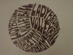
Envelope distort would be my first thought, you could try to make a mesh in the appropriate shape and see how the type conformed to the shape.
tracing
Place a scan of image in Illustrator, trace by hand with the pen tool, preserving a nice hand drawn feel to the letterforms.
Place a scan of image in Illustrator, trace by hand with the pen tool, preserving a nice hand drawn feel to the letterforms.
Envelope distort would be my first thought, you could try to make a mesh in the appropriate shape and see how the type conformed to the shape.
Place a scan of image in Illustrator, trace by hand with the pen tool, preserving a nice hand drawn feel to the letterforms.
Envelope distort may not get there accurately enough for the finished product but could be a good start.
On the other hand, tracing by hand with the pen tool using the image as a template might be a good way to go. You'd really only need to trace one instance of both words, and then copy and paste and rotate the others into position and tweak if necessary.
Time-wise it may be six of one and half a dozen of the other. I suggest playing around with it a bit to get a feel for the approach you like the best.
Place a scan of image in Illustrator, trace by hand with the pen tool, preserving a nice hand drawn feel to the letterforms.
Doesn't take much practise to get good with the Pen tool -- I think you'd spend no longer drawing it over an imported scan than you would trying to get the results you wanted from Envelope, and I agree that the Pen version would probably look nicer, anyway
Cheers!
Jim
Doesn't take much practise to get good with the Pen tool -- I think you'd spend no longer drawing it over an imported scan than you would trying to get the results you wanted from Envelope, and I agree that the Pen version would probably look nicer, anyway
Cheers!
Jim
Agreed - I'd probably lean towards doing it that way too, especially since it's hand-drawn and enveloping a standard font would require customization after shaping anyway.
Envelope distort may not get there accurately enough for the finished product but could be a good start.
On the other hand, tracing by hand with the pen tool using the image as a template might be a good way to go. You'd really only need to trace one instance of both words, and then copy and paste and rotate the others into position and tweak if necessary.
Time-wise it may be six of one and half a dozen of the other. I suggest playing around with it a bit to get a feel for the approach you like the best.
After a quick test of my suggested envelope method I would tend to agree
After a quick test of my suggested envelope method I would tend to agreeUsing a warp mesh there might be a bit more effective to start to help control the overall shape though.
That could very well be. I reckon when it gets right down to it, it depends on the user's preference.
Register on MacRumors! This sidebar will go away, and you'll see fewer ads.


