Become a MacRumors Supporter for $50/year with no ads, ability to filter front page stories, and private forums.

dgdosen

macrumors 68030
Original poster
Dec 13, 2003
2,817
1,463
Seattle
Say you're using vim/neovim (any text editor) on an a new Macbook Pro with miniLED display that allows you to set a color scheme with a pure 'black' background.

- Will that contrast mean that those 'black' pixels are completely off?

- Would that high contrast be healthy/unhealthy from an ergonomic perspective?

I'm asking because on an HDR Macbook Pro - I can't distinguish between neovim and the screen bezel when using a color scheme with a black background. If I try that same color scheme on an Macbook Air (without miniLED), I can definitely see the bezel around the screen, as the bezels are a 'blacker black'.

Thanks for any advice.
 

throAU

macrumors G3
Feb 13, 2012
9,204
7,354
Perth, Western Australia
Say you're using vim/neovim (any text editor) on an a new Macbook Pro with miniLED display that allows you to set a color scheme with a pure 'black' background.

- Will that contrast mean that those 'black' pixels are completely off?

- Would that high contrast be healthy/unhealthy from an ergonomic perspective?

I'm asking because on an HDR Macbook Pro - I can't distinguish between neovim and the screen bezel when using a color scheme with a black background. If I try that same color scheme on an Macbook Air (without miniLED), I can definitely see the bezel around the screen, as the bezels are a 'blacker black'.

Thanks for any advice.

Yes, the black pixels are pretty black.

I'm sure you may be able to measure light or something with a meter, but to the naked eye a black background is indistinguishable from the bezel - hence the notch disappears entirely when the background is black.

Health/ergonomic wise? I'm not a doctor.

But yes, on my 14", blacks are proper black. Not very dark grey like on other non-HDR displays. BLACK.


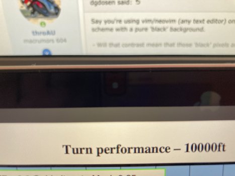
e.g., here's a super up close photo of my camera notch with stuff on the screen in full screen mode. can you see it? you can see the camera, but...

edit:
actually looks like in the photo the camera you see is a reflection of my iPhone. but still. you can't see the notch against a black screen = the screen is properly black.
 

Attachments

  • IMG_0808.jpg
    IMG_0808.jpg
    325.8 KB · Views: 136
Last edited:

white7561

macrumors 6502a
Jun 28, 2016
934
386
World
Yeah it's pretty much black on parts where there isn't any text. Saves power as well. I can confirm that with looking at the power draw from istat menus and from my powerbank (which has an OLED wattage meter when plugging things)
 
  • Like
Reactions: throAU

throAU

macrumors G3
Feb 13, 2012
9,204
7,354
Perth, Western Australia
Yeah it's pretty much black on parts where there isn't any text. Saves power as well. I can confirm that with looking at the power draw from istat menus and from my powerbank (which has an OLED wattage meter when plugging things)
Yeah hadn't considered that, but these screens with lots of dimming zones - using black means it can turn a bunch of LED backlighting OFF (vs. a traditional LCD with a single backlight for the entire screen).

thus saving power.
 

white7561

macrumors 6502a
Jun 28, 2016
934
386
World
Yeah hadn't considered that, but these screens with lots of dimming zones - using black means it can turn a bunch of LED backlighting OFF.

thus saving power.
Yep. I definitely can see it when watching HDR. The higher your brightness level is. The more crazy the difference of power usage when using mostly black background compared to all white backgrounds.

I think I've seen the panel takes 20w on an HDR scene. But it's not the max tho since it's not all of the screen being lit up on an HDR content. Also it's only 1000nits content. So yeah. It does draw a lot of power on HDR scenes where it's very very bright.
 
  • Like
Reactions: throAU

white7561

macrumors 6502a
Jun 28, 2016
934
386
World
@throAU just tested a blank picture. My brightness is 8 clicks from the screen off.

With my current background tasks which i tried to reduce as much as possible.
The total black picture with only menu bar visible is taking on average 4.3w and on all white it's about 7w. So yeah it's pretty crazy. My dark ide theme seems to use about 6w of power (all of these tests are from pictures or screenshots so it's more fair)

I'm gonna see if there is a good vscode black theme and see if it's worth it. Since the blacker the background, the more blooming you will be able to notice. And normal dark theme is not as dark that it will let you see the blooming at all usually.
 
  • Like
Reactions: throAU

white7561

macrumors 6502a
Jun 28, 2016
934
386
World
I'm not particularly fussed as the machine lasts long enough for me to get through a work day with power to spare for what I do with a black on white/light text background, but still interesting to know.
Yeh. Pretty good info to know when you need to save power for whatever reasons :p
 
  • Like
Reactions: throAU

white7561

macrumors 6502a
Jun 28, 2016
934
386
World
Any theme with black set to `#000000` should do the trick, no?
Ya but it seems like on 8 clicks of brightness. The difference with my Material Theme isn't that noticable. It will overtime though and on higher brightness.

Pitch black theme avg 5.5w
My used material theme 6w avg

All with the same shell file opened to make sure it simulates real world usage
 

tmoerel

Suspended
Jan 24, 2008
1,005
1,570
Say you're using vim/neovim (any text editor) on an a new Macbook Pro with miniLED display that allows you to set a color scheme with a pure 'black' background.

- Will that contrast mean that those 'black' pixels are completely off?

- Would that high contrast be healthy/unhealthy from an ergonomic perspective?

I'm asking because on an HDR Macbook Pro - I can't distinguish between neovim and the screen bezel when using a color scheme with a black background. If I try that same color scheme on an Macbook Air (without miniLED), I can definitely see the bezel around the screen, as the bezels are a 'blacker black'.

Thanks for any advice.
From an ergonomic point of view, a white background with black letters is way better. The reason is that a brighter screen will cause the irises in your eyes to narrow. This will in turn increase the depth of field of your eyes putting less stress on the muscles needed to focus your eyes. This will reduce strain.
 
Last edited:

FNH15

macrumors 6502a
Apr 19, 2011
822
867
Say you're using vim/neovim (any text editor) on an a new Macbook Pro with miniLED display that allows you to set a color scheme with a pure 'black' background.

- Will that contrast mean that those 'black' pixels are completely off?

- Would that high contrast be healthy/unhealthy from an ergonomic perspective?

I'm asking because on an HDR Macbook Pro - I can't distinguish between neovim and the screen bezel when using a color scheme with a black background. If I try that same color scheme on an Macbook Air (without miniLED), I can definitely see the bezel around the screen, as the bezels are a 'blacker black'.

Thanks for any advice.
On a Mini-LED display, the black sections are not pixels which are turned off (that’s an OLED), but rather sections of the backlight which have been turned off. Still completely black, though.

The other post regarding contrast is true in a well-lit environment. For night reading though the opposite can also be true. Depends on how much ambient light is present.
 

Krevnik

macrumors 601
Sep 8, 2003
4,101
1,312
Ergonomics also depends on brightness levels of the display vs ambient light levels. Having a monitor set too dim in a bright room, or vice versa can add strain.

Thankfully text editors don’t have an HDR mode. :)
 
Register on MacRumors! This sidebar will go away, and you'll see fewer ads.