Become a MacRumors Supporter for $50/year with no ads, ability to filter front page stories, and private forums.

ibookowner2005

macrumors newbie
Original poster
Dec 12, 2005
24
0
Is it just me or were you expecting a more slim-line looking iPhone, it looks pretty tacky to me. Let me explain...


1) The rounded edges, makes it look quite feminem.

2) Position of the camera. Doesent look profesional, isnt in the centre, no flash or mirror that come standard on other phones. Basically some ugly round hole.

3) The shiny apple logo and mixed black / white cover. Makes the product appear quite cheap. Would look more slick and streamlined with all black.

I MUCH prefair the LOOK of the Lg Prada Phone.

In terms of the physical appearence and not features etc... you must agree that the prada looks better!

4) Also the round "home" button does not look attractive, compared to that of the glossy buttons at the bottom of the Prada phone.


I love the iPhone and i want to buy one, im just saying that it could look better... whats your thoughts?
 
I MUCH prefair the LOOK of the Lg Prada Phone.

In terms of the physical appearence and not features etc... you must agree that the prada looks better!

4) Also the round "home" button does not look attractive, compared to that of the glossy buttons at the bottom of the Prada phone.

The PRADA is very cheap looking in real life.
 
I usually dislike Apple's new products untill i have looked at them for awhile. Then I grow to love them.

Its a interesting and well supported oppinion, but im going to have to disagree. I fell in love with the design from the begining. Its nice and simple.
 
1) The rounded edges, makes it look quite feminem.

I think you meant feminine. Since when does feminine equal ugly? It's going to make for a very nice-feeling gadget in your hand.

2) Position of the camera. Doesent look profesional, isnt in the centre, no flash or mirror that come standard on other phones. Basically some ugly round hole.

The center of a rounded edge is the obvious spot to place a small, circular item on a large rounded rectangle. The middle is not. Small cellphone camera mirrors are the very definition of tacky. The lack of a flash unit is not a design concern; it's a missing feature. Adding it would have almost certainly made the design uglier.

In terms of the physical appearence and not features etc... you must agree that the prada looks better!

No, I must not.

the button bar below the screen on the Prada is hideous - it doesn't match anything in the rest of the design, and it's placed too low. The sharp edges will make for a (mildly) unpleasant tactile feel. The side buttons are asymmetrical and they stick out when viewed from the front - they're also disingenuous, looking almost exactly like those on the RAZR. The camera is in the same spot as with iPhone, only on a hideous plate with ugly text on it.

I think you'll find few people here who will agree with your contention that iPhone is ugly. I would have changed a few minor things about it (at the expense of something else, I'm sure) but overall, it's a stunning, iconic design.
 
Is it just me or were you expecting a more slim-line looking iPhone, it looks pretty tacky to me. Let me explain...

1) The rounded edges, makes it look quite feminem.

It looks like it won't rip a hole in my Prada pants.

2) Position of the camera. Doesent look profesional, isnt in the centre, no flash or mirror that come standard on other phones. Basically some ugly round hole.

The LG Prada has it's camera off-center as well.

3) The shiny apple logo and mixed black / white cover. Makes the product appear quite cheap. Would look more slick and streamlined with all black.

The back cover is metal...the shiny Apple doubles as a mirror when using the camera (if you really feel you need one).

4) Also the round "home" button does not look attractive, compared to that of the glossy buttons at the bottom of the Prada phone.

You hate the etched shiny Apple on the aluminum backing of the iPhone but you love the shiny buttons on the LG Prada, well...you're in luck...it looks like it's got plenty of shiny buttons on both sides too.
 
Beauty is in the eye of the beholder.

I think the design is good, but there are other aspects of the iPhone I would consider ugly....extremely ugly. Fugly if you will :D
 
but overall, it's a stunning, iconic design.

I have to disagree,

since when is a design "Apple fans" have been drawing and making mock-ups for (months before the product was announced) an "iconic design".

Its a "touch screen" so obvously theres no buttons, apart from a home button. The phone has a camera on the back with a Apple logo.

Aside from the software and features etc. Looking at it physically...

its far from a "stunning, iconic design" dont you think ? :confused:
 
I think that The Iphone looks great.

I agree that the back could look better. Maybe an all chrome back would make it look better. But then again most of us cant comment on the looks since we have not seen one in real life. You cant judge the look and feel of an object by an image.

The only thing that I feel was a mistake is the place where the camera is placed. I would have loved to have the camera ponting towards me so that I can video conference. I know this would suck for taking pictures. Maybe they could have had it swing to the front somehow or just add a second one in the front. Maybe someone will comeback with a mirror type attachment.

I would love to use the iphone with skype, that is if skype becomes available.
 
since when is a design "Apple fans" have been drawing and making mock-ups for (months before the product was announced) an "iconic design".

I have not seen a single fan mock-up that came even close to the actual design oh iPhone. The first thing I thought when Steve showed it at the keynote was, omigod, those mock-ups were SO lame compared to this.

Aside from the software and features etc. Looking at it physically...

its far from a "stunning, iconic design" dont you think ? :confused:

No, I don't.
 
extravagantly minimalist

Apple has always been extravagant in features while minimalist in design. This makes their products very 'ergonomically economical' (is that a word?). They are freaks on design and maximize every available space as well as finish.

I remember reading a review from somebody who had one (it was on Macrumors a few weeks ago) and they said that is was well constructed (even heavy!). I hope they are right! I think they are.

Just remember, this is the first phone to spawn all of the touch screens! Prada may have introduced one to the market first, but I am betting that the iPhone will outsell the Prada in a week (maybe even less than that)!.
 
I have not seen a single fan mock-up that came even close to the actual design oh iPhone.

Add a "home button" and space for the ear speaker... there you go!


Most of the mock-ups for the "fullscreen iPod" are similar to the iPhone... there everywhere. Basically a device with one side covered with a "touch interface" resembles an iPhone.

Yeh i also think the iPhone will outsell the Prada ina week :)

I may not like the whole appearence of the iPhone... but i sure am buying one as soon as possible! Go iPhone!
 
2) ... Basically some ugly round hole.

3) The shiny apple logo and mixed black / white cover. Makes the product appear quite cheap. Would look more slick and streamlined with all black.

I love the iPhone and i want to buy one, im just saying that it could look better... whats your thoughts?

Point 2 makes me laugh for some reason.

Point 3, well it makes me think of a product from outer space.

It could look better? Oh yes, revisions revisions revisions!

ewww that sounded Balmery!
 
It's an awesome design IMO. And no I'm not going to give any reasons because I feel no need to try and change the mind of anyone else.
 
1) The rounded edges, makes it look quite feminem.
I think this is a good thing, all my apple computers have female names so will my iPhone, also it won't dig in pocket.
2) Position of the camera. Doesent look profesional, isnt in the centre, no flash or mirror that come standard on other phones. Basically some ugly round hole.

Flash would have been nice, but I think the positioning of the camera was fine, don't forget in the middle you have the sim card
3) The shiny apple logo and mixed black / white cover. Makes the product appear quite cheap. Would look more slick and streamlined with all black.
I've never seen the product in person yet so I can't pass judgement, but looking at the photos it do make me wonder why they choose that.
I MUCH prefair the LOOK of the Lg Prada Phone.

I don't
In terms of the physical appearence and not features etc... you must agree that the prada looks better!
no
4) Also the round "home" button does not look attractive, compared to that of the glossy buttons at the bottom of the Prada phone.
I think it looks quite good.


I usually dislike Apple's new products untill i have looked at them for awhile. Then I grow to love them.

Thats happened to me on a few of apples products recently, i.e. G5 powermac/mac pro, the new macbooks, ipod stereo etc etc
 
Is it just me or were you expecting a more slim-line looking iPhone, it looks pretty tacky to me. Let me explain...


1) The rounded edges, makes it look quite feminem.

2) Position of the camera. Doesent look profesional, isnt in the centre, no flash or mirror that come standard on other phones. Basically some ugly round hole.

3) The shiny apple logo and mixed black / white cover. Makes the product appear quite cheap. Would look more slick and streamlined with all black.

I MUCH prefair the LOOK of the Lg Prada Phone.

In terms of the physical appearence and not features etc... you must agree that the prada looks better!

4) Also the round "home" button does not look attractive, compared to that of the glossy buttons at the bottom of the Prada phone.


I love the iPhone and i want to buy one, im just saying that it could look better... whats your thoughts?

Although I do disagree with some of your points, I'm totally on your side here. I think the iPhone is overhyped. I think Apple's "it's three devices in one so we'll price it like that!" argument is flawed. I think the fact that the camera doesn't even have a mirror adds insult to injury. I doubt the camera will be any good, even if it is 2.0 MP.

I don't mind how it looks, and I hope to buy a second version, but even then, problems such as tactile feedback (SMS will be so fun! :rolleyes: ) and it just being a stupendously delicate device may still prevent me from buying it.
 
Is it just me or were you expecting a more slim-line looking iPhone, it looks pretty tacky to me. Let me explain...

http://img513.imageshack.us/my.php?image=iphonebacksmallhk8.jpg

1) The rounded edges, makes it look quite feminem.

2) Position of the camera. Doesent look profesional, isnt in the centre, no flash or mirror that come standard on other phones. Basically some ugly round hole.

3) The shiny apple logo and mixed black / white cover. Makes the product appear quite cheap. Would look more slick and streamlined with all black.

I MUCH prefair the LOOK of the Lg Prada Phone.

In terms of the physical appearence and not features etc... you must agree that the prada looks better!

4) Also the round "home" button does not look attractive, compared to that of the glossy buttons at the bottom of the Prada phone.


I love the iPhone and i want to buy one, im just saying that it could look better... whats your thoughts?
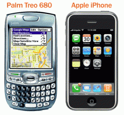
I did not know they were even released yet. Anyway, you love it but think it is ugly. Hope you do not use that line in the bedroom.
 
look at this image thats what people are carrying arround these days (treo) now tell me what would you rather carry in terms of design?
 

Attachments

  • Treo_2DiPhone_2DComparison.gif
    Treo_2DiPhone_2DComparison.gif
    60.7 KB · Views: 150
Is it just me or were you expecting a more slim-line looking iPhone, it looks pretty tacky to me. Let me explain...


1) The rounded edges, makes it look quite feminem.

2) Position of the camera. Doesent look profesional, isnt in the centre, no flash or mirror that come standard on other phones. Basically some ugly round hole.

3) The shiny apple logo and mixed black / white cover. Makes the product appear quite cheap. Would look more slick and streamlined with all black.

I MUCH prefair the LOOK of the Lg Prada Phone.

In terms of the physical appearence and not features etc... you must agree that the prada looks better!

4) Also the round "home" button does not look attractive, compared to that of the glossy buttons at the bottom of the Prada phone.


I love the iPhone and i want to buy one, im just saying that it could look better... whats your thoughts?

Please do not feed the troll.
 
ugh it doesnt look like they put ANY effort at all to design the treo its the defenition of ugly. Sorry if this is offensive but you apparently have no concept of design:eek:

I don't care about looks, I care about functionality. The iPhone looks better, but I couldn't care less. Functionally, it does not meet my needs.

I also care that if I wanted to, I could purchase a Treo without being limited to a single carrier or needing to extend a contract, plus it would be unlocked for me to use on any GSM carrier I wanted.

Please do not feed the troll.

So anyone who claims that Phone X is better than the iPhone is suddenly a troll. How nice :rolleyes:
 
I don't care about looks, I care about functionality. The iPhone looks better, but I couldn't care less. Functionally, it does not meet my needs.

I also care that if I wanted to, I could purchase a Treo without being limited to a single carrier or needing to extend a contract, plus it would be unlocked for me to use on any GSM carrier I wanted.


So anyone who claims that Phone X is better than the iPhone is suddenly a troll. How nice :rolleyes:
please read my question first it clearly states what would you pick IN TERMS OF DESIGN.
 
Register on MacRumors! This sidebar will go away, and you'll see fewer ads.