Hi everyone ! I'm Dimitri, Game Designer for Seele Games.
We just released The Knight Watch, a fast paced puzzle game combining chess mechanics with arcade gameplay. We feel it perfectly fits Apple Watch device and can work for short spurts or longer sessions. Let us know what you think !

You can download the game here
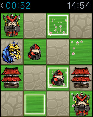
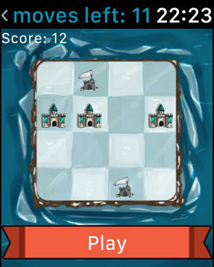
As a lone knight who can only move in an L-shape (as in chess) the goal is to clear the levels by capturing all of the pieces. During the game, you will meet units inspired by chess pieces(rook, bishop, queen…) and tricky obstacles to overcome through 200 levels and 3 games modes. We also dod a skin system allowing to change characters and background visuals at will, with 30 themes available !
The game is easy to learn but hard to master and can be enjoyed by newcomers and chess experts as well.
Our goal is to make a good game for iPhone/iPad, but also for Apple Watch. In order to do this, we adapted the gameplay, visuals and game modes to be optimized on the Watch. I hope you will like it.


Apple Watch Features :
- Unique game modes
- 100 unique levels
- Complications
- Apple Watch only leaderboards.
What could we improve ? Which kind of updates would you like to see ? Let us know !
We just released The Knight Watch, a fast paced puzzle game combining chess mechanics with arcade gameplay. We feel it perfectly fits Apple Watch device and can work for short spurts or longer sessions. Let us know what you think !

You can download the game here
As a lone knight who can only move in an L-shape (as in chess) the goal is to clear the levels by capturing all of the pieces. During the game, you will meet units inspired by chess pieces(rook, bishop, queen…) and tricky obstacles to overcome through 200 levels and 3 games modes. We also dod a skin system allowing to change characters and background visuals at will, with 30 themes available !
The game is easy to learn but hard to master and can be enjoyed by newcomers and chess experts as well.
Our goal is to make a good game for iPhone/iPad, but also for Apple Watch. In order to do this, we adapted the gameplay, visuals and game modes to be optimized on the Watch. I hope you will like it.


Apple Watch Features :
- Unique game modes
- 100 unique levels
- Complications
- Apple Watch only leaderboards.
What could we improve ? Which kind of updates would you like to see ? Let us know !


