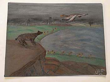
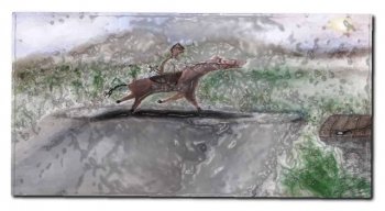
Just look at the beauty of that honey bear and the fur stand up as well as thwt duck flying. look at the background and most. this is some serious badass professional work. How can you fault it? yea the bear may be too small but it could be a honey badger or simply not fully grown. that’s all I can fault in it though.
It is an improvement over the previous work, because proportions look slightly better, and the composition is somewhat more pleasing as well.
From a purely technical perspective, it is still at a beginner's stage. That said, you may not accept this until you honestly compare it to true masters who depicted these same topics:
Bear by Terry Isaac
Arnold Schatz (both the swans and ducks)
Now, compare with yours. Look at the dynamic shapes, the astonishing composition, the lighting, the textures, colours, the details where it counts, the implied movement of those birds. A lot is implied in Schatz's work, and it takes on a dreamy almost surreal quality. These idealized depictions look better than reality ever could, or any photo for that matter.
There is true weight and feel injected into those animal shapes, and their presence is acutely felt, even though we are merely looking at 2d flat depictions.
Your bear feels flat in comparison, like a cardboard flat cutout in a flat landscape. Your duck is also drawn from the side, and the relative size and placement on the paper causes it to feel as if it is bigger than the bear. Drawing objects from a side/front perspective is often part and parcel of a beginner artist, because they haven't grasped the concept of seeing the shapes in 3d and converting these 3d shapes in 2d shapes on paper.
I am utterly aware that it is completely unfair and rather harsh to compare your work with that of these two artists. But to become a good artist (or designer) one must be entirely devoid of ego as far as technical abilities go. Be brutally honest. Your work's technical level is light-years behind these examples.
And that is to be expected. Because these two artists started out at some point in their career where you are now. And they became better at drawing and painting by years and years of practice and realizing their strengths and weaknesses. But the only way to become that good is by relinquishing yourself to wanting to become better. And understanding the technical quality of your own work, which requires your 'artistic eye' to develop and evolve as well, as you grow as an artist. This is the very reason why accomplished masters remained brutally critical of their own work even when they arrived at a level beyond where most of us can only dream to be.
I say this from personal experience. At 10 years old I drew an owl and it was published in the school's newsletter. I loved my drawing, and was really proud of it. At that age I drew better than anyone else in the entire school, and was told by everyone that it looked awesome. I was convinced it was the best drawing of an owl ever.
A few years later I really got into drawing, and I was exposed to the level of work that exists throughout history of depictions of owls. While I still think that my drawing of an owl for a 10 year old is not that bad, obviously now I recognize the relativity of my ego at the time. It is just a beginner's drawing, albeit at a slightly more accomplished level. The proverbial frog in the well, I was. I only improved after being exposed to the much larger and scarier world of professional art that is out there. Only then I realized: the adults were humouring a ten year old, and B) my world was so small.
And knowing how to become better efficiently is important as well. Do not re-invent the wheel, and do learn from the hard-earned lessons from past artists. Knowing how to draw in perspective is merely introducing yourself to a set of rules, and then you practice these rules. While your stance might be that these rules result in derivative, generic, and unoriginal work by themselves, to point is that when you become adept drawing scenes and objects according to perspective rules, then can you proceed to implement these in your own work, and decide to break them and still remain in total control. And the rules of perspective become a mere tool in your toolset to depict things convincingly on paper/the digital screen.
And a beginner artist should look at these high-level examples as a source of inspiration, and not suffer a mental breakdown over comparing that level of work with their beginner work. One of my best friends drew very well, and loved drawing comics. He improved, but he kept comparing himself with the greatest in the comics field, and at some point beat himself up to such an extent over his perceived lack of ability, and stopped doing any art up till this day. That, of course, is not the point. The point is to have fun, and become better while enjoying the process. The end result is less important.
But to really improve you must be brutally honest, and realize there are many artists out there that are REALLY good. Allow that work to become an inspiration. You may not become as good as them, but your work will improve rapidly at any rate, is my experience.
Anyway, apologies for my long post.
[automerge]1583456962[/automerge]
I also just recently realized I was making my stuff in resolutions too small really even for the web just to save space and because it looked fine on the artbaord or my iPad display. Instead of 800x600 which is fine I guess as a protoflio showpiece I have with embedded images, I need to start working with 1920x1080 for pc widescreen monitors.
For multi-tone coloured painted art, work at the desired output size and a minimum of 300ppi.
Suppose you need portrait A4@300ppi full (painted) colour: 2480px high by 3508 px wide.
But if you are unsure about the final output size, it is better to work at twice the expected size. I double that resolution in that case: A4@600ppi = 4961px by 7016px.
For pure black and white printed work (black inks like in comics) ideally work at the desired page size and 1200ppi: portrait A4@1200ppi: 9921px by 14032px. Ideally in 1bit, or ink using vectors in software like Illustrator. It will output at the highest resolution of the output device in that case.
Of course, if you are drawing pixel art (for games), work at the exact pixel size. Could be as low as 16 by 16px.
PS Graphic design is not the software that you use. Graphic design uses digital tools like Illustrator and InDesign nowadays, but it used to be done on paper before the advent of the Mac.
Learning to use the tools of the trade does not make you a better artist or designer...


")