Become a MacRumors Supporter for $50/year with no ads, ability to filter front page stories, and private forums.

iRock1

macrumors 65816
Original poster
Apr 23, 2011
1,081
144
Personally I don’t understand why the made it ‘shorter’. Instead, they could have just increased the height of the old mini a bit — And screen size could have been closer to the 8.9” 14:9 ratio some of us were expecting. That way, while still being pocketable and easy to handle with one hand, the mini could offer a movie watching and browsing experience in landscape mode nearly identical to the old full size 9.7” screen!

See for reference:
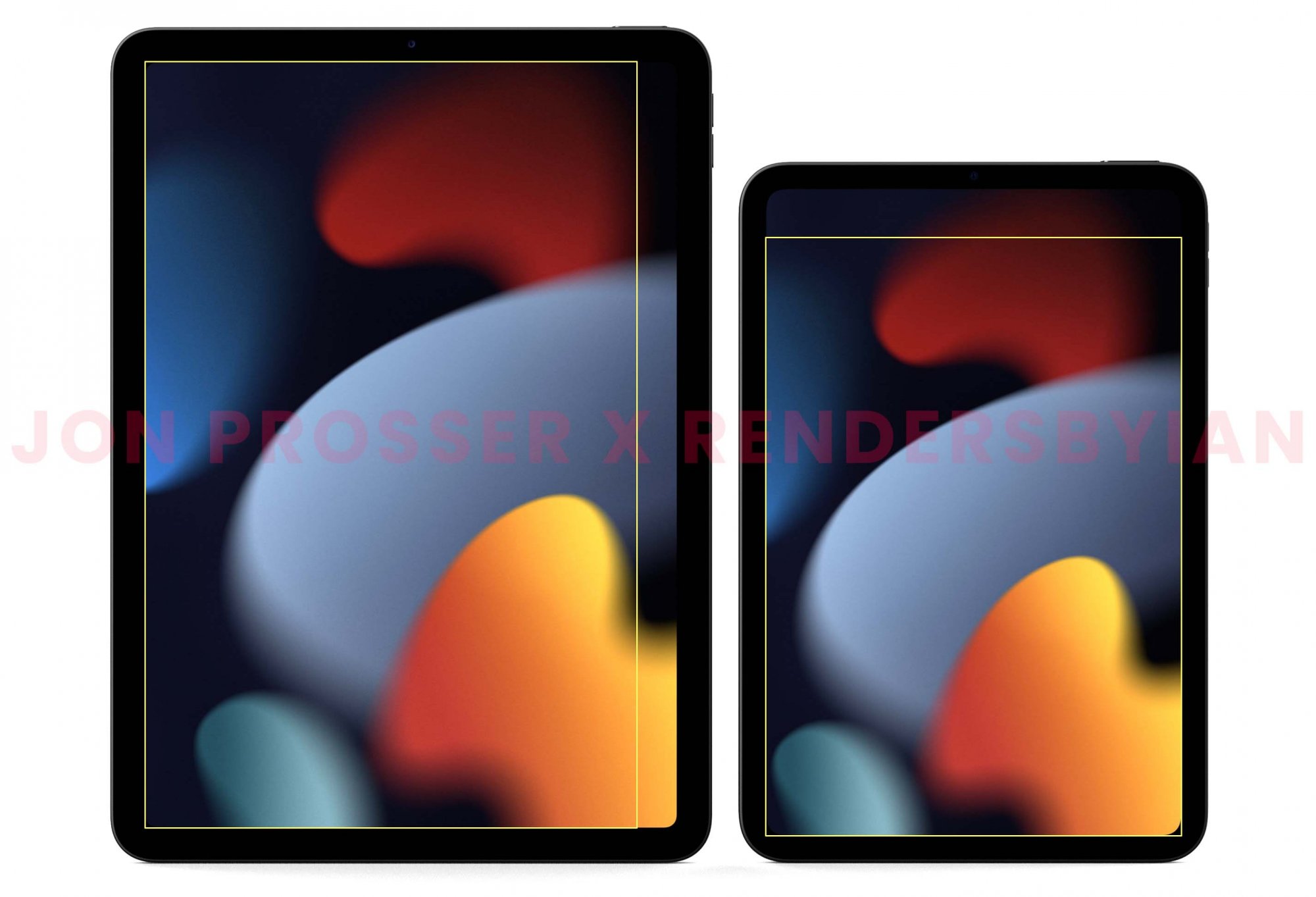

Another benefit of a slightly longer footprint is that you could justify putting a smart connector on the back and giving slightly more room for third parties when designing a mini keyboard.

I love the new design and all, but honestly going from 7.9 to 8.3” was not that much to justify the $499 price tag of the original iPad.

Also, I can’t stand the stupid removal of the headphone jack. There is no justifiable excuse from a user perspective to do that on any iPad. Apple really needs to capitulate on that one.

They could also increase the brightness of the screen (500 nits is still too little) and the base storage from 64 to 128 GB.

Now there you have a perfect mini everybody would gladly pay 500 bucks for!

P.S. Personally I don’t care about the LED display and 60 Hz.
 
Last edited:

tpfang56

macrumors regular
Jul 1, 2021
183
328
Assuming you can’t make the mini into a higher spec model ie. an ipad mini pro.

- jelly scroll/scan-skew is in landscape mode instead of portrait
- screen panel is higher quality
- higher base storage (128gb)
- smart connector
- better iPadOS optimization
 

HobeSoundDarryl

macrumors G5
  1. Headphone jack: IMO dongles are dumb but would still work for those who 'love them', a great Apple-made DAC is already inside and bluetooth lacks the bandwidth for Apple's best quality audio files (but would still work for those who 'love bluetooth').
  2. option for more storage tiers.
  3. option for iPhone/iPad Pro cameras.
Yes, #2 & #3 probably means "pro" branding and pricing about 30% more but- as far as I'm concerned- so be it.

Otherwise- IMO- it is pretty near PERFECT!
 
Last edited:
  • Like
Reactions: iRock1

Kobra

macrumors regular
Jun 17, 2009
228
105
They should have retained the overall size and aspect ratio of the last generation, but with thinner bezels and no home button. But my main gripe with the mini 6 isn’t hardware related, instead it’s OS. Apple should fix the general size and layout of the GUI. Menu text is too small and some of the screen panes are totally off, messages is one example.
 

Xand&Roby

macrumors 6502a
Jun 13, 2020
534
486
I can’t understand why out target owners complains on the web about them choices.
Mini need to be mini.
Original case from 1 to 3 Gen was shorter than then 4 and 5 Gen, screen’s form factor and handle with one hand were the design’s guide. 4 and 5 are less confortable for everyone see the differences (for example people with small hands), as the 12” and 13” Mac are uncomparable.
Instead of long strange screen form factor I hope OLED or microLED came fast, iPhone/Watch screen are more confrontable than miniLED screens and we need them in all platform.
Also USB-C Thunderbolt, MagSafe and more case material options.
Keyboard no, isn’t a real upgrade, and I’m writing this post from an iPad mini 2 with Logitech Ultra thin keyboard folio (gift trashware).
 
  • Like
Reactions: Oohara

azentropy

macrumors 601
Jul 19, 2002
4,138
5,665
Surprise
- Reduce Jelly Scroll (why I didn't purchase). So use a better panel, change to ProMotion, change orientation back or some combination.
- Increase width of screen in portrait (change aspect ratio), even if that means the bezels are not symmetrical. In some cases the 6 screen seems smaller than the 5 because of this change.
- Cut price back $50 or increase standard storage.
 

SirAnthonyHopkins

macrumors 6502a
Sep 29, 2020
948
1,892
Reduce Jelly Scroll (why I didn't purchase)
Honestly think you're mad if that's your only reason not to purchase one. It's noticeable when you look for it. In day-to-day usage, you're never quickly flicking up and down long passages of text while also needing that text to be perfectly legible.

Would it be better if it wasn't there and we had the same screen as on the 12.9" Pro? Yes. But it really isn't much of an issue in general usage.
 

achappy

macrumors 6502
Oct 26, 2017
271
312
Add FaceID. Although I’ve gotten used to TouchID since it’s easier with a small device, having an iPP12.9 and a 12 Max, it would’ve been nice to have.

But it’s a minor change. Don’t notice/care about jelly scrolling, screen too small to notice ProMotion (noticed it on the Air) and 64GB is still way too much space for me.

I’m absolutely loving the Mini after trying the previous ones several times.
 
  • Like
Reactions: CarboysDesire

jimmy_uk

macrumors 68020
Oct 19, 2015
2,478
3,306
UK
Better quality screen and display controller.

Just say no to jelly.

NeatQuestionableAdamsstaghornedbeetle-size_restricted.gif
 

*~Kim~*

macrumors 65816
May 6, 2013
1,178
470
UK
Front camera to the side to facilitate better Facetime etc, allowing a headphone jack to return in the then free space at the top.

128/512 options at a minimum, this is a mid range device with the price tag to match and entry level storage options.

Same size as prior mini, maybe a tad bigger. I thought the 8.3' was a little disappointing when announced, though I was concerned that 8.9 would be too much. Even the base iPad managed a full half an inch when it got a larger screen.
 

James Godfrey

macrumors 68020
Oct 13, 2011
2,068
1,710
Personally I don’t understand why the made it ‘shorter’. Instead, they could have just increased the height of the old mini a bit — And screen size could have been closer to the 8.9” 14:9 ratio some of us were expecting. That way, while still being pocketable and easy to handle with one hand, the mini could offer a movie watching and browsing experience in landscape mode nearly identical to the old full size 9.7” screen!

See for reference:


Another benefit of a slightly longer footprint is that you could justify putting a smart connector on the back and giving slightly more room for third parties when designing a mini keyboard.

I love the new design and all, but honestly going from 7.9 to 8.3” was not that much to justify the $499 price tag of the original iPad.

Also, I can’t stand the stupid removal of the headphone jack. There is no justifiable excuse from a user perspective to do that on any iPad. Apple really needs to capitulate on that one.

They could also increase the brightness of the screen (500 nits is still too little) and the base storage from 64 to 128 GB.

Now there you have a perfect mini everybody would gladly pay 500 bucks for!

P.S. Personally I don’t care about the LED display and 60 Hz.
A silver colour option ?‍♂️
 

estabya

macrumors 6502a
Jun 28, 2014
691
730
I picked up the mini 6 on launch day, and it quickly became my most used device. It’s the perfect size and weight for my commute on the light rail, laying in bed, and taking notes.

The only improvement I would ask for is a promotion display.
 

dancingonthefence

Suspended
Nov 2, 2021
34
6
  1. Headphone jack: IMO dongles are dumb but would still work for those who 'love them', a great Apple-made DAC is already inside and bluetooth lacks the bandwidth for Apple's best quality audio files (but would still work for those who 'love bluetooth').
  2. option for more storage tiers.
  3. option for iPhone/iPad Pro cameras.
Yes, #2 & #3 probably means "pro" branding and pricing about 30% more but- as far as I'm concerned- so be it.

Otherwise- IMO- it is pretty near PERFECT!
It is perfect, but you need to have a iPad Pro 12.9
 

ejin222

macrumors 6502a
Oct 12, 2011
564
432
As a long time iPad Mini user, these would've been the changes to the Mini I would've paid $600 for:
1) Same size as Mini 5, but the screen pushed out to the edge and not this shorter Mini 6
2) Face ID (I'm really hating Touch ID more and more...)
3) Smart Connector (If the Mini 6 was Mini 5 size, a keyboard option would've been nice for me)
4) Bigger battery (Maybe it's just me, but my Mini dies rather quickly...)
 

Rafterman

Contributor
Apr 23, 2010
7,267
8,809
As a long time iPad Mini user, these would've been the changes to the Mini I would've paid $600 for:
1) Same size as Mini 5, but the screen pushed out to the edge and not this shorter Mini 6
2) Face ID (I'm really hating Touch ID more and more...)
3) Smart Connector (If the Mini 6 was Mini 5 size, a keyboard option would've been nice for me)
4) Bigger battery (Maybe it's just me, but my Mini dies rather quickly...)

I like TouchID. At least you can unlock, if the iPad is sitting on the desk in front of you.
 

puckhead193

macrumors G3
May 25, 2004
9,578
862
NY
Better quality screen or have the option to upgrade to a better screen with more nits
128
This is more iPad os but be able to check battery level before unlocking in portrait mode.
Bigger battery. I feel like I need to constantly charge this thing.
 
Last edited:
Register on MacRumors! This sidebar will go away, and you'll see fewer ads.