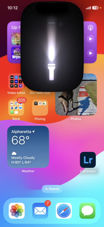
I have mixed feelings.
For better or worse, Apple used to have a unified design language.
Lately this has changed.
Right now is like a neo-skeuomorphism, in the opposite spectrum of the iOS 7 minimalist look.
I find it too bold, too much information. 🤷♂️
I have mixed feelings.
For better or worse, Apple used to have a unified design language.
Lately this has changed.
Right now is like a neo-skeuomorphism, in the opposite spectrum of the iOS 7 minimalist look.
I find it too bold, too much information. 🤷♂️
I like it. Not everything can be boiled down to some cryptic little icon. In the case of the flashlight, the illustration image shows you exactly what it does and how to control it. I think it’s a very good little bit of information design.
I have mixed feelings.
For better or worse, Apple used to have a unified design language.
Lately this has changed.
Right now is like a neo-skeuomorphism, in the opposite spectrum of the iOS 7 minimalist look.
I find it too bold, too much information. 🤷♂️
Yeah that's pretty wild and I had no idea that feature was there. It has to be done with hardware somehow; I'm guessing there's multiple LEDs under the lens that turn on or off depending on the spread.
I do wish you could use TrueTone in the flashlight, though, to make the light a bit warmer. Guess we'll be waiting for iOS 19 for that though.
I have mixed feelings.
For better or worse, Apple used to have a unified design language.
Lately this has changed.
Right now is like a neo-skeuomorphism, in the opposite spectrum of the iOS 7 minimalist look.
I find it too bold, too much information. 🤷♂️