Become a MacRumors Supporter for $50/year with no ads, ability to filter front page stories, and private forums.

mpavilion

macrumors 65816
Original poster
Aug 4, 2014
1,461
1,072
SFV, CA, USA
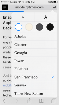
It's not even available as an option in the new Reading Mode font selector (see attached).

When Apple "goes another way," they really go another way. They really went from "everything in this font" to "forget it even existed."

(For the record -- San Francisco's OK, and it is more legible at smaller sizes; but it lacks a certain "class" and "presence" that Helvetica carries.)
 

Attachments

  • image.png
    image.png
    229.9 KB · Views: 220
  • Like
Reactions: DoctorKrabs

Madonepro

macrumors 6502a
Mar 16, 2011
677
666
LOL, can you explain 'lacks a certain class and presence"? Personally I like the new font, it has made everything a little easier to read, and a few of my colleagues feel the same way.
 
  • Like
Reactions: dearfriendx

yanki01

macrumors 68040
Feb 28, 2009
3,682
1,927
Twitter got a little getting used to reading but I really enjoy the font. feels like a whole new device.
 

mpavilion

macrumors 65816
Original poster
Aug 4, 2014
1,461
1,072
SFV, CA, USA
LOL, can you explain 'lacks a certain class and presence"? Personally I like the new font, it has made everything a little easier to read, and a few of my colleagues feel the same way.

I'm not a design guy, I don't really have the vocabulary to talk about typefaces... I just think Helvetica looks "classic" (I guess b/c it is "classic"), whereas SF looks like a modern digital font designed for clarity (which it is; with its anemic, clipped letterforms).

I know Helvetica has its detractors (as overused, etc.), and Apple was criticized specifically for relying on it so much as a mobile font. They were probably right to make the change. But it's interesting that Helvetica has been in the mix since the original Mac (right?), and now it's gone from iOS.
 
Last edited:

Madonepro

macrumors 6502a
Mar 16, 2011
677
666
It's still exists as a font, and no doubt many will still use it. I guess Apple believe it is a better typeface to use for reading clarity. I for one, agree.
 

C DM

macrumors Sandy Bridge
Oct 17, 2011
51,392
19,461
When Apple changes something they really change it most of the time without some option to revert that. Been pretty much the case with them for a long time.
 

bandofbrothers

macrumors 601
Oct 14, 2007
4,779
328
Uk
I prefer it too.

I'm sure that some people will jail break when/if it becomes available on iOS 9 to use Bytafont to reintroduce the original font.
 

campyguy

macrumors 68040
Mar 21, 2014
3,413
957
Helvetica. Ugh. Ugly. There's nothing, absolutely nothing unique about that font family, this coming from a tech writer and typesetter going back to 1987. I won't, and don't, miss Helvetica.

OK, so there's some "lovers" of Helvetica out there. Let's look at one ugly side of using this font - the cost, coming from the typesetter side of me. I license all of the fonts that I use in my work. I've won awards for my layouts - not one of them included Helvetica (one did use Skia, another Palatino, so thanks Apple for those fonts!).

I like the Helevetica font, but Linotype is charging $832 for all of the Linotype Styles. Ouch. Multiply that price, even with a "group discount", for an OS that costs $0 and I'd see that cost digging a pretty big hole when multiplied by 10 or 50 or 100 million Mac users.

So, the San Francisco Font it is. If you don't like it, send your check to Linotype for $832.
 

KALLT

macrumors 603
Sep 23, 2008
5,380
3,415
Helvetica and San Francisco are so much alike, why include two typefaces that are barely distinguishable?
 

KALLT

macrumors 603
Sep 23, 2008
5,380
3,415
They look pretty different to me(?) We're not talkin' "Arial" here...!

Definitely not Arial/Helvetica similarity, but it is very obvious that San Francisco was based on Helvetica. Apple designers love that typeface and they made sure that most of its elegance was retained, while optimising for legibility. There are some tests online that compare the two and even though I’m a typeface fetishist, I had a really tough time keeping them apart. Most users will either not notice the difference (maybe just observe that ‘something’ looks different) or find the difference so minor that it’s not necessary to keep Helvetica around.

All I’m saying is that it makes sense for Apple to keep the list short and provide some visually distinctive typefaces. Helvetica and San Francisco would be the most similar on that list.
 

stevemiller

macrumors 68020
Oct 27, 2008
2,057
1,607
Total personal opinion, I don't mind or even notice sf to much for text, but numbers, specifically the time at the top of the screen somehow feels horizontally stretched.
 
  • Like
Reactions: Cougarcat

mpavilion

macrumors 65816
Original poster
Aug 4, 2014
1,461
1,072
SFV, CA, USA
Total personal opinion, I don't mind or even notice sf to much for text, but numbers, specifically the time at the top of the screen somehow feels horizontally stretched.

Yes, the wider spacing between characters in SF (I think they call it "kerning") is one of those factors that I'm sure increases legibility, but looks "off" to me.
 
Register on MacRumors! This sidebar will go away, and you'll see fewer ads.