Got a tip for us?
Let us know
Become a MacRumors Supporter for $50/year with no ads, ability to filter front page stories, and private forums.
Think I'm Pretty Much Done
- Thread starter tony3d
- Start date
- Sort by reaction score
You are using an out of date browser. It may not display this or other websites correctly.
You should upgrade or use an alternative browser.
You should upgrade or use an alternative browser.
That is insanely good, I really like it.
Thanks. Think I'm going to change the lamp base to something more Tiffany style, to better fit the mood of the image.
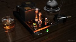
A couple thoughts from me really because I like your work. Some of the reflections on that black thing in the rear right could use more detail. The ice cubes seem to be refracting kind of weird. It seems like they should have a little more contrast at the top and pick up at least some indirect color. The cigarette cherry seems a bit dark compared to other bright things in the scene. It should at least be a little brighter where it turns red orange. The texture on the cigarette seems like it could use a little work, but it might be a pain in the ass. The wood texture could use a little work, possibly a bit of minor bump. I think your spec or reflective channel is washing it out a little in spots. I don't know if lightwave has a way of sampling blurry reflections. Right now the fringing seems a bit odd. I wish it had more GI or off camera reflections to break up the consistency of some of those black objects. There are a few spots where there should be at least a tiny bit of contact shadowing that could be accomplished with AO.
Overall I like it. Those are just speculative thoughts and you may not like any of them. Also I don't really know lightwave, so I'm pretty unfamiliar with the available shaders and how it samples. I feel like I'm writing a lot of critical stuff when I like the image itself. The only reason I'm not deleting that top part is in case you like some of the ideas.
Overall I like it. Those are just speculative thoughts and you may not like any of them. Also I don't really know lightwave, so I'm pretty unfamiliar with the available shaders and how it samples. I feel like I'm writing a lot of critical stuff when I like the image itself. The only reason I'm not deleting that top part is in case you like some of the ideas.
A couple thoughts from me really because I like your work. Some of the reflections on that black thing in the rear right could use more detail. The ice cubes seem to be refracting kind of weird. It seems like they should have a little more contrast at the top and pick up at least some indirect color. The cigarette cherry seems a bit dark compared to other bright things in the scene. It should at least be a little brighter where it turns red orange. The texture on the cigarette seems like it could use a little work, but it might be a pain in the ass. The wood texture could use a little work, possibly a bit of minor bump. I think your spec or reflective channel is washing it out a little in spots. I don't know if lightwave has a way of sampling blurry reflections. Right now the fringing seems a bit odd. I wish it had more GI or off camera reflections to break up the consistency of some of those black objects. There are a few spots where there should be at least a tiny bit of contact shadowing that could be accomplished with AO.
Overall I like it. Those are just speculative thoughts and you may not like any of them. Also I don't really know lightwave, so I'm pretty unfamiliar with the available shaders and how it samples. I feel like I'm writing a lot of critical stuff when I like the image itself. The only reason I'm not deleting that top part is in case you like some of the ideas.
All goof thoughts. I'll consider them. Thanks.
Dude, I wish I had half your talent.
Well thanks. Rendered at twice the resolution of high definition took my 3.06 gig 12 core with 24 gigs of ram took 11.5 hours to render. Mostly due to refraction in the glass, and ice cubes.
Last edited:
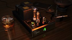
What do you think of this?
That's an enormous improvement. Again if it was me at this point, I would probably add a little attenuation to the lighting in the upper left. It might just be via extra off camera detail to break it up a bit. In the post phase I would probably add a little weight to the shadows on those metal flip switches as the shadowed portions feel a bit bright relative to other similar shadows. I really like the changes in composition. The warmed up portions on the ice cubes feel great. Cigarette feels more like it's lit. It's very nice work. Some of the accents on those nameplates also add a lot to it. I'm used to mental ray, so it's difficult to comment in a way that is relative to the tools you're using.
That's an enormous improvement. Again if it was me at this point, I would probably add a little attenuation to the lighting in the upper left. It might just be via extra off camera detail to break it up a bit. In the post phase I would probably add a little weight to the shadows on those metal flip switches as the shadowed portions feel a bit bright relative to other similar shadows. I really like the changes in composition. The warmed up portions on the ice cubes feel great. Cigarette feels more like it's lit. It's very nice work. Some of the accents on those nameplates also add a lot to it. I'm used to mental ray, so it's difficult to comment in a way that is relative to the tools you're using.
Thanks. Still tweaking it, but I do think it's coming along nicely.
The last pic you posted is such a huge improvement from when you first posted this scene. It's really coming along nicely.
Well thanks. Rendered at twice the resolution of high definition took my 3.06 gig 12 core with 24 gigs of ram took 11.5 hours to render. Mostly due to refraction in the glass, and ice cubes.
Oh man that render time jumps up. Are they using displacement maps or something? That's the only thing I can think of, trying to trace through displacement mapped geo.
Thanks. Still tweaking it, but I do think it's coming along nicely.
I would agree.
WOW I like very much.
The only thing that catches my eye is the cigarette has a little unreal quality - perhaps its the materiel?
The only thing that catches my eye is the cigarette has a little unreal quality - perhaps its the materiel?
WOW I like very much.
The only thing that catches my eye is the cigarette has a little unreal quality - perhaps its the materiel?
Think the render is amazing but agree with the above quote.. The cigarette looks very low quality compared to the rest of the image..
Think the render is amazing but agree with the above quote.. The cigarette looks very low quality compared to the rest of the image..
And what would you do t make it look more real? I have one lit right next to me, and it seems look about right. Not sure what to do with it.
The second rendering looks much better.
Some notes on the composition:
Some notes on the composition:
- It looks odd to have a notebook without a pencil
- The lower right corner and upper left corner are dead spaces which gives the impression that the table extends to infinity. (Might be improved if you provide a table edge at about the light area of wood in front of the green reflection.)
- The person working on this device is right-handed (based on the location of the ashtray), so it looks odd to have the glass on the left side. (They would need to lift the glass over the electronics and most people avoid that.)
- The ashtray needs a little in the middle.
- There appears to be no glow spilling from the two large tubes.
- For the cigarette, maybe a subtle paper-fibre bump map running down the length.
The second rendering looks much better.
Some notes on the composition:
- It looks odd to have a notebook without a pencil
If you look closely it's actually an owners manual. Many manuals of the day actually were spiral bound. Hence no need for a pencil.
- The lower right corner and upper left corner are dead spaces which gives the impression that the table extends to infinity. (Might be improved if you provide a table edge at about the light area of wood in front of the green reflection.)
Great idea. I like it!
- The person working on this device is right-handed (based on the location of the ashtray), so it looks odd to have the glass on the left side. (They would need to lift the glass over the electronics and most people avoid that.)
Understand. I have tried the in other locations, it just looks more pleasing where it is.
- The ashtray needs a little in the middle.
Ash? Perhaps.
- There appears to be no glow spilling from the two large tubes.
The two large tubes have the same amount of glow as the rest. One can certainly see it radiating off the top edge of the transformer behind it.
- For the cigarette, maybe a subtle paper-fibre bump map running down the length.
Agreed.
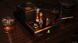
Yep the evil smoking stick looks much better to my eye now ")
Good job indeed (wish I had skills like yours)
Good job indeed (wish I had skills like yours)
Added desk drawers, and slight bump to cigarette.
I like it. Much better than the original scene. I'm a photographer who does some still life and the original bugged me because of the bright object in the upper right. It's all about the composition and you've cropped just about the right amount of non-subject supporting objects.
But have you considered brightening up the blacks a bit? However you do that in your program. I'm missing some detail in what is probably beautiful and interesting surfaces.
This is amazing work! Is this for your portfolio or is it client work?
This is for my portfolio. Thanks for the comments.
Register on MacRumors! This sidebar will go away, and you'll see fewer ads.