I mean just take a look at the header image. It is to the point, effective and not too much color or exaggeration is used in this article:
https://www.theverge.com/2019/11/25...ar&utm_medium=social&utm_source=meetedgar.com

I also think this basic Apple ad from back in the day represents great visual and graphic design concepts with its simplicity in motion:
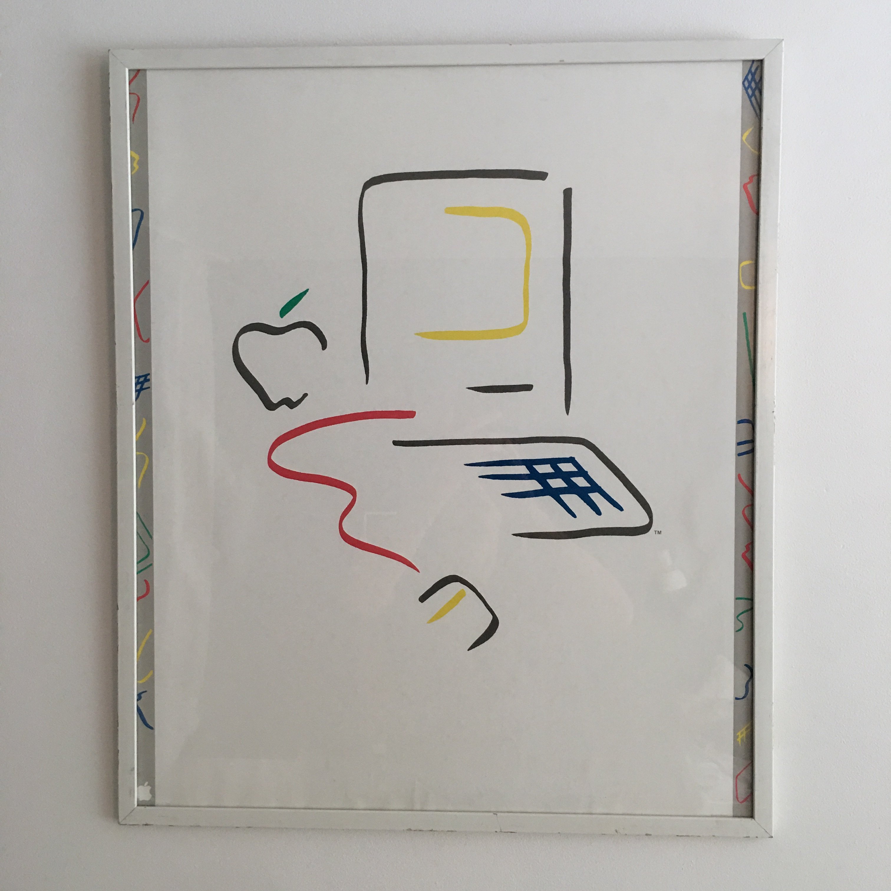
via:
https://forums.macrumors.com/threads/1984-macintosh-poster.2198746/?post=27831448#post-27831448
I mean this is good design. The **** popular now with the metoo and SJW generation seems to be these over the top weird illustrations of people with fat legs and big shoes laying down sideways.
I mean this is the **** popular now for some reason or that gathers all the money for graphic designrs and media page views?

https://www.theverge.com/2019/11/25...ar&utm_medium=social&utm_source=meetedgar.com
I also think this basic Apple ad from back in the day represents great visual and graphic design concepts with its simplicity in motion:
via:
https://forums.macrumors.com/threads/1984-macintosh-poster.2198746/?post=27831448#post-27831448
I mean this is good design. The **** popular now with the metoo and SJW generation seems to be these over the top weird illustrations of people with fat legs and big shoes laying down sideways.
I mean this is the **** popular now for some reason or that gathers all the money for graphic designrs and media page views?