Become a MacRumors Supporter for $50/year with no ads, ability to filter front page stories, and private forums.

leonremi

macrumors regular
Original poster
May 12, 2017
105
188
OK i tried.

First time ever i downgrade.

The control center is a complete piece of ****, pseudo flexibility kills usability and speed, and the icons are small to the point of being illegible.

The colored icons , the large icons are all hideous in the general interface.

Photos app is even (much much) worse than before.

This looks like a five year's old tried to ape Android with their crayon.
 
What icons are you having issues with? I know you can resize some of them.

Edit: This is assuming you were referring to buttons, if you meant the little glyphs then I can understand what you're getting at.
 
OK i tried.

First time ever i downgrade.

The control center is a complete piece of ****, pseudo flexibility kills usability and speed, and the icons are small to the point of being illegible.

The colored icons , the large icons are all hideous in the general interface.

Photos app is even (much much) worse than before.

This looks like a five year's old tried to ape Android with their crayon.

Will be useful if you posted all of the feedback IDs that you no doubt submitted as part of running the beta software.
 
OK i tried.

First time ever i downgrade.

The control center is a complete piece of ****, pseudo flexibility kills usability and speed, and the icons are small to the point of being illegible.

The colored icons , the large icons are all hideous in the general interface.

Photos app is even (much much) worse than before.

This looks like a five year's old tried to ape Android with their crayon.
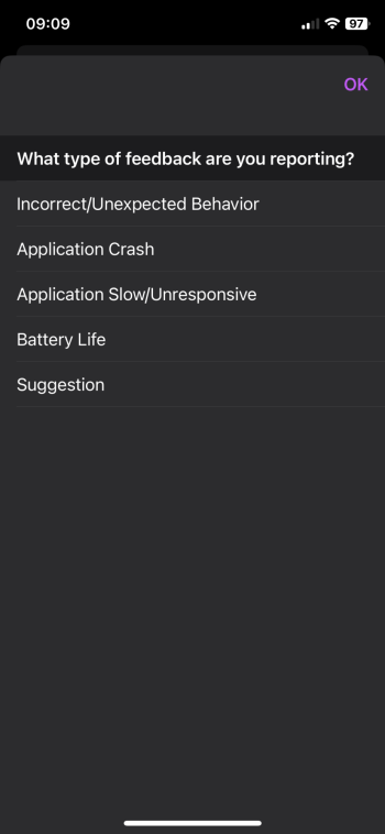
Settings > General > Transfer or Reset iPad > Erase All Content and Settings
 
What icons are you having issues with? I know you can resize some of them.

Edit: This is assuming you were referring to buttons, if you meant the little glyphs then I can understand what you're getting at.
I assume you are referring to the control center.
Yes the little glyphs. Plus the exaggerated roundness of it all makes them seem even smaller.

More fundamentally, multiple pages in the control center is idiotic, it should be an efficient place, where I reach and act.
Who the eff is going to remember what’s on 3rd page of the control center?

And I especially dislike the « second page » with the data and communication stuff (WiFi and such). Each time I want to get out of the control center, I get first kicked into this useless page.
 
Last edited:

Attachments

  • IMG_4778.png
    IMG_4778.png
    112.3 KB · Views: 41
I assume you are referring to the control center.
Yes the little glyphs. Plus the exaggerated roundness of it all makes them seem even smaller.

More fundamentally, multiple pages in the control center is idiotic, it should be an efficient place, where I reach and act.
Who the eff is going to remember what’s on 3rd page of the control center?

And I especially dislike the « second page » with the data and communication stuff (WiFi and such). Each time I want to get out of the control center, I get first kicked into this useless page.

Like you, I prefer the Control Center to be as efficient as possible, so I just deleted the second and third page and customised the first (favourites) to my liking, still with some positions to fill. You can also turn those “small round glyphs” into a pill-shaped or large square ones, depending on how many you intend to use. Basically, try customising it some more.
 
  • Like
Reactions: Jada34
Control Center: love how customizable it is. Deleted all pages (except the first) and now my CC looks just like iOS 17 CC except icons are now exactly where I want them to be. UX is now much better.

Large app icons look really cool after looking at them for a week. Now I can't imagine going back to small app icons.

Dark mode app icons look amazing. Once all app icons get updated, home screen will look great at night.

Photos app is probably my fav app now. Love how customizable it is. I've customized it exactly to my liking, and now it's probably the most efficient and cleanest app on home screen. I open the app, and I immediately have access to the grid, albums, favorites, media types, and utilities (in this exact order). Exactly what I need. All the other fluff is gone.
 
More fundamentally, multiple pages in the control center is idiotic, it should be an efficient place, where I reach and act.
Who the eff is going to remember what’s on 3rd page of the control center?
So don’t put anything there? It’s customizable. You can have the layout almost exactly as it was in iOS 17.
 
  • Like
Reactions: Jada34
I assume you are referring to the control center.
Yes the little glyphs. Plus the exaggerated roundness of it all makes them seem even smaller.

More fundamentally, multiple pages in the control center is idiotic, it should be an efficient place, where I reach and act.
Who the eff is going to remember what’s on 3rd page of the control center?

And I especially dislike the « second page » with the data and communication stuff (WiFi and such). Each time I want to get out of the control center, I get first kicked into this useless page.

The best thing about the new CC is that you can move things and change it to suite your needs. Don't need connectivity toggles? Delete them. Don't need multiple pages? Delete them. Want a bigger media player? Embiggen it.

You can make it as efficient for you and your needs as you want it to be.
 
Register on MacRumors! This sidebar will go away, and you'll see fewer ads.