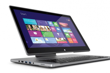
it would be nice to know who did it first, out of curiosity.
if Apple were to do somrthing similar for the MacBooks, I can see them bringing it further down near the base, possibly near the bottom edge of the screen, still raised above the keyboard section, and possibly having the keyboard/touch section sliding out towards the user.
The Apple hinge is the full width of the Ipad Pro, it is entirely possible that the MacBook design would be as well. It would have advantages in terms of durability and stability, at the tisk of being clunkier looking possibly.
It's actually... Asus by a longshot! This monster came into this world in 2013. I'm surprised too, though that helps explain some of the design missteps.
What I struggle with is envisioning what a wide hinge would look like in aluminum. The iMac has already defined the look for a narrower hinge, and I think it's safe to say ASUS took a few design cues there. In terms of function, though, a wide hinge certainly does everything you would want it to do.
No, they have not. What they have done is used the same split hinge.
The huge difference is that there's not only vastly increased bulk at the back, there's also zero wrist rest at the front, nor is there a usabke touch pad.
Hard pass from myself also.
You responded to me saying "we agree this is the same concept for the hinge" with "no, what they did is use the same hinge." I know people tend to skim these threads but you are staking out a hard stance against a position no one has actually taken.
Anyway, the wrist rest and touch pad aren't a problem with the hinge design, and are problems that are easily fixed. The touchpad goes at the bottom of the base where it is supposed to go.
Instead of having the screen rest in the middle of the machine, I would have it go between two positions:
- Resting on the edge of the base, so it looks sort of like the angle ⦟ on a raised drafting table. This would be the default touch position.
- Upright, raised slightly from the keyboard (think iMac). You would have three axes of maneuverability to set the screen to a position of your liking.
This really only leaves the issue of the increased bulk at the back. A lot of that bulk is clearly unnecessary. How much is hard to say, but I think we can improve on ASUS' 2013 design.
It's an ugly child, but that hinge design does not demand an ugly notebook.


