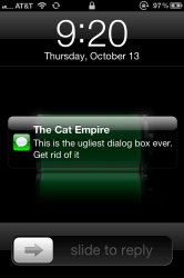
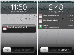
What's the deal with this ugly black dialog bubble? The blue-ish one was perfect.
The problems:
- Everything is left justified
- The tiny icon doesn't have enough space around it (it's too close to the edge and too close to the text)
- The bubble is BLACK with a harsh white highlight on top of it (looks cheesy)
- On a black background (like the battery background) it almost disappears because black on black looks bad (especially with the white reflection on top)
- Slide to read the message looks tacky as well.
I wish that no bubble appeared on the lock screen and only showed up in list view (like when there's more than one message). That's a much more elegant design.
What do you guys think? It just doesn't match anything else the iPhone has.


