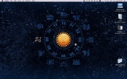
This is the kind of thing Apple should have used for Leopard's space theme. Looks much better on the desktop than their default wallpaper.
And this clock is active, not a static image. That would be a nice visual twist, instead of reflective dock and transparent menu bar.
And this clock is active, not a static image. That would be a nice visual twist, instead of reflective dock and transparent menu bar.


