Become a MacRumors Supporter for $50/year with no ads, ability to filter front page stories, and private forums.

jamdr

macrumors 6502a
Original poster
Jul 20, 2003
659
0
Bay Area
In my spare time I'm an artist in a few traditional mediums (i.e. stuff you can touch) and I'm not really used to doing artistic work on the computer. However, I want to create a website to document some of my thoughts and new projects I'm working on, and I want to "brand" it. I'm not really ready to start a company at this point, but that's my eventual goal once I've got some stuff to show.

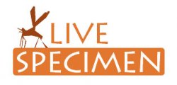
I came up with the title of my site, Specimen, because that seems to be a theme in a lot of my work--examining one thing that represents a whole group. Keep in mind this isn't a design service or any other type of service, just a brand to show all my work under. Anyway, I'd like to hear any input you have about the font, colors, size, or idea in general. Thanks a lot for your time!

logoyj3.png
 
I like the colors and the font. I am a bit confused as to what the blob thing is... is it a snail? a praying mathis? a roach? a blob?
If you're trying to create more of a blob thing, get rid of the bottom (jaws thing) and will look more modern. If you're trying to go for some animal form, accentuate it. If it's supposed to be ambiguous, then it's good. I mean it.
 
The "blob" is suppose to be a kind of ambiguous fossil-looking thing but maybe I made it bit too ambiguous :eek: Too be honest, it looked better at a larger size and then I scaled it down and got this--maybe I can tweak it a bit more. I wish I had a tablet at a time like this...

I'm not offended Max Payne, but do you think you could offer up a font you like better, instead? I'm definitely open to changing the font as long as it's free or already installed on my computer :D
 
That blob kinda looks like a flea to me... what about amber with a bug in it as a more clear icon? Just a suggestion. Like the font and color.:)
 
That blob kinda looks like a flea to me... what about a amethyst with a bug in it as a more clear icon? Just a suggestion. Like the font and color.:)

Ha. My thoughts exactly, I to thought it was a flea. Something in amber might look cool however, Or just something a bit more fossil llooking. I like your color scheme which Amber might fit, And i am fine with the font.

Overall nice job.

:)
 
With those colors I think you need to give the graphic a little more definition, otherwise it may be mistaken for a sample of fecal matter... or maybe my mind is just "in that zone" because a friend was very excited tonight because she gets to work with poop in lab next week (mmmm, makes me glad I'm not a lab technician!)
 
Stool Specimen?

Change the name. Specimen immediately makes me think of bodily fluids and doctors. The colour makes me then think of excrement. Then you have added a brown blob which can be seen as more excrement (or a flea). So far you are doing VERY badly. Also the typeface is not a great choice. Really it mostly comes down to personal preference on this but again your choice isnt the best. Try and choose a more simple typeface with 'cleaner' edges.

Rotis Sans Serif is what I have in mind.

Try http://www.logolibrary.co.uk to try and get some ideas going.
 
Alright thanks for the feedback everyone! I have a thing for fleas so the original picture was indeed based on a flea, but I can see that nobody else really liked that idea :cool:.

I have another version of it but it's still definitely a work in progress because there are a number of things I'm not happy with. But I'll show you all what I'm working on anyway so I can get more feedback :). Here are the changes I focused on:

  • For one thing, I changed the name. Once I read Macboobs' post about a specimen of poop, that's all I could think of when I looked at my logo. So I changed the name to Live Specimen, which is a more interesting concept anyhow, and hopefully loses the association with feces.
  • From the name change and srf4real's suggestion, I came up with the idea of depicting a bug breaking out of a piece of amber to show a live specimen. I think that's a pretty cool image, but it's also kinda hard to draw it in the style I'm going for. I'm not really satisfied with the state it's in now, but I like the direction it's going in, I think. It may be too busy with the amber but I really don't want to get rid of it!
  • I haven't changed the font for now. I just haven't gotten to it and I sorta like what I have now. I'm definitely open to more suggestions in this area though.

Without further ado, here's the new version:

logowq0.png
 
Much improved. I don't see poo anymore.

Maybe a little more color variety in the wings of the insect that could be mirrored in the "live" portion of the text? Also, double back to make sure it looks good in black+white, just in case you ever want to create a company, it'll need to look good coming from a fax/copier.
 
I'm not a huge fan of anything you've done with this logo.

But you seem intent on this font/style/concept, so I'm only recomendation is to play with the kerning on the letters a bit.
 
I really like the logo idea. :)
The main problem I find with it, though, is the cutout effect and possibly the refinement of the shapes.
The idea is fine but the colours look a little weird.

Maybe you could try using the shapes as a transparency mask and colouring it in, for example?
 
Getting there, but I'd lose the rock. Unless you can nail it, it will can look like a blob, or a potato or worse :)

I don't mind the insect, but it needs refining.

And can you give us some more typefaces? We need different options, not just one. Often ideas from various designs can be combined.
 
Alright here's a variation on the font, which I actually like better. I'm still working on the rock because I really want to keep it! As far as "refining" the mosquito image, I don't know what that really means. The blocky, somewhat abstracted look is intentional and it reflects the style of my art.

logov2nc0.png
 
Register on MacRumors! This sidebar will go away, and you'll see fewer ads.