Last edited:
Got a tip for us?
Let us know
Become a MacRumors Supporter for $50/year with no ads, ability to filter front page stories, and private forums.
To be Translucent, or not to be?
- Thread starter swindlenz
- Start date
- Sort by reaction score
You are using an out of date browser. It may not display this or other websites correctly.
You should upgrade or use an alternative browser.
You should upgrade or use an alternative browser.
I prefer the translucency, doesn't really affect the readability of the menu and it looks nicer IMO.
I do prefer the translucency, though I can see why people would turn it off. It does makes it a tad more readable without it - especially the dividing lines between each 'set' of options in the menu.
Generally I don't agree with the translucency. Never liked the transparent menu bar. Don't know what purpose the translucency serves. It Makes a mess of Vista and Win 7 and adds visual clutter to the GUI. I can't see any reason why I should like it in OS X.
Yes there is an argument from the designers at Apple that translucency serves to indicate to the user their location in an app in context to content scrolled up the page but in any ways it looks horrid to counter any advantage this gives. I have seen it at play in Xcode in the Navigator pane. It looks like somebody is punching holes in the interface and with the translucent menu bar everything looks like it is blending into each other, a great way to reduce the distinction between apps and windows.
Unfortunately, in the shots above, the un-translucent version looks a bit flat. I would go for the non dark version, CLI the Dock to dark mode, and then kill the goofy Finder Icon and re-instate his more reserved and clever brother.
I'm really in a great mood tonight. Been on Windows all day.
Is it possible to keep the menu translucent but kill it in windows? Basically, like Mavericks.
Probably with a plugin for whatever controls the menubar but not stock.
I'm still kind of torn between the two, I've been switching back and forth, but I think I like it non-translucent better (with dark mode at least). I think it will probably depend on which background I'm using for me.
I love the frosted glass effect. It gives me a nice feeling like sitting on my patio next to the beach and enjoying a nice cold drink.
Hi,
I am actually having an issue with translucency all together.
I upgraded from DP2 to DP3 looking forward to use Dark Mode. However, when I toggle On/Off Translucency it isn't translucent. The setting does not change even if I reset.
Now when I try to use Dark Mode I have it in the ugly non translucent dark mode. I have asked around the issue but I have no idea how to fix it.
Thanks
Last edited:
I upgraded from DP3 to DP4 looking forward to use Dark Mode.
There is no DP4 yet...
There is no DP4 yet...
I fixed the post. Although, it is pretty clear what my issue is.
I know there are sever thread with regards to screen shots and dark mode, but I feel if this was a post it would just get buried.
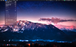
I'm curious to see what the general consensus is to using the Translucent menu bar option. I almost prefer it off...
[url=http://i.imgur.com/lIYAria.png]Image[/URL]
[url=http://i.imgur.com/69WlQ5R.png]Image[/URL]
I just have to say your desktop picture + Dark Mode looks awesome!
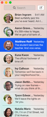
Does this truly add dimension?
This, from Apple:
"Translucency adds more dimension emphasis on your content translucent sidebar lets you see whats hidden "
So a quick show of hands, please, people.
Which of the following do you see?
This, from Apple:
"Translucency adds more dimension emphasis on your content translucent sidebar lets you see whats hidden "
So a quick show of hands, please, people.
Which of the following do you see?
- Ceramic dinnerware
- an unnecessarily messy background to the text content.
Attachments
I really like the translucent backgrounds, however I have a few issues
1. Any translucent light dropdown menu looks too grey in my opinion, I'd like it to be whiter
2. The dark statusbar and dock look pretty nice, but the contrast between them and the finder windows being so bright is not so nice.
3. I absolutely hate the way my taskbar icons look in dark mode (see pic attached.) I mean, they're completely fine in light mode, but look stupid in dark. I don't know what the OS does for the ones that do turn from black to white, but it's clearly not doing it for all.
Attachments
Use in the dark: is there awareness of f.lux software?
Without the flippancy of my previous question this one is, to people who sometimes use a Mac in relatively dark environments.
f.lux
automatically makes the color of your computer's display adapt to the time of day, warm at night and like sunlight during the day.
Are you familiar with the software and if so, for work in a dark environment, would you prefer:
I discovered f.lux around fifteen months ago. IMHO it's great idea, smartly implemented.
This post is not a suggestion that Apple should implement f.lux functionality (it's patent pending). Rather, I'm curious about the perceived effectiveness of Apple's dark mode in dark environments.
Without the flippancy of my previous question this one is, to people who sometimes use a Mac in relatively dark environments.
f.lux
automatically makes the color of your computer's display adapt to the time of day, warm at night and like sunlight during the day.
Are you familiar with the software and if so, for work in a dark environment, would you prefer:
- dark mode in build 14A298i of Yosemite
- f.lux without Apple's dark mode
- some combination of the two?
I discovered f.lux around fifteen months ago. IMHO it's great idea, smartly implemented.
This post is not a suggestion that Apple should implement f.lux functionality (it's patent pending). Rather, I'm curious about the perceived effectiveness of Apple's dark mode in dark environments.
I've been using f.lux for a couple of years now, on all my computers and on my iPads (with jailbreak). F.lux is absolutely great, it reduces the strain when working at night.
As for the OS's dark mode, I see it more as a pleasing aesthetic change than an actual workplace utility, as the areas affected by dark mode are minimal, so all my sadari/chrome/finder windows are still way bright.
----------
More importantly do you have a direct link to that gorgeous wallpaper? It looks amazing with Yosemite.
If you mean mine, here you go: wallpaper
This, from Apple:
"Translucency adds more dimension emphasis on your content translucent sidebar lets you see whats hidden "
So a quick show of hands, please, people.
Which of the following do you see?
- Ceramic dinnerware
- an unnecessarily messy background to the text content.
I see what you mean! I especially think it's a bad direction to go in the translucent direction - which Microsoft by the way is going away from with Win8... But with that said, I think Apple takes better advantage of it, than Microsoft did

Translucency now you see it, now you don't
And on the day before Yosemite was released, Mr Benn left his house at 52 Festive Road, intending to buy the classic Coupe ceramic dinnerware that translucency had presented to him whilst spying on a conversation between Matthew Reiff and his family about orange sunsets, whale spouts and a condor.
Mr Benn arrived at the costume shop. As if by magic, on 16th October 2014 the colourful fancy-dress shopkeeper appeared. He tried it on. But where previously he had seen a screenshot of translucency, there now appeared as if by magic a single horizontal line.
What a lovely cartoon that was.
Mr Benn was a lovely cartoon too.
This, from Apple:
"Translucency adds more dimension emphasis on your content translucent sidebar lets you see whats hidden "

Which of the following do you see?
- Ceramic dinnerware
- an unnecessarily messy background to the text content.
And on the day before Yosemite was released, Mr Benn left his house at 52 Festive Road, intending to buy the classic Coupe ceramic dinnerware that translucency had presented to him whilst spying on a conversation between Matthew Reiff and his family about orange sunsets, whale spouts and a condor.
Mr Benn arrived at the costume shop. As if by magic, on 16th October 2014 the colourful fancy-dress shopkeeper appeared. He tried it on. But where previously he had seen a screenshot of translucency, there now appeared as if by magic a single horizontal line.
What a lovely cartoon that was.
Mr Benn was a lovely cartoon too.
Register on MacRumors! This sidebar will go away, and you'll see fewer ads.


