I posted about a 2019 iMac (refurb) I bought at the beginning of July. Out of the box, the display had really noticeable white uniformity issues, the top left corner was a burnt orange/pink which looked muddy, dark and low-contrast and the bottom right corner was very cool and blue/green, with the rest of the screen a gradient between the two.
I took it into a (platinum) AASP and they completely replaced the display. Unfortunately, the new display is just as bad, if not worse, though instead of left to right the pink/green thing goes top to bottom, with a muddy dark pink band in the middle right at eye level and a really obnoxious bright cool green spot in the bottom.
I do graphic design so I’m sensitive to this kind of thing but my partner is able to clearly see this too.
The screen looks good when watching videos or viewing full-screen colour images but anything with a grey or white background (so, most of the Internet), looks really awful. It is not just completely unusable for any graphics work but it’s also really unpleasant to look at in the course of normal, “consumer”-type activities, like browsing the web.
I have AppleCare+ and spent an hour on the phone with an Apple Support supervisor who was quite unhelpful and basically told me to take it back in again. This time I was able to get a Genius Bar appointment at an Apple Store so I’ll be taking it in in a few days, however I’m starting to lose hope that this will get resolved.
Additionally, the AASP scratched the front of the housing while doing the display swap, which is not ideal in case I decide to resell the thing. Which I’m starting to think about as I’m now way outside the return window.
To be honest I’m kind of shocked at how awful these two displays are. They’re not just “kind of bad.” They’re really, truly awful. My expectations aren’t set by professional level reference monitors or by some abstract ideal, only by 20 years of working on Macs with Apple displays. My previous iMac was a 2011 21.5 and the display on that thing, while far from perfectly uniform, is way, way better than this new one.
Did I really just get super unlucky twice in a row or is this what things are like these days? Is there a chance the third one will be better?
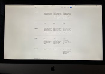
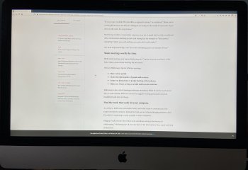
Attached images are of the second, replacement screen. What these pictures can’t convey is how jarring it is to scan content over a white background with drastic tonal and brightness shifts.
I took it into a (platinum) AASP and they completely replaced the display. Unfortunately, the new display is just as bad, if not worse, though instead of left to right the pink/green thing goes top to bottom, with a muddy dark pink band in the middle right at eye level and a really obnoxious bright cool green spot in the bottom.
I do graphic design so I’m sensitive to this kind of thing but my partner is able to clearly see this too.
The screen looks good when watching videos or viewing full-screen colour images but anything with a grey or white background (so, most of the Internet), looks really awful. It is not just completely unusable for any graphics work but it’s also really unpleasant to look at in the course of normal, “consumer”-type activities, like browsing the web.
I have AppleCare+ and spent an hour on the phone with an Apple Support supervisor who was quite unhelpful and basically told me to take it back in again. This time I was able to get a Genius Bar appointment at an Apple Store so I’ll be taking it in in a few days, however I’m starting to lose hope that this will get resolved.
Additionally, the AASP scratched the front of the housing while doing the display swap, which is not ideal in case I decide to resell the thing. Which I’m starting to think about as I’m now way outside the return window.
To be honest I’m kind of shocked at how awful these two displays are. They’re not just “kind of bad.” They’re really, truly awful. My expectations aren’t set by professional level reference monitors or by some abstract ideal, only by 20 years of working on Macs with Apple displays. My previous iMac was a 2011 21.5 and the display on that thing, while far from perfectly uniform, is way, way better than this new one.
Did I really just get super unlucky twice in a row or is this what things are like these days? Is there a chance the third one will be better?
Attached images are of the second, replacement screen. What these pictures can’t convey is how jarring it is to scan content over a white background with drastic tonal and brightness shifts.