Sans, serif or display? What new or existing elements does it have to work with? Show us what you have so far.
This is a concept (and nothing more) that I came up with a few weeks ago. After drawing it out on paper I had to see what it would look like digital. I recognize that it's not easily reproduced across a variety of mediums. Just had to get it out of my system so I could work on the next concept.
http://pxls2prnt.com/concept2.4.png
I think what you want to do here is go with a typeface that is more geometric, and also something relatively light in weight. Something like Century Gothic or Futura, maybe.
To me, a heavier typeface would begin to feel a little cheap. Open up the tracking between the letters and see if that tickles your fancy.
Personally, I like Arno Pro for this application. I think if you mixed it with a nice, classy, open san-serif, it may have potential.
I've been working with Arno Pro, and played around with a lot of other typefaces, but I'd agree with you, lighter is better.
Adobe Caslon, HF&J Verlag, HF&J Mercury, HF&J Sentinal or HK&J Topaz would be the best options IMHO.
Hoefler-Frere & Jones
To really showcase quality and style for an established company you will need to pay top dollar for a quality font otherwise it will look cheap, you need to buy a classic fontpack thus the suggestions they will look awesome 20years + from the time you've designed it.
Trust me on this, you can use a free or cheap font but it will date very quickly and never look right.
Oh, I trust you! It'll be near impossible to convince my boss to pay for a new typeface (or two). I've been using Adobe Caslon for nearly all our print work that we've been doing the past couple years, but the more I see it and use it, the more I feel that it's "old." It's the typeface that I used on our billboards. If you are interested in seeing that, it's the first couple images at
http://pxls2prnt.com under the "PRINT" section (I hope this isn't breaking forum policy).
Logo then typeface. Otherwise it's like picking your furniture before the house is built.
What if the primary focus is to have a wordmark? There has been recent talk to have something just set in text.
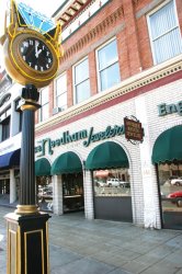
Anyway, I want to avoid the cliché diamond in the logo. A lot of our customers know us by our long time slogan, "Middle of the block, at the sign of the clock" because of our old street clock. I'm still playing around with some concepts using the street clock in the logo, but even that is pretty hard as the clock is quite busy. Anyway, this is where I am at.
*Also, the current logo is an early '90s redesign of VERY similar logo that was designed and used from 1929 to 1939. The one that you can see on the front of the building in the image below (The Jetsons/Star Trek looking logo) was put up in the late '60searly '70s. They want to remodel the front of the building in the next year or so and want something ready to go up (and will also fit more horizontally than vertically). And there is your condensed history lesson of our logo.

") A wordmark is another thing entirely. If you're in a hurry, you could base it off an existing type face - but to make something memorable, you still need to come up with a solid concept and possibly a custom type face if you go the that route.
A wordmark is another thing entirely. If you're in a hurry, you could base it off an existing type face - but to make something memorable, you still need to come up with a solid concept and possibly a custom type face if you go the that route.