Hi.
Aside from putting rounded windows corners on a rectangular screen (with no rounded corners), I feel like Apple doesn't properly test their UI changes.
Example:
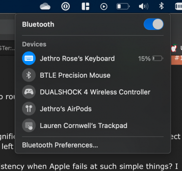
In the Bluetooth and Wifi menus from the menu bar, the mouse travel has significantly increased to toggle Bluetooth or select a different Wifi network. Also, the menus open to different directions - to the left or the right, which is inconsistent.
What's the point moving macOS and iOS closer together for the sake of consistency when Apple fails at such simple things? I guess If I wanted to, I could find a lot more of these examples.


Your thoughts?
BR
Aside from putting rounded windows corners on a rectangular screen (with no rounded corners), I feel like Apple doesn't properly test their UI changes.
Example:
In the Bluetooth and Wifi menus from the menu bar, the mouse travel has significantly increased to toggle Bluetooth or select a different Wifi network. Also, the menus open to different directions - to the left or the right, which is inconsistent.
What's the point moving macOS and iOS closer together for the sake of consistency when Apple fails at such simple things? I guess If I wanted to, I could find a lot more of these examples.
Your thoughts?
BR


