Hello designer folks,
I am working with a client that sells shaving products and have come up with a update to the shaving soap labels as he will soon have 4 products and i have suggested that having 4 black labels with the same colour of text would be really difficult to tell apart at a glance.
Now i know little about design being a programmer other than basic typography, layout, and colour theory from college.
(They seem to think programmers need to know this stuff so i often get lumbered with design jobs)
I am looking for suggestions on how to better the design, my main aim was to get the dominant colour of the main ingredient to represent the label. The images on the label are from google and only for illustration i am going to take some photos then trace them to create a similar effect but higher res or vectored and of course with no copyright issues.
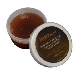
So without further ado here is the existing label

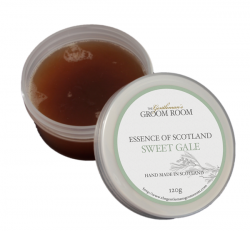
Here is my proposed update

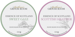
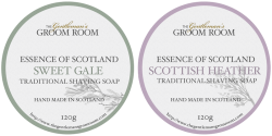
And here is 2 more labels.

Note: I know i need to work out the colours for print and am going to order a water proof sticker for a proof print to get the colours right on paper. And the texture will be removed it is just to show the paper effect.
I am working with a client that sells shaving products and have come up with a update to the shaving soap labels as he will soon have 4 products and i have suggested that having 4 black labels with the same colour of text would be really difficult to tell apart at a glance.
Now i know little about design being a programmer other than basic typography, layout, and colour theory from college.
(They seem to think programmers need to know this stuff so i often get lumbered with design jobs)
I am looking for suggestions on how to better the design, my main aim was to get the dominant colour of the main ingredient to represent the label. The images on the label are from google and only for illustration i am going to take some photos then trace them to create a similar effect but higher res or vectored and of course with no copyright issues.
So without further ado here is the existing label
Here is my proposed update
And here is 2 more labels.
Note: I know i need to work out the colours for print and am going to order a water proof sticker for a proof print to get the colours right on paper. And the texture will be removed it is just to show the paper effect.


