Become a MacRumors Supporter for $50/year with no ads, ability to filter front page stories, and private forums.

Jay43

macrumors member
Original poster
Sep 16, 2015
56
10
Hi guys,

I have upgraded my CMBP from Mavericks to El capitan yesterday and after a full day at work, I've found out some things that really bothers me (except the fact that I find it similar to the fake OS you see in movies)

1) Something about the font makes El Cap really tiring for my eyes. Even with font smoothing and transparency disabled.

2) The green button resizes most of the windows in full screen instead of adapting the size of the window to the screen

3) Spotlight is in the middle of the screen which makes it impossible to perform a search while comparing the results to something on the screen

I also have some bugs with preview but that's another story. I've thought about going back to Mavericks but I'll have the same problems next year when Mavericks' support will end and that I'll be forced to upgrade my OS

Have you found some workarounds for those who encountered the same problems as me ?


Thanks for your help

Jay
 

randomgeeza

macrumors 6502a
Aug 12, 2014
624
460
United Kingdom
1) You will get used to it, or try turning brightness down.
2) Hold alt and the older green button behaviour is back.
3) Spotlight window can be moved and sized to your own preference.

Hope that helps.
 

Jay43

macrumors member
Original poster
Sep 16, 2015
56
10
1) You will get used to it, or try turning brightness down.
2) Hold alt and the older green button behaviour is back.
3) Spotlight window can be moved and sized to your own preference.

Hope that helps.

Wow thanks, the idea of moving the spotlight search window never came across my mind o_O

I hope I'll get used to the font and the overall look of the OS.
 

F1Mac

macrumors 65816
Feb 26, 2014
1,283
1,604
1) You will get used to it, or try turning brightness down.

After a small hiccup I reinstalled Mavericks on my 1,1 - just in case. El Cap works just fine but I have to admit, even after one year on Yosemite and now El Cap, these damn fonts are difficult to get used to and as mentioned by OP, they are indeed tiring, helvetica or san fransisco it doesn't matter. And the fact that for some stupid reason they chose to have them dark grey instead of black. When I boot into Mavericks the system font feels just right (I'm not on retina), and the UI takes much less resources. Yes, 10.11 is performing really well in that regard, it's "smooth", but it comes at a cost.
 
Last edited by a moderator:

F1Mac

macrumors 65816
Feb 26, 2014
1,283
1,604
Wow thanks, the idea of moving the spotlight search window never came across my mind o_O

If you had upgraded to Yosemite first, no matter how many times it would have crossed your mind, you couldn't move it, it's one of El Cap new features... ;)
 

Ebenezum

macrumors 6502a
Mar 31, 2015
782
260
1) You can change font back to Lucida Grande with a tool made by schreiberstein

I am considering moving back to Mavericks because 10.10 or 10.11 offer very little benefits for my needs...
 

F1Mac

macrumors 65816
Feb 26, 2014
1,283
1,604
1) You can change font back to Lucida Grande with a tool made by schreiberstein

I've tried it but didn't find it very effective, it still looks different and thinner than Mavericks.

I am considering moving back to Mavericks because 10.10 or 10.11 offer very little benefits for my needs...

On the same boat... Although I really like to keep my system "current" but like you I've realized I'm not using the 10.10 or 10.11 specific features. I have mutliple monitors, Split View, to name one, is totally irrelevant for me.
 

KALLT

macrumors 603
Sep 23, 2008
5,380
3,415
Legibility won’t get better after a while, it just is how it is. As for the green button, I noticed the broken functionality of the zoom behaviour as well. Pretty frustrating. They might as well get rid of it entirely.
 

Shirasaki

macrumors P6
May 16, 2015
16,263
11,764
Well, another potential San fransicso font hater.
1. I admit there is some sort of readability issues against new font, but this is too subjective.

2. Oh, this does reminds me a thread discussing about the green button behaviour. My opinion is still the same: the green button behaviour is still unpredictable. And Apple must find a way to make it clearer.

3. Spotlight window now can be moved around. A new feature in El Capitan.
 

sibcc

macrumors member
Oct 5, 2015
66
35
La Jolla CA
Hi guys,

I have upgraded my CMBP from Mavericks to El capitan yesterday and after a full day at work, I've found out some things that really bothers me (except the fact that I find it similar to the fake OS you see in movies)

1) Something about the font makes El Cap really tiring for my eyes. Even with font smoothing and transparency disabled.

The primary reason I became excited about EC was to get rid of the hideous Helvetica Neue. I tried the Lucida Grande switch on Yosemite, but was disappointed in the results. The SF font is marginally better but still lacks legibility. Sadly, OS X does not have a system to increase the size of fonts without decreasing resolution. Both Linux and Windows have such utility built in to the UI.

2) The green button resizes most of the windows in full screen instead of adapting the size of the window to the screen

Option key and click green. What it does is dependent on the view you currently have in the finder window. A toggle to get back the old behavior would be ideal; however, this is Apple.

3) Spotlight is in the middle of the screen which makes it impossible to perform a search while comparing the results to something on the screen

I never understood the love for Spotlight, but it is nice that it can now be moved.
 
Last edited:

Jay43

macrumors member
Original poster
Sep 16, 2015
56
10
Thanks for your replies guys.

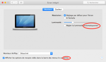
I've installed the Lucida Grande tool but it's still not as legible as in Mavericks and it still makes my eyes really tired. There are also some letters missing with the tool as you can see on the attachment (it misses the final letters of the circled words) but that might be related to the fact that my OS is set-up to French.


I will give it a few days more but I'm really considering going back to Mavericks as El cap just brings a few useless features along with a look that I don't really like. I'll face the same problem next year when Apple stop to support Mavericks though
 

Attachments

  • Sans titre.png
    Sans titre.png
    73.8 KB · Views: 223
  • Like
Reactions: vista980622

vista980622

macrumors 6502
Aug 2, 2012
369
178
Thanks for your replies guys.

I've installed the Lucida Grande tool but it's still not as legible as in Mavericks and it still makes my eyes really tired. There are also some letters missing with the tool as you can see on the attachment (it misses the final letters of the circled words) but that might be related to the fact that my OS is set-up to French.


I will give it a few days more but I'm really considering going back to Mavericks as El cap just brings a few useless features along with a look that I don't really like. I'll face the same problem next year when Apple stop to support Mavericks though

Sadly, it appears Apple is no longer supplying security updates for anything system wise except El Capitan.
 
Last edited:
  • Like
Reactions: Kevenly

vista980622

macrumors 6502
Aug 2, 2012
369
178
Thanks for your replies guys.

I've installed the Lucida Grande tool but it's still not as legible as in Mavericks and it still makes my eyes really tired. There are also some letters missing with the tool as you can see on the attachment (it misses the final letters of the circled words) but that might be related to the fact that my OS is set-up to French.


I will give it a few days more but I'm really considering going back to Mavericks as El cap just brings a few useless features along with a look that I don't really like. I'll face the same problem next year when Apple stop to support Mavericks though

I'm the co developer of Lucidagrandeelcapitan, Kenny.

Apple has changed their underlying sub-pixel rendering algorithms in Yosemite and El Capitan. They have also adjusted color darkness to be far lighter for any non-Chinese/Japanese fonts. So if you speak any of those two languages, changing language to those darkens and thickens the font. Turning on "Increase Contrast" in Accessibility settings would help a bit in apps like Finder, but also renders the overall UI more clunky. A recalibrated ColorSync profile would also help a bit.

Font clipping issues are related to individual application window's nib files, and can not be genrrally fixed. They can theoretically be fixed on a case-by-case basis, but that would require a tremendous amount of effort in addition to understanding of all 26 languages. The fix would also blow up Lucidagrandeelcapitan's file size, which is not desirable.

The fact is Yosemite and El Capitan's user interface are not designed with @1x display panels in mind. These issues are more or less migrated in newer @2x Retina displays. Unfortunately, most people would take shinier, more saturated colors in design, and "cleaner" typefaces over usability and legibility within a heartbeat.

Lastly, tell Apple what you think.
http://www.apple.com/feedback
 
Last edited:

Jay43

macrumors member
Original poster
Sep 16, 2015
56
10
I'm the co developer of Lucidagrandeelcapitan, Kenny.

Apple has changed their underlying sub-pixel rendering algorithms in Yosemite and El Capitan. They have also adjusted color darkness to be far lighter for any non-Chinese/Japanese fonts. So if you speak any of those two languages, changing language to those darkens and thickens the font. Turning on "Increase Contrast" in Accessibility settings would help a bit in apps like Finder, but also renders the overall UI more clunky. A recalibrated ColorSync profile would also help a bit.

Font clipping issues are related to individual application window's nib files, and can not be genrrally fixed. They can theoretically be fixed on a case-by-case basis, but that would require a troupe does effort and understanding in all 26 languages. The fix would also blow up Lucidagrandeelcapitan's file size, which is not desirable.

The fact is Yosemite and El Capitan's user interface are not designed with @1x display panels in mind. These issues are more or less migrated in newer @2x Retina displays. Unfortunately, most people would take shinier, more saturated colors in design, and "cleaner" typefaces over usability and legibility within a heartbeat.

Lastly, tell Apple what you think.
http://www.apple.com/feedback

Thank you for your work to develop the app and for your explanations.

I have already sent a feedback to Apple suggesting to let the user choose between the old and the new font.
There are little chance that they'll listen but if enough people complain I guess they could listen eventually.
Like when they disabled the possibility to set the iPhone on 2g with Ios 7. Ios 8.1 finally brought that feature back
 
Register on MacRumors! This sidebar will go away, and you'll see fewer ads.