Become a MacRumors Supporter for $50/year with no ads, ability to filter front page stories, and private forums.

p0intblank

macrumors 68030
Original poster
Sep 20, 2005
2,548
2
New Jersey
I'm having the hardest time understanding spot colors, for whatever reason. I'm well versed in the world of graphic design, but I have always had trouble with spot colors. I know how to apply them as solids, but how would I go about prepping spot colors for a printing company when using a gradient? They need the file in the correct format along with the values.

Please see the included graphic (ignore the bad color profiling; quick export job). I've searched and read all around Google, but I can't find one definitive article that explains everything clearly. Any help is much appreciated. Thanks!

am_logo.jpg
 
Where's the spot?

What I see is solid red with a black (multiply) overprint. I guess the black plate could be a PMS maroon or burgundy but it still appears to be a 2-color image.

There are several ways to use spot colors within graphics software. QuarkXPress, InDesign, and Illustrator are more straightforward -- just add a spot (Pantone) color and assign it to an object. For a gradient, make certain the object is set to multiply (or "overprint" in FreeHand). What apps are you working with?

The graphic you're seeing has a very subtle gradient, so it's kind of difficult to see. It's a dark red moving up into a slightly lighter red. Anyway, the graphic was designed in Photoshop, but I need it brought over into Illustrator while retaining the correct spot colors.

The printing company is requesting the colors, so I am using the PANTONE values from the gradient itself. However this does not appear to be enough to work with. I rarely print anything, so this is somewhat new to me. If I do print something, it's usually more straightforward than this.

I've tried recreating the graphic within Illustrator itself, but when I try to use two PANTONE colors (same as spot colors?) on each end, Illustrator displays a gradient that appears kind of off; as if there is a washed out color in the middle. This is not the case in Photoshop, however.

Sorry for the rambling. What is your best suggestion? I appreciate your help!
 
Sample file

The graphic you're seeing has a very subtle gradient, so it's kind of difficult to see.

I see it.

It's a dark red moving up into a slightly lighter red. Anyway, the graphic was designed in Photoshop, but I need it brought over into Illustrator while retaining the correct spot colors.

You want to use 2 reds. That's what I was fishing for.

I've tried recreating the graphic within Illustrator itself, but when I try to use two PANTONE colors (same as spot colors?)...

Yes, for simplification, PANTONE is a spot color system.

...on each end, Illustrator displays a gradient that appears kind of off; as if there is a washed out color in the middle.

Thats because a solid red square must be behind the gradient and the gradient square must be set to multiply in the Transparency palette.

Sorry for the rambling. What is your best suggestion? I appreciate your help!

You're not rambling -- quite lucid in fact.

Attached is a sample Illustrator file with notes. It may not be the same PANTONE colors or font but demonstrates what you're attempting to achieve is possible within Illustrator. Each element is on a separate layer just so you can examine the construction. In reality the whole thing can be on a single layer grouped together.

CAVEAT: When preparing art in this manner make certain you do not place the logo within another CMYK document or you'll wind up with 2 additional plates (6-color job).
 

Attachments

  • spotcolors.png
    spotcolors.png
    23.1 KB · Views: 515
  • spotcolors.ai.zip
    1,015.4 KB · Views: 273
The graphic you're seeing has a very subtle gradient, so it's kind of difficult to see. It's a dark red moving up into a slightly lighter red. Anyway, the graphic was designed in Photoshop, but I need it brought over into Illustrator while retaining the correct spot colors.

The printing company is requesting the colors, so I am using the PANTONE values from the gradient itself. However this does not appear to be enough to work with. I rarely print anything, so this is somewhat new to me. If I do print something, it's usually more straightforward than this.

I've tried recreating the graphic within Illustrator itself, but when I try to use two PANTONE colors (same as spot colors?) on each end, Illustrator displays a gradient that appears kind of off; as if there is a washed out color in the middle. This is not the case in Photoshop, however.

Sorry for the rambling. What is your best suggestion? I appreciate your help!


Do you have whatever it is that is printing as a spot color saved as a spot channel and saved out as a DCS 2.0 file?
 
Screen angles

After a bit more sleep, it occurred to me I should caution you about screen angles. I may use a few terms that require definition. I'll embolden the ones defined in the Graphic Arts Glossary on my website or you can Google them.

To prevent an undesirable moire pattern using CMYK inks for standard offset printing process, each plate is angled enough so the tiny dots do not land on top of each other. When color separations are printed to high-end devices, the proper angles are automatically applied.

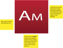
Option 1: All spot colors generally default to the same angle. When preparing a 2-color job, remind the person printing the job to manually set the optimum screen angles for the spot colors.

Option 2: What I do sometimes to avoid screen angle problems for spot color jobs is prepare a proofing file like the one previously uploaded. After achieving personal satisfaction and client approval, I prepare a different one for the printer -- swapping the spot colors for two CMYK colors. Screens are then properly angled automatically by the RIP (raster image processor). The pressman is instructed to use the cyan plate to print spot color 1 and the magenta plate for spot color 2.

There are advantages to preparing the file either way. Likely the logo is not printed by itself but in context to other elements on the page. How those other elements are prepared dictates the best production method.

"jecapaga" previously mentioned saving DCS (desktop color separation) files from Photoshop. It is an EPS file containing raster images (and a composite preview) that can optionally retain manually applied screen angles. Though it is a possible solution, the art you shared lends itself to vector graphic preparation. The problem with hardwired screen angles is that each RIP uses what the manufacturer feels are optimum angles. So each person that prints the file in the future will require a different DCS file to match his equipment. Likely, as already mentioned, this logo is being placed on a page with other elements. It would defeat the purpose to specify angles for one imported element if those colors are used elsewhere on the page.
 
Thanks for the help, everyone! I really appreciate all the details. Fortunately the lady at the printing company got everything working in Illustrator. I guess Photoshop and Illustrator handle gradients differently? I wasn't aware that I had to set the gradient to Multiply to achieve the effect I was going for. Photoshop usually handles it in one shot, at least through my typical workflow.

Anyway I really have to sit down and learn about spot colors. Your explanation is great, Kwill. Again, thank you!
 
Register on MacRumors! This sidebar will go away, and you'll see fewer ads.