Become a MacRumors Supporter for $50/year with no ads, ability to filter front page stories, and private forums.

Leareth

macrumors 68000
Original poster
Nov 11, 2004
1,569
6
Vancouver
Does anyone else think this logo sucks?
Why choose an inuit symbol for games that are held nowhere near the inuit area?
This area of Canada is so rich in native and local symbols... why use something that represents less than 1% of the country
To me the logo looks like a pacman goalie, I generally like simple, elegant design but this is just stupid for olympic games
OK enough of my rant
what do the rest of you think...
 

Attachments

  • vancouver2010.jpg
    vancouver2010.jpg
    13.6 KB · Views: 1,543

Lacero

macrumors 604
Jan 20, 2005
6,637
3
Winter Olympics in Whistler. I tried volunteering for the Winter games, but the waiting list was way too long.
 

mcmav37

macrumors 6502
Dec 30, 2004
306
0
Ann Arbor, MI
Nermal said:
I thought the Olympics were every 4 years, which would mean either 2008 or 2012 :confused:

Yes, they are every 4 years, but a while back they started staggering the summer and winter games. So... the summer games just happened in 2004, but it has been since 2002 that we had winter games. Therefore, the next winter games will be 2006 and 2010.
 

Leareth

macrumors 68000
Original poster
Nov 11, 2004
1,569
6
Vancouver
I voted against the games in the plebiscite
the RAV line fiasco is really ticking me off
and all those venues will be useless after the games
and the cost to the public is not worth it.
 

wordmunger

macrumors 603
Sep 3, 2003
5,124
3
North Carolina
I don't mind the logo. They're always a little dorky, and this one is a little less so. I wonder if it will be worth the bother (and expense) to go up there for the games.
 

vouder17

macrumors 6502a
Apr 30, 2003
828
4
Home
pseudobrit said:
Torino's mascots are quite possibly the dumbest thing I've ever seen.

e_mascotte.jpg


Wow is that little blue guy relaxing his "urinate" muscles...or is that just a clever little melting puddle of ice :eek: :eek:
 

StarbucksSam

macrumors 65816
Nov 21, 2004
1,433
5
Washington, D.C.
I don't know the symbolic meaning of it but I think it's kind of cool looking - hehe.


Umm, Vancouver! Yay. I love that city. Maybe I'll actually attend the Olympics. oooh plan. Um, only five years to go! Haha.
 

mkrishnan

Moderator emeritus
Jan 9, 2004
29,776
15
Grand Rapids, MI, USA
Leareth said:
Why choose an inuit symbol for games that are held nowhere near the inuit area?

Recognizing that this is an Inuit symbol (because you told me so ;)), it does still also remind me of the kind of totems you see in BC, like the ones that are at the First People's Exhibit at Royal BC.

Dunno, sorry to not be more supportive. I personally think its cute (as long as it doesn't offend any First People!). But I guess too that, especially as Vancouver goes through transitions involving its changing cultural demographics, and Canada celebrates its rich modern history, this could be frustrating to you. Perhaps it would be nice if they could have picked a logo which shares the common nobility of all Canadian peoples instead of showcasing one group.
 

Les Kern

macrumors 68040
Apr 26, 2002
3,063
76
Alabama
mkrishnan said:
Recognizing that this is an Inuit symbol (because you told me so ;)), it does still also remind me of the kind of totems you see in BC....

Inuit? I thought it was Springfield.
 

Mr. Anderson

Moderator emeritus
Nov 1, 2001
22,568
7
VA
pseudobrit said:
Torino's mascots are quite possibly the dumbest thing I've ever seen.

e_mascotte.jpg

what's with the "smack"? is it because they're that annoying you want to smack them?

D
 

mkrishnan

Moderator emeritus
Jan 9, 2004
29,776
15
Grand Rapids, MI, USA
Mr. Anderson said:
what's with the "smack"? is it because they're that annoying you want to smack them?

D

Hope it's not a Heroin reference! We're still recovering from 4/20! :eek: :D

I have to admit though, that while Neve and Gliz are a little annoying, Aster is kinda cute. :)
 

iGav

macrumors G3
Mar 9, 2002
9,025
1
Leareth said:
Does anyone else think this logo sucks?
Why choose an inuit symbol for games that are held nowhere near the inuit area?
This area of Canada is so rich in native and local symbols... why use something that represents less than 1% of the country
To me the logo looks like a pacman goalie, I generally like simple, elegant design but this is just stupid for olympic games
OK enough of my rant
what do the rest of you think...

very 1980's... :p

if you think that's bad, you've obviously not seen the London 2012 logo then. :eek: :eek: :rolleyes: see the grass isn't always greener :p :p :p
 

CanadaRAM

macrumors G5
Leareth said:
Does anyone else think this logo sucks?
Why choose an inuit symbol for games that are held nowhere near the inuit area?
This area of Canada is so rich in native and local symbols... why use something that represents less than 1% of the country
To me the logo looks like a pacman goalie, I generally like simple, elegant design but this is just stupid for olympic games
OK enough of my rant
what do the rest of you think...
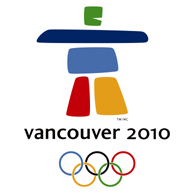
I dunno, at least I recognized it right away as an inukshuk which I feel is a powerful and positive image.

"Inukshuk (singular), meaning "likeness of a person" in Inuktitut (the Inuit language) is a stone figure made by the Inuit. The plural is inuksuit. The Inuit make inuksuit in different forms and for different purposes: to show directions to travellers, to warn of impending danger, to mark a place of respect, or to act as helpers in the hunting of caribou."

"Inukshuit in themselves are the product of cooperation. The hands and efforts of an entire group were required to build these massive stone sculptures. They are the result of a consensus of purpose, of focused action by a group united in its goal and labor. The inukshuk reminds us that as good as our individual efforts may be, together we can do even greater things."

It's a Canadian games, not just a Vancouver or BC games so I don't think it's inappropriate to choose an Arctic rather than a West Coast icon.

Better than yet another orca or polar bear.

Although it brings back some vague memories of childhood stories about stone giants or trolls :p
 

killuminati

macrumors 68020
Dec 6, 2004
2,404
0
OMG, I hope they change it before the olympics.

That is so hideous its embarrasing. I can understand if the games were up in Iqaluit but this Vancouver. A totem pole would have made more sense!

Even this is a nicer logo.
logo_vancouver_2010a.gif
 

wdlove

macrumors P6
Oct 20, 2002
16,568
0
I think that the London 2012 looks nice. The Vancouver 2010 seems to be a representation of something in Vancouver history, reminds me of a totem pole type of design. Both of the logo are trying to use the five colors of the Olympic rings. As others have mentioned it may be a matter of getting used to the design.
 

Leareth

macrumors 68000
Original poster
Nov 11, 2004
1,569
6
Vancouver
The NYC 2012 logo is just cool
its olympic while showing a recognizable part of NY
that is why we have host CITIES not countries...

For the Vancouver logo I would rather they used a Haida carving for the logo not some rock sculture not found anywhere near where the games are being hosted, Vancouver/Whistler is so beautiful, there are so many things that could have been used to represent it.
Anyone who has driven on the Sea to Sky highway knows what I mean

remember this is the logo not the mascot...
as a mascot...OK
as the logo, nope...
 
Register on MacRumors! This sidebar will go away, and you'll see fewer ads.