Hey Ya'll. I'm a student at the good old Florida State University, and am majoring in Graphic Design. I thought I was going to major in something different all my life, until first semester, when I switched to Graphic Design. Anyways, I don't know all that much, I haven't even taken field specific classes yet. Anyways, I was practicing a bit, and decided to make a logo. Is there anyway you guys could give me some ideas, and help me through it. I've recently picked up a book on Typography and have fallen in love with it. Any help would be appreciated.
Got a tip for us?
Let us know
Become a MacRumors Supporter for $50/year with no ads, ability to filter front page stories, and private forums.
Virgin Student Critique
- Thread starter Emulsion
- Start date
- Sort by reaction score
You are using an out of date browser. It may not display this or other websites correctly.
You should upgrade or use an alternative browser.
You should upgrade or use an alternative browser.
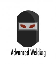
From what I've always read and seen, i think thats got more colors than I think it needs. But I may be wrong, I'm not a pro at this. Still curious.
start off by doing it in basic black and white in illustrator, then worry about the effects in photoshop. You said you were in love with a typography book, well why dont you take that inspiration and design your own font or logo treatment. you can experiment by manipulating existing typefaces. Also, think about what your logo is intended for. I think what you have now will not work if you make it small, the "Advanced Welding" will get lost.
start off by doing it in basic black and white in illustrator, then worry about the effects in photoshop. You said you were in love with a typography book, well why dont you take that inspiration and design your own font or logo treatment. you can experiment by manipulating existing typefaces. Also, think about what your logo is intended for. I think what you have now will not work if you make it small, the "Advanced Welding" will get lost.
You've got a point.
I think I'll try and make some type of "AW" logo.
Thanks.
---
I haven't gotten illustrator yet unfortunately.
I just might make my own font. I tend to right all of my sticky notes on my monitor in a certain font I like that I might try out.
Hey Ya'll. I'm a student at the good old Florida State University, and am majoring in Graphic Design. I thought I was going to major in something different all my life, until first semester, when I switched to Graphic Design. Anyways, I don't know all that much, I haven't even taken field specific classes yet. Anyways, I was practicing a bit, and decided to make a logo. Is there anyway you guys could give me some ideas, and help me through it. I've recently picked up a book on Typography and have fallen in love with it. Any help would be appreciated.
Don't think the red for eyes in the welders mask works...makes me think that the person has not slept or is drunk! (lol)
AW might work, but first think of what is involved with welding besides the protective mask. There are gloves, a torch, etc.
Don't think the red for eyes in the welders mask works...makes me think that the person has not slept or is drunk! (lol)
AW might work, but first think of what is involved with welding besides the protective mask. There are gloves, a torch, etc.
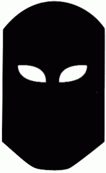
... and no eyes at all.
Made me think of a sci-fi movie until I saw the name. I think its the eyes.
Definitively the eyes. Very distracting.
or what about there not being an icon at all, but more of a type logo like someone said above. I'm envisioning the type somehow being "welded" together. Or maybe it's just the "AW" as an icon, and they are welded together somehow. Could be really simple either way, and look really classy. I don't know, just some ideas.
-je
-je
just sketch some ideas on paper. You don't have to go directly from the computer. I find I get my best ideas when I'm not directly focusing on the project. Step back from it, it will still be in the back of your mind, then do some sketches and see if you can get something going.


Loose the evil eyes. It's advanced welding, not advanced executing.
It's also too clean for a welding logo. It needs to be simpler, yet more powerful at the same time. You chose the welding mask to use, which I like, but you have to use it in the proper fashion. It's a great symbol for instant response. People see it and will want to look, but make sure when they look they're not so captivated with the mask or eyes to actually care what the logo stands for.
The mask needs to be rougher. The type position is fine, but the type should be something rather slim I say.
Definitely refine it, because it's a good logo to work on, you can really do something with it.
Register on MacRumors! This sidebar will go away, and you'll see fewer ads.