Become a MacRumors Supporter for $50/year with no ads, ability to filter front page stories, and private forums.

Silly John Fatty

macrumors 68000
Original poster
Nov 6, 2012
1,806
514
I have the latest gen iPad Pro 12,9 and the latest iPad OS, and I absolutely can't stand that what is (+) and (-) in portrait mode, becomes (-) and (+) in landscape mode.

I understand the idea behind it: In landscape mode, the right (usually the (-) button) is suddenly at the right, and Apple wants that to become to (+) button.

But it is so anti-intuitive for me and I wish I could revert it back to how it was.

*sigh*. Every Apple purchase, every Apple update, anything that has to do with Apple is WORK. We consumers WORK for this company! Sadly as someone who has studied Marketing Management, I can tell you this is a very well known strategy found in every school book to tie customers to you. Apple wants you to get involved in their product, no matter in what way. But it is extremely annoying, and as far as I am concerned, I am more mad than ever before at this company (I've been an Apple user for 25 years).

So I did some research and there used to be an option to revert this back, but it's no longer there. Making customers mad is also a strategy by the way. It may sound counterintuitive, but everything that moves emotions (be they good or bad) is a popular attachment strategy (see news papers for example).

Has anyone figured out a way to make it always stay (+) and (-)?
 
  • Like
Reactions: winxmac and F27

chabig

macrumors G4
Sep 6, 2002
11,449
9,318
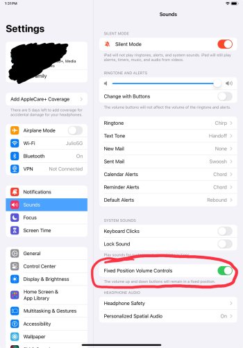
They didn't take away the option. It's still in Settings > Sound.


IMG_0446.jpg
 

FreakinEurekan

macrumors 604
Sep 8, 2011
6,546
3,422
Newer iPads don't have an option. "Volume Up" is always the top or right button, in whatever orientation you're using it. Took me a couple hours to get used to it, I don't even think about it any more.
 

Jim Lahey

macrumors 68030
Apr 8, 2014
2,743
5,681
They removed that option to lock the buttons because Apple. If you carry your iPad around the house listening to a podcast or something while enclosed in a folio, you literally have to guess which button does what by the time it comes to rest.

Unbelievable and yet totally believable. I sometimes wonder if anyone at Apple even uses their products.
 

Silly John Fatty

macrumors 68000
Original poster
Nov 6, 2012
1,806
514
This is so annoying. Apple will of course introduce this feature at some point and sell it as something new. They have nothing else to offer otherwise, when they release their next OS.

Introduce something, remove it and make people angry, re-introduce it and make them happy again, remove it again, etc.

That's playing with people's feelings. It' some well known business strategy. I really dislike Apple's philosophy.

Also this 6th gen iPad Pro is more clumsy and slower than my old 3rd generation iPad Pro.

Apple somehow manages to bring out products that are worse than the older ones. Same thing with my 13 mini. Slower than my OG SE.
 

Homme

macrumors 6502a
Jun 17, 2014
951
869
Sydney
This change happened during iPadOS 15 and the reasoning is to due to the Mini 6’s redesign since its volume buttons are positioned differently from every other iPad hence why Apple had this feature for every iPadOS 15 or later device
 

F27

macrumors regular
May 24, 2022
123
156
I also dislike this behaviour, so much that I’ve just stopped using the buttons on my Air 5 completely and just control the volume in control center. I’m used to buttons staying what they are supposed to be, much like it’s been since the dawn of time. Muscle memory is superior.

What’s more ridiculous is they give a simple software setting to turn it on or off on older iPad’s but not the newer ones, something that could so easily be offered but it’s not compatible with “Apple’s way of doing things”.
 

Silly John Fatty

macrumors 68000
Original poster
Nov 6, 2012
1,806
514
Muscle memory is superior.

Thank you! This is exactly the problem with this. I thought maybe Apple is trying to make their devices friendly for people who don't think (or better: feel) logically.

And the button has just disappeared so it can reappear as something new one day and sell us an update, when in reality the update will slow down our device and make us buy a new one!
 

WilliamG

macrumors G4
Mar 29, 2008
10,007
3,894
Seattle
I got so used to the change within seconds, but I can definitely understand the complaints about being forced into the change, with no option to revert on new iPads.
 
  • Like
Reactions: winxmac

curnalpanic

macrumors 6502a
Mar 26, 2008
517
668
go:teborg
I actually like it better the new way. It is akin to how the trackpad scroll direction went from "unnatural" to natural a long time ago.
 

Jim Lahey

macrumors 68030
Apr 8, 2014
2,743
5,681
I actually like it better the new way. It is akin to how the trackpad scroll direction went from "unnatural" to natural a long time ago.

But it was previously optional. They removed the option to lock the buttons. It’s so unfathomable that it may even be a bug. Wouldn’t be the first time Apple broke something and never fixed it 👎
 

Silly John Fatty

macrumors 68000
Original poster
Nov 6, 2012
1,806
514
What's annoying is I just got an iPhone 13 mini because it's the last small phone, and I plan to keep it for a while, and I'm getting mixed up between all these buttons now …
 
Register on MacRumors! This sidebar will go away, and you'll see fewer ads.