Become a MacRumors Supporter for $50/year with no ads, ability to filter front page stories, and private forums.

RJCP

macrumors 6502
Original poster
Jun 8, 2011
434
40
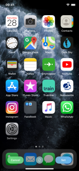
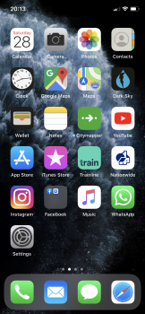
Hi guys! I know that this issue has been talked about since iOS 12, but I was wondering if anyone knew of a reason for the difference in colour saturation when you preview a wallpaper and what you actually get after you apply it.
It’s Not just the colour saturation on the wallpaper. It’s actually the icons as well.
I’m on an iPhone XS but this was there on my old iPhone X as well.
screenshots attached. You can clearly see the difference in saturation between preview (first screenshot) and the real thing (second screenshot)
 

Attachments

  • 0AC25AC0-4915-4230-8070-740A0C6595F4.png
    0AC25AC0-4915-4230-8070-740A0C6595F4.png
    7.4 MB · Views: 162
  • 7B9896A5-8EC3-4D8F-A45D-CF1A11E2ADAE.png
    7B9896A5-8EC3-4D8F-A45D-CF1A11E2ADAE.png
    7.1 MB · Views: 153
It’s the other way around. It’s too saturated in the first screenshot which is not ideal because you won’t see when icons actually are designed to be saturated.
The «washed out» screenshot is normal.
 
I just posted that on the iOS 13.1.1 thread.
It happens when changing wallpapers only. Restart the phone and saturation goes back to normal.

But I really don’t know why this is happening. Several users reported that.

For me, just a quick reboot After changing wallpapers did the trick. See if that works for you.

Needless to say we shouldn’t have to reboot for anything to work properly 🙄.
 
Great now I can’t unsee this on my 11 Pro.... notification number badge in the home screen just isn’t as red compared to the preview when selecting a new wallpaper!

What’s the deal here? I’ve restarted and still no luck.
 
Register on MacRumors! This sidebar will go away, and you'll see fewer ads.