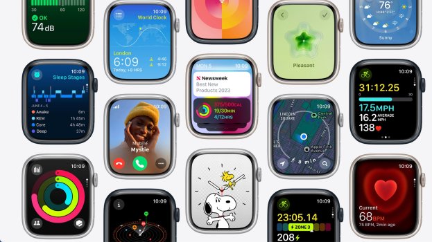
Is anyone else not liking some of the big changes across WatchOS 10? Namely:
- Info that used to all be on one page split across multiple pages (Activity App, Heart Rate)
- Tiny buttons (that sometimes don’t respond) to navigate to different pages that used to be a swipe (Weather, the – button when editing the Smart Stack)
- Long animations / transitions
- Colored gradient backgrounds that fit less content and are lower contrast / less glanceable than black
Seems apple is evolving the watch away from being quick and glanceable, from taking you away from your iPhone to just being another iPhone.
That said I am generally liking the Smart Stack, Control center mapped to the side button (missing the double-tap to go to the last app though), and Maps got a nice upgrade.


