Become a MacRumors Supporter for $50/year with no ads, ability to filter front page stories, and private forums.

ezekielrage_99

macrumors 68040
Original poster
Oct 12, 2005
3,336
19
Well it's that time of the year again where I have to redesign some broadcast weather graphics for the company I work for, but I'm a little stuck on ideas...

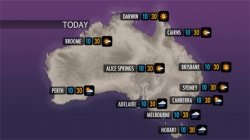
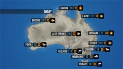
I am thinking of something less "satellite" more stylised, I have attached a very quick idea and was hoping to see if people like the direction I am going.

The basic concept for the moment it a charcoal map with purple or blue ocean and gem style icons. For the moment I haven't really settled on a font but I'm thinking of Futura, Delicicous or Pigiarniq.

Any feedback of what people like to see in weather graphics (it can be anything besides the nude one) would also be helpful and very much appreciated.
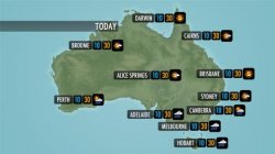
 

Attachments

  • weather_1.jpg
    weather_1.jpg
    17.7 KB · Views: 270
Aesthetically, I think it looks great. I love the colors and cleanness of the icons themselves (great job).

I would say, though, that the colors should be changed. I like them a lot, but for weather, the dark purple and grey always say "stormy" to me. Maybe try a blue/green or lighter white color for the land.

The icons look fantastic though!
 
i dont know if its important, but the graphic looks like a night time graphic with the colors you have for the background. I really like the design and the colors, im just not sure if your company wants it to look more day, and maybe use that for the night. I may be wrong, but you may want to consider it. Thanks
 
Hi, thanks for the replies. The graphics once live will be in 3D so I can simulate time of day, but for the moment the initial concept will be done in Photoshop.

I have chosen a darker colour for the sea and a charcoal map for 2 reasons:
1) Radar and satellite show up very well.
2) You tend to get better separation of map/information/min/max/

I'll have a little play around with it and put a few more ideas up soon.

Thanks :apple:
 
my amateur eye thinks the TODAY juts into the map a bit to much?

Perhaps pull it back to the edge by an inch?
 
I would tend to agree with fluidedge. I think the "TODAY" is a bit too far into the map, but not by much. Maybe have it hug the title safe? The project as a whole, though, is pretty gorgeous. I like the clear type and style of the graphics; great job! The only other thing I would change, as others have noted, is the purple. I think the darkness could even work if it were blue; the purple just looks a bit unnatural to me. You (the viewer) see blue, you know it's water. Keep the land the same tone, but that purple needs to go (in my opinion).
 
Personally I don't like it, maybe its the UK weather forecasts that I'm used to but your icons look tiny and the black boxes make the 'weather' look even smaller.

In the UK our forecasts are a lot simpler looking, its all very well going for style but you've got to be able to clearly read the info and I don't feel that yours works too well. Theres got to be a reason why weather forecasting hasn't changed a great deal in style over the years.

And what are the 2 sets of numbers for, I know one would be temp but whats the other?
 
And what are the 2 sets of numbers for, I know one would be temp but whats the other?

The numbers are minimum temperature and maximum temperature. Australia in general has far more variation in temperature so it's ideal to have the min and max in forecasting.

Also please remember this is a demo, it's not been framed correctly (locations are out of safe) and it's at 1/3 size it should be (the original is 1024x576).
 
The problem with it is the same thing that's been wrong with the British forecasts since they changed them in 2005: there's no immediate concept of what the weather will be like.

Just glancing at it, I don't know if it's day, night, December or July.

The main message at the moment is that it's a map of Australia. The main message should be where is it sunny, where is it raining?

The symbols should be the main message, not the map.

This was the older BBC system, with symbols. If you're going to use icons, this is probably the best example of how it should be done:
http://www.bbc.co.uk/weather/features/images/gr_david_weather_screen.jpg

It was replaced by this universally loathed version, which ditched the symbols and a great deal of the detail. A completely sunny day is brown. A completely cloudy day is a slightly darker brown. It's miserable and everyday looks like winter. Please don't start going down this route! http://upload.wikimedia.org/wikiped...005-.jpg/180px-BBC_Weather_Graphics_2005-.jpg

Yes I understand the problem with the BBC graphics, back in 2005 a NZ company called Metra won the contract for BBC. The contention with the system was never with the actual look because this was done by BBC creative, it was that BBC chose a non UK supplier for the graphics.

I deal with international weather graphics on a daily basis, from what I've seen the 2 best looks at the moment are Bloomberg's new international look with the isotherms and DWTV all I can say it that the light grey land with the dark (nearly black) ocean just works.

I totally agree with the dark graphics or eternal winter comment, but the graphics will be for a 24 hour 365 day show and the main concept was to do something completely different.

Also the graphics are 1/2 size which means they will darken up and you will loose detail on the icons.
 

Attachments

  • weather_2.jpg
    weather_2.jpg
    16.1 KB · Views: 107
  • weather_3.jpg
    weather_3.jpg
    20.3 KB · Views: 117
I like the light blue and green myself

the TODAY has pushed even further in though!!
 
Nice feel. There is a certain quality to it that is serene.
I think we have all had moments when we have watched the weather channel for too long......


Knowing that readability in this format is a little off... (as you have mentioned :) I am a little concerned about the clarity of the location names. Again, realising that most people seeing this would know the location anyway...... but it makes me squint. The same with temps. Max is okay, but min is hard to see. I think max works well because of the colour..

again..it could be the current format....but the location name and min. is a little cloudy and "mist" into the back ground. Keeping with your cool (min) hot (max) colours perhaps adding more blue etc in tone might work. The only other thing that may make them work in the current format, is a little more spacing, say 10 pixels/units or even a quarter of the exisiting space may bring the pureness of the colour scheme more clarity.

Sorry will take a breath :)

The only thing that does not work at all for me is the current format of "TODAY" tag, and its rectangular stripe. Maybe the stripe could be filleted corners at the RHS like the rest of the labels background, with a little more space to the top and bottom between the text and the stripes edge....

Ahh and tassie seems to be crunched at he bottom. Again perhaps a little more space between the bottom of the state and the frame.

Hope this helps. But as always, it is just my humble opinion.

But how amazing to work on a job like that........
"Hey mum, Ddid you see the weather for tomorrow, I did that..." LOL

ali
 
I still think the weather symbols should be the main feature.

How about something like this for an idea?

That looks great, I'm guessing you've used the NASA Blue Marble texture?

I really like the positioning of the min/max and weather icon, cool idea :cool:

In response to alicat, weather graphics is cool going home each night and checking the TV to see your weather graphics being displayed I still get a buzz out of it.

And again thank you for all of your input, when I get a more developed idea I'll post it. Cheers :apple:
 
That looks great, I'm guessing you've used the NASA Blue Marble texture?

I really like the positioning of the min/max and weather icon, cool idea

In response to alicat, weather graphics is cool going home each night and checking the TV to see your weather graphics being displayed I still get a buzz out of it.

And again thank you for all of your input, when I get a more developed idea I'll post it. Cheers

Glad it was some help. The symbols in the bottom right are crashing into each other a bit, but that's just a detail.

Yep, the original image is the NASA one with a green layer over the top set to multiply or darken. Can't remember which though now! :D

I figured people know where they are on the map, so they can easily see 'their' symbol at a glance. So I gave that more emphasis and the city names a little less.

All with a few drop shadows to give elements some depth.

Let us know how you get on! :cool:


All good comments from alicat too!
 
*small quiet voice from the back row* i still think the "today" protrudes way too far into the frame
 
Not a big fan of the black boxes surrounding the temperatures. It gets too distracting at a closer glance and I agree with maybe some sort of symbols being used outside of the black boxes.

It's too much otherwise.

Make it simplified and easier to read, because let's face it, it'll be on the screen so it needs to be as simple as possible. Remember, in graphic design, less is more.
 
Like it alot! I just think the Today it a little bit wierd, like it's in the wrong place..
 
Remember it's widescreen, so the edges won't appear on 4:3 TVs.

That's why the 'Today' looks a little too far in.

Not a big fan of the black boxes surrounding the temperatures. It gets too distracting at a closer glance and I agree with maybe some sort of symbols being used outside of the black boxes.

It's too much otherwise.

Fair comment. All stuff for ezekiel to take on board!
 
*small quiet voice from the back row* i still think the "today" protrudes way too far into the frame

I know but they are 16x9 graphics but titles need to be in 4x3 action safe. I would much prefer them to be moved however it means it wouldn't be visible on a 4x3 set...

And again thank you for the great posts people, they are of immense help to me and the design overhaul.
 
ah ok i've just realised that from a post above. I see what you're doing now.

I have to say of all the designs, i like the light blue sea, green land and the numbers on top of each other :)
 
Register on MacRumors! This sidebar will go away, and you'll see fewer ads.