Become a MacRumors Supporter for $50/year with no ads, ability to filter front page stories, and private forums.

razorianfly

macrumors 65816
Original poster
Oct 16, 2007
1,357
0
Cheshire, United Kingdom
Hi Guys,

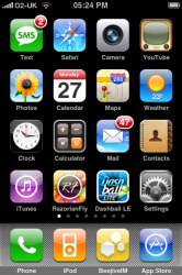
Something a bit different from the norm. I recently re-designed a web clip icon (apple-touch-icon.png),
and wondered if I could have some professional critique.

As it's just used for bookmarking the blog, the drive to make it was just my love for designing. I was bored and thought, why not.
It's not meant to follow the design of the blog, I tried that and to me it looked a bit naff.

Anyway, any comments are greatly appreciated.
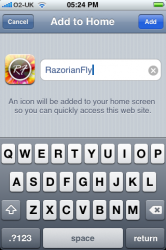
It's currently live, and if you'd like to try it out, the address is razorianfly.com.

[Update] - Attached original artwork to give you all a feel of the design decisions, etc. ;)

[Updatex2] - Switched out to original typeface.

Cheers,
R-Fly
 

Attachments

  • IMG_0045.PNG
    IMG_0045.PNG
    118.7 KB · Views: 95
  • IMG_0044.PNG
    IMG_0044.PNG
    106.2 KB · Views: 76
  • newwebclip.jpg
    newwebclip.jpg
    213.5 KB · Views: 72
It's brightly colored and uses several neat-o web/PS tricks, so it's very you. It also has nothing to do with your website's design, communicates nothing of what the website is or why someone would bookmark it, and it is sort of garish.

OTOH, maybe it's perfect. ;)
 
Personally, I would key colors to the actual Web site. The problem you are having with the icon is not that you need more colors. It's that you need a better logo.

The first thing many company owners erroneously think they need is a monogram logo. That might be fine if the company name is rather long, drab and forgettable (i.e. International Business Machines). Arbitrarily using initials can dilute an identity because there is bound to be more than one company with the same initials. Really, a symbol provides more opportunity to communicate a memorable message. There is great potential for a really cool symbol representing your blog.
 
Personally, I would key colors to the actual Web site. The problem you are having with the icon is not that you need more colors. It's that you need a better logo.

The first thing many company owners erroneously think they need is a monogram logo. That might be fine if the company name is rather long, drab and forgettable (i.e. International Business Machines). Arbitrarily using a initials can dilute an identify because there is bound to be more than one company with the same initials. Really, a symbol provides more opportunity to communicate a memorable message. There is great potential for a really cool symbol representing your blog.

Great advice, thank you!

It's brightly colored and uses several neat-o web/PS tricks, so it's very you. It also has nothing to do with your website's design, communicates nothing of what the website is or why someone would bookmark it, and it is sort of garish.

OTOH, maybe it's perfect. ;)

I realise it has nothing to do with the blog -- well, it kinda does now as I've switched out the original typeface used on our top header - but this was not the original intention.
The intention was to create an aesthetically pleasing icon/logo that people would want on their homescreen's ;)

Thanks for the advice anyway!

Greatly appreciated.
New version is now live.

Cheers,
R-Fly
 
Register on MacRumors! This sidebar will go away, and you'll see fewer ads.