it's a big improvement over what was there before, so well done on that count.
In the words of Henry David Thoreau however, ... Simplify, simplify, simplify.
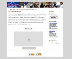
The logo is fugly. If redesigning it is not an option, at least get rid of the web address in the mountain pic, which will help clean it up a little. Move the tag-line "The Home of Quality Electric Supplies!" up and under the name
Get rid of the photo of the day - it serves no purpose and just complicates the site unnecessarily. There seem to be many elements like this on the site that you've included just because you could, rather than because the site needed them.
Concentrate on the basics - why have the business' customers come to the site, what do they want to know? Answer these questions first, and don't put things on the site that make it more difficult for them to find what they came there for (however nice they might seem as friendly "extras").
Not sure why you have sponsors on a commercial site.. more confusion. Google ads are passable, but the big Firefox logo is intrusive. Visitors don't need or want to be told what browser to use. It's up to you to build the site for whatever they want to use. If it doesn't work, it should be your problem, not theirs.
Lose the counter. Doesn't work with the design, is of no interest to your customers and if the numbers are low, can only serve as an embarrassment. If you need stats, get them from the server logs. Counters are a bad guide to visit numbers in any case.
Don't have a news pane unless there is regular news, and don't talk about what failed on the site (the forum) or what's coming up until you're ready to implement it.
Save your product Photo gallery pics for the product page and lose the gallery page altogether (esp. the flying beer!)
Include the About Us and Home links in with the rest of the nav pane. Two navigation sets is confusing (i didn't even see it first time through). The About Us page could include the store pictures from the gallery
Contact us could include the map and driving directions pages rather than them being separate, or they could be made into a separate Visit our Store page.
Lose the Links page - if it's meant to be a site map it should be called that, but the site isn't big enough, and shouldn't be complicated enough to need one.
The product line page has a totally different layout to the other pages..
Try and build one template page for the header, nav and footer, and keep that consistent across the site.
I hope all this is not overly harsh... like I said, you've improved it a great deal over the original, a bit more work and it will be even better.
(and I hope you're out of the shelter now
")
)