First, some background on WebOS, in case you don't know:
1.) The home screen consists of a desktop with a row of icons on the bottom (with an application launcher).
3.) Apps launch and are kept as cards on the home screen, which can be re-arranged anyway the user wants.
2.) Apps have two states, full screen and card view. The card view is basically a zoomed-out version of the full app as it continues to run/update. The user can't directly interact with the app until they select it (and it becomes full screen).
What if the WebOS concept was used on the iPad with iPhone apps...
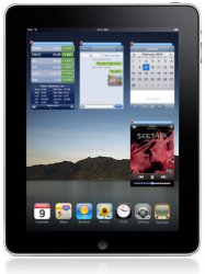
It would be way better and more functional then the crap we are going to get instead. Apps could have 3 different states: mini/widget, iPhone, and iPad (full screen).
The mini/widget sized would be about the size of panels when switching pages in Safari on the iPhone (see above). Basically they would just be zoomed-out versions of the app. Alternatively, mini apps could act as widgets and have some limited interaction such as iPod controls or stock/weather/IM alerts (see below). Dragging the blue bar above the mini would move the app around the home screen, while tapping the blue bar will expand the app to the iPhone size.
The normal iPhone app would run just as they will on the actual iPad. Instead of running against a black backdrop of nothingness, however, it would run on the home screen. Tapping the red X for any app on the home screen will close it.
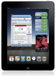
Finally, a tap on the blue bar for a standard sized app would launch it full screen. Pressing the home button would shrink all apps to mini sized.

Switching between apps would be as easy as tapping on another part of the screen! You could browse the web while keeping track of an IM conversation, monitoring your email inbox, or advancing tracks on the iPod. Running an app in full screen would be one tap on the screen and switching apps would be one tap of the home button. Sigh, one can dream...
1.) The home screen consists of a desktop with a row of icons on the bottom (with an application launcher).
3.) Apps launch and are kept as cards on the home screen, which can be re-arranged anyway the user wants.
2.) Apps have two states, full screen and card view. The card view is basically a zoomed-out version of the full app as it continues to run/update. The user can't directly interact with the app until they select it (and it becomes full screen).
What if the WebOS concept was used on the iPad with iPhone apps...

It would be way better and more functional then the crap we are going to get instead. Apps could have 3 different states: mini/widget, iPhone, and iPad (full screen).
The mini/widget sized would be about the size of panels when switching pages in Safari on the iPhone (see above). Basically they would just be zoomed-out versions of the app. Alternatively, mini apps could act as widgets and have some limited interaction such as iPod controls or stock/weather/IM alerts (see below). Dragging the blue bar above the mini would move the app around the home screen, while tapping the blue bar will expand the app to the iPhone size.
The normal iPhone app would run just as they will on the actual iPad. Instead of running against a black backdrop of nothingness, however, it would run on the home screen. Tapping the red X for any app on the home screen will close it.

Finally, a tap on the blue bar for a standard sized app would launch it full screen. Pressing the home button would shrink all apps to mini sized.

Switching between apps would be as easy as tapping on another part of the screen! You could browse the web while keeping track of an IM conversation, monitoring your email inbox, or advancing tracks on the iPod. Running an app in full screen would be one tap on the screen and switching apps would be one tap of the home button. Sigh, one can dream...

