Become a MacRumors Supporter for $50/year with no ads, ability to filter front page stories, and private forums.

johnathan.macle

macrumors member
Original poster
Jul 25, 2006
37
0
Hey, ok first off this is a highly political website, if you don't like it then please do not make stupid comments.

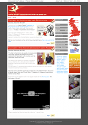
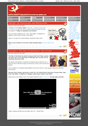
Now I was looking at a favored website of mine http://www.scottishcommunists.org.uk
And decided to have a go at designing a more, 21st century version.

I would love your comments on it, I did borrow heavily from Web Worker Daily, I also redesigned the Logo and Cleaned up the "Advert Space", tell me what you think about the design.

Thanks Johnny.
 

Attachments

  • SCWEBPAGE.png
    SCWEBPAGE.png
    484.6 KB · Views: 188
My main comments would be toward the readability of text.

- The lighter gray text is hard to read on my screen, it needs more contrast.
- The text in the very upper right (the dark red on medium red) also lacks contrast.
- The image off on the right about "The Communist Party ..." is hard to read. Red letters on red image, not a good idea.
- The light blue links under the navigation and in some other areas is also hard to read. Again, need more contrast.

Font types and styling look good and I like the layout of the page. Guess that's all i have to comment without being able to interact with the page. Nice job on it.
 
The colors and overall style is generally very well done. I think the right side is too busy with both a navigation bar and all those logos / banner ads / whatever they are. I'd either move one of the two to the left, or possibly move the navigation to the top (underneath the main red banner).
 
I would definitely get rid of the grey text, it is just to much and makes the site a real challenge to read. I'd also try to put a tiny bit of space between the three columns... or even better, move the middle navigation column to the top (and maybe put the archives on the bottom below the ads). As it is it the columns looks a little cluttered.

Aside from that it looks good. The colors (outside of the grey text) go well and the use of the logo works nicely.
 
Ok a couple new designs, any better?
 

Attachments

  • Web design 2.png
    Web design 2.png
    477.8 KB · Views: 126
Yeah, that is much better. I thought it would look better, but I didn't expect moving the navigation to have such a nice affect. You did a great job incorporating the archive into both spaces as well. It has a good flow to it. Nice work.
 
This design looks better. Nice job on the changes. Just one note, in the navigation the Search button is in all caps whereas the other button are done in small caps. This may have been purposeful, but wanted to mention it just in case.
 
This design looks better. Nice job on the changes. Just one note, in the navigation the Search button is in all caps whereas the other button are done in small caps. This may have been purposeful, but wanted to mention it just in case.

Whoops :eek:
 
Register on MacRumors! This sidebar will go away, and you'll see fewer ads.