Become a MacRumors Supporter for $50/year with no ads, ability to filter front page stories, and private forums.

bluetooth

macrumors 6502a
Original poster
May 1, 2007
662
1
Toronto
this is a website I am working on for a client. they are a french horn quartet and are looking for something "generic, hip, fearless, sharp & clean, modern, minimalist, black&white colors, greyscale".

Let me know your thoughts.

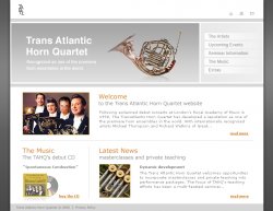
EDIT - don't mind the watermarks on the images they are just comps of stock photos for now.

thanks
 

Attachments

  • tahq_web.jpg
    tahq_web.jpg
    262.9 KB · Views: 311
I like it, simple and clean is always a good design.

Also is that a wordpress/rapidweaver theme because it looks very professional.


Nice work :cool:
 
For small business web sites rapidweaver/wordpress themes are great as a starting point, they are also fantastic for mock-ups and for an overall design for a big client to get a very look and feel from.
 
question...if i wanted to make a custom blog...what would be the best way?

I am by no means a web designer but i can fumble my way through Adobe golive. Wordpress?

I am currently using iweb to make one but it loads way too slow. I don't really want to go the blogger route either.


www.4porkchop.com is the current blog.
 
overall looks pretty nice. Personally I would maybe try a version with a splash of the orange/yellow/gold colour on the 'trans atlantic horn quartet' bit of the title - just for impact.

Also check your lines the right hand grey in the title is slightly taller (about 1-3 pixels I would guess). I'm not sure if its the save or not but the sub titles in the page look different colours as do the hyperlinks - might be worth checking they all match

thanks - good point, I may give the splash of colour in the title a go. :cool:
 
It's a nice design overall, but try contrasting your colors a bit more, and balance out the top white rectangle with the body of the design.
 
Register on MacRumors! This sidebar will go away, and you'll see fewer ads.