Become a MacRumors Supporter for $50/year with no ads, ability to filter front page stories, and private forums.

Laird Knox

macrumors 68000
Original poster
Jun 18, 2010
1,958
1,346
Weekly Photo Contest: 19-26 March - Nightlife

Welcome to this week's photo contest thread!


Theme: Nightlife

I believe this topic is open to a wide range of interpretations. Often the first thought that comes to mind is a club scene or party but what about the clerk in a convenience store or the people hanging around outside? Do you know where an alley cat prowls or a barn owl hunts? Once I submitted a shot of the police investigating an accident for a nightlife assignment in Night Photography class. Not the usual nightlife one thinks of in Las Vegas although the neon lights here could also fit the subject.

This topic can fit into many photographic styles so go for something outside the norm. It doesn't matter if you are a portrait, street, wildlife or architecture photographer, find something in the night that speaks to you.


Here's an easy one from the Cheap Trick concert a couple of weeks ago:

1BDS06Q


Contest ends: 26th March 2015


Rules:

1. Be creative and have fun.

2. Please submit only one photo per contest.

3. Please do not comment on photos until after the judging has taken place.

4. The contest runs for exactly one week, starting NOW! (see time/date stamp at the start of this thread)

5. At the end of the week, The judge (last week's winner) will choose a 1st, 2nd, and 3rd place photo, providing as much feedback as possible. (Judge has 24 hours to make decision)

6. The 1st place Winner will start a new thread with the topic/theme of their choice, and act as the Judge for that contest. (Winner has 48 hours to create new theme)
 
Last edited:

MacRy

macrumors 601
Apr 2, 2004
4,351
6,278
England
This is a cracking shot. I got one from South Bank last week looking over to where you appear to be from the Sea Crates hotel. Assume this is from station platform?


Beautiful colours mate.


Thanks. It's taken from Blackfriars Station through the glass sides.
 

tomnavratil

macrumors 6502a
Oct 2, 2013
876
1,588
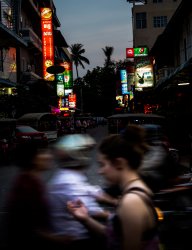
Busy nightlife in Phnom Penh

People passing by one of the busy side streets in Phnom Penh's riverside.
 

Attachments

  • nightlife.jpg
    nightlife.jpg
    2.1 MB · Views: 756

jkramerbob

macrumors regular
Sep 16, 2013
135
104
Indiana
Laird Knox.. You have set yourself up for a difficult judging endeavor! I think this week's contest has multiple "winners!"
 

Laird Knox

macrumors 68000
Original poster
Jun 18, 2010
1,958
1,346
Time is running out, get your pics in!

I will post the results this evening. I figure sitting at the gallery is a good place to look at photos. ;)
 

Laird Knox

macrumors 68000
Original poster
Jun 18, 2010
1,958
1,346
Miltz
i-HWstdRZ-L.jpg


There is a lot I like about this image. Living in the desert we don’t often seen atmospherics like that.

The greens and color saturation are nice. I like the edge lighting through the grass in the foreground and the path makes a nice curve through the scene.

I would prefer a little more shadow detail in the trees and maybe a bit tighter crop to accent the pathway. Overall a very pleasing image.


The Bad Guy
14231730039_3a7aa75eb9_b.jpg


Very nice color and density although the shadows get a bit blocked up. The vertical format really accents the alley.

The image falls between being too dark and not dark enough. It would be interesting to see it with either the shadows opened up a bit or the highlights brought down some.

It is a very striking image.


fireman32
15918135062_e623e5da91_b.jpg


Somebody has a Pixelstick. ;)

I like the idea but find it a bit too busy for my tastes. Pixel murals, LEDs and sparks combine to push it over the top. Maybe if the intensity of the Pixelstick was turned down a bit? I looked at some of your other images and really liked some of the shots you did in this tunnel.

The concept took some thought to put together the numerous elements.


themumu
15351049772_7955838891_c.jpg


That is a very challenging scene to capture with the stars, Moon, city lights and foreground detail. Was this a composite? I’m seeing some odd movement in the lone cloud in the center.

The lens distortion added to the tilted horizon distracts for the otherwise well done shot.


MacRy
15787134591_7acd6b5597_b.jpg


Another nice exposure with crisp detail. I would like to see some detail in the deepest shadows. The color under the bridge is wonderful but I get lost in the darkness. I might bring the crop in a bit on the right hand side just to remove the pillar or building corner that is cut off.

It is nice to see a sky with some color in it. All too often nighttime cityscapes are shot too late and the sky goes black.


someoldguy
loris2c1.jpg


Love the color of neon at night. The couple in the corner aren’t doing it for me. I would like to see what the scene looked like about ten seconds later. If the couple and the girl weren’t there then the couple standing against the window kind of take on a bit of an “American Gothic” feel. Particularly if the they were both looking towards the camera.

The busy lights, signs and neon work in this image. It does a good job of capturing a busy night in the city.


tomnavratil
attachment.php


This does a good job of capturing a bustling nightlife. It is fun exploring the signs lining the street. It definitely tells a story.

The background is nice and sharp with the motion blur in the foreground. I would try opening up the shadows a bit so they don’t get completely blocked up.


acearchie
16575469660_d4eeeb9571_c.jpg


You certainly captured the night I would like to see a bit more life. ;)

The exposure is good and my eye is drawn to the letters reflected in the window (Y ILTO). It would be fun if somebody were inside sweeping up or perhaps seeing some passersby in the reflection.

Overall it is an intriguing shot.


Indydenny
16288832053_f2682c5b9a_h.jpg


A nice urban shot but the right had side fall off into an abyss. If it were taken earlier so that there was still some light in the sky it wouldn’t fall off so sharply.

There are so many possible sources to white balance against I like balance used in this image. The orange of the sodium vapor lights works for the urban scene and sets off the green of the mercury vapor along the water. The splashes of magenta and blue lead the eyes around the image.


Puckman
15305931724_af2ee58cdc_b.jpg


Creative use of color. This image might be too busy in color and it would likely work well as a black and white. The heavily desaturated image and the color cast work well together.

Partly due to the desaturation the traffic trails tend to get lost giving it a deserted feel. I would like to see a bit more activity considering the theme but do like the image.


jkramerbob
6240431037_a3603a78af_b.jpg


Nice use of perspective although I think I might like to see the camera just a touch higher. The plane of the grass works really well I would just like to see a bit more of the people in the foreground.

Excellent job with the exposure. There is virtually no tonal merger with the sky and very little between each person. I wish the light flare to the right wasn’t there as it keeps drawing my attention away from the rest of the picture.

Nicely done.


Cheese&Apple
DSC_3745-XL.jpg


A very nice low key shot. I would like to see it cropped in just a bit, particularly on the bottom. Maybe just into the edge of the pool of light?

Her head needs to be turned slighting in either direction. It looks like she has a weird lump between her nose and upper lip. ;)

The warm colors play nicely against the deep black. Pull the crop in on the left (not too much) and the bottom and I think it will be a stronger image.


Virtual Rain
13174968444_4bb64ec586_o.jpg


Fantastic capture of this week’s theme.

I would like to see a little more detail on the people in the foreground. Without your note I wouldn’t have known what they were doing.

The color temperature of the LED headlamps what throws this image off. It makes the scene a bit jarring. I would recommend processing this image twice to bring the white balance of the foreground into harmony with the background then masking it in as a layer.

I would also darken down the light in the trees a bit and perhaps correct the white balance on it as well.


---

Without further delay...

Honerable mention to acearchie and Puckman. I like the images but would like to see a bit more life in the night. ;)

This week third place goes to VirtualRain. You have the makings of a nice image. I would see where you might be able to take it.

Jkramerbob makes noise in second place.

Finally the night is swept away by The Bad Guy. I keep coming back to the richness of the image.

Well done everybody. You put up some wonderful images this week.
 

tomnavratil

macrumors 6502a
Oct 2, 2013
876
1,588
tomnavratil
attachment.php


This does a good job of capturing a bustling nightlife. It is fun exploring the signs lining the street. It definitely tells a story.

The background is nice and sharp with the motion blur in the foreground. I would try opening up the shadows a bit so they don’t get completely blocked up.

---

Without further delay...

Honerable mention to acearchie and Puckman. I like the images but would like to see a bit more life in the night. ;)

This week third place goes to VirtualRain. You have the makings of a nice image. I would see where you might be able to take it.

Jkramerbob makes noise in second place.

Finally the night is swept away by The Bad Guy. I keep coming back to the richness of the image.

Well done everybody. You put up some wonderful images this week.

Thanks for your comments Jeff, appreciate that! Might give the RAW file another try after your comments, you are right.

Tough judging this week and a lot of good entries, well done everyone! Looking forward to your challenge next week The Bad Guy. :)
 

fireman32

macrumors 6502a
Aug 30, 2010
509
31
Raleigh, NC
Great job with the judging. Yes i do now own a Pixelstick and that was shot on my first night out with it. Now that the weather is getting warmenr I plan on doing a lot with it in the coming months.
 

jkramerbob

macrumors regular
Sep 16, 2013
135
104
Indiana
Excellent Contest

You had a tough job this week Laird Knox but your critiques were excellent. I really like it when judges give straightforward honest opinions for improvement! Honestly, there were numerous photos that I liked better than my submission but thank-you none the less.
 

Cheese&Apple

macrumors 68010
Jun 5, 2012
2,004
6,606
Toronto
Thank you very much for the feedback Jeff it's much appreciated.

As for the winner this week...hands down and without doubt, The Bad Guy nailed this one with an absolutely beauiful shot. So much to look at and explore...I want to jump right in (with someone to watch my back). Well done Adam.

Great shots everyone.

~ Peter
 
Register on MacRumors! This sidebar will go away, and you'll see fewer ads.