Become a MacRumors Supporter for $50/year with no ads, ability to filter front page stories, and private forums.

logista

macrumors member
Original poster
Mar 25, 2010
56
8
Ann Arbor, MI
Welcome to this week's contest!

The theme this week is Tabletop. Whatever it is -- traditional still life, recipe illustration, toys acting out a scene (humorous or not) -- should be constructed on a table and photographed using whatever light you need (natural or artificial).

(Why didn't anybody tell me that this would be so hard! ;))

Contest ends: 27th May 2015


Rules:

1. Be creative and have fun.

2. Please submit only one photo per contest.

3. Please do not comment on photos until after the judging has taken place.

4. The contest runs for exactly one week, starting NOW! (see time/date stamp at the start of this thread)

5. At the end of the week, The judge (last week's winner) will choose a 1st, 2nd, and 3rd place photo, providing as much feedback as possible. (Judge has 24 hours to make decision)

6. The 1st place Winner will start a new thread with the topic/theme of their choice, and act as the Judge for that contest. (Winner has 48 hours to create new theme).
 

koilvr

macrumors 6502
Jun 15, 2010
383
87
Knoxville, TN
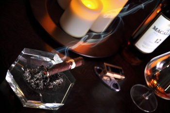
Table Cigar drink

I did a couple of cigar ads a couple of years ago. I wonder what people think of this? I used fake electric candles and only the light the comes from a window.
 

Attachments

  • IMG_4420.JPG
    IMG_4420.JPG
    1.9 MB · Views: 400

kenoh

macrumors 604
Jul 18, 2008
6,507
10,850
Glasgow, UK
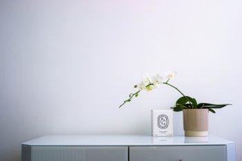
Minimal exploration of negative space - or some arty idea like that...
 

Attachments

  • _DSC6893.JPG
    _DSC6893.JPG
    2.2 MB · Views: 393

JDDavis

macrumors 65816
Jan 16, 2009
1,242
109
A orchid on the kitchen table with a bright green bath towel as the backdrop. :cool:

p187896218-5.jpg
 

logista

macrumors member
Original poster
Mar 25, 2010
56
8
Ann Arbor, MI
fireman32
Looks tasty! Composition is a bit cluttered for a really great food image, maybe de-emphasize the salt & pepper? Love the green and red colors.

koilvr
Unusual perspective and the smoke trail make this an interesting image. The reflections in the snifter are a distraction. The warm colors really help sell the smell.

kenoh
Feels like a spa! The box without the candle is unexpected, but I can kind of see where you're going with it. There's a bleb on the lower edge that's caught my attention. Over all a very calming image.

DrJones1011
I know I said "tabletop" but I wasn't quite expecting the top of a table. Love the color of the table, and the clay jar in the corner, but I can't decide if the chairs are distracting or helping.

rx7dude
Another top of a table! The symmetry is so close, but doesn't work at the fence. If you can redo this one with the table & chair moved to the right a bit... I like the black & white for this, really brings out the lines and grain of the wood.

adougall
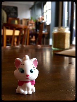
Cute subject. I like the background blur, it feels like a cosy restaurant or cafe. Next time try holding a piece of white card next to the cat (on the left side), just out of frame to make it pop out of its surroundings.

gaswerks
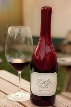
Great attempt! Glass is hard, especially when you're outside and everything is visible in the reflections. Love the colors, and how pretty the wine in the glass looks.

Apple fanboy
Fan of more than Apple, I see! I really like the arrangement of the bottles. The flash should be more diffused, and perhaps a crop in from the left to remove the trees? Feels like it's going to be a good party, though.

JDDavis
Lovely. I like that the green isn't solid, but has some gradient to it. The spikes of color in the orchid (including the purples) stand out really well. The only thing I might suggest is adding a bit of breathing room (top & left) for the orchid.

needfx
This feels like an abandoned electrical shop. As the only source of color, I find myself wanting to see the booklet more. Does it have something to do with the dohickey to the left? Why is there a wire coming out of it? An intriguing photograph.

BeagleMeister
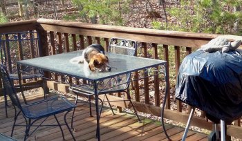
This one made me laugh out loud! Somebody is giving us the stink eye. The grill with the turtle on it seems to echo the dog on the table, but it's cut off a bit too soon. Could be an interesting juxtaposition, especially if you lowered your camera to dog level.

MacRy
Lovely isolation on the daisy. I'm glad you left the stem visible, and the focus is excellent. The black to the left is a bit much (feels like it would be used in a magazine article behind some white text). I wonder what this would look like as a square crop?

Without further ado, drum roll, please...

3rd. kenoh
2nd. MacRy
1st. JDDavis

You guys must have known I'm a sucker for minimalist botanicals :)

Thanks for letting me run the show this week! It's been eye-opening to say the least, and both easier and harder than I expected. If anyone is lurking trying to decide whether or not to participate (as I did for many months), know that it is definitely worth the effort.
 

kenoh

macrumors 604
Jul 18, 2008
6,507
10,850
Glasgow, UK

Incredible shot!

----------

fireman32
Looks tasty! Composition is a bit cluttered for a really great food image, maybe de-emphasize the salt & pepper? Love the green and red colors.

koilvr
Unusual perspective and the smoke trail make this an interesting image. The reflections in the snifter are a distraction. The warm colors really help sell the smell.

kenoh
Feels like a spa! The box without the candle is unexpected, but I can kind of see where you're going with it. There's a bleb on the lower edge that's caught my attention. Over all a very calming image.

DrJones1011
I know I said "tabletop" but I wasn't quite expecting the top of a table. Love the color of the table, and the clay jar in the corner, but I can't decide if the chairs are distracting or helping.

rx7dude
Another top of a table! The symmetry is so close, but doesn't work at the fence. If you can redo this one with the table & chair moved to the right a bit... I like the black & white for this, really brings out the lines and grain of the wood.

adougall
Cute subject. I like the background blur, it feels like a cosy restaurant or cafe. Next time try holding a piece of white card next to the cat (on the left side), just out of frame to make it pop out of its surroundings.

gaswerks
Great attempt! Glass is hard, especially when you're outside and everything is visible in the reflections. Love the colors, and how pretty the wine in the glass looks.

Apple fanboy
Fan of more than Apple, I see! I really like the arrangement of the bottles. The flash should be more diffused, and perhaps a crop in from the left to remove the trees? Feels like it's going to be a good party, though.

JDDavis
Lovely. I like that the green isn't solid, but has some gradient to it. The spikes of color in the orchid (including the purples) stand out really well. The only thing I might suggest is adding a bit of breathing room (top & left) for the orchid.

needfx
This feels like an abandoned electrical shop. As the only source of color, I find myself wanting to see the booklet more. Does it have something to do with the dohickey to the left? Why is there a wire coming out of it? An intriguing photograph.

BeagleMeister
This one made me laugh out loud! Somebody is giving us the stink eye. The grill with the turtle on it seems to echo the dog on the table, but it's cut off a bit too soon. Could be an interesting juxtaposition, especially if you lowered your camera to dog level.

MacRy
Lovely isolation on the daisy. I'm glad you left the stem visible, and the focus is excellent. The black to the left is a bit much (feels like it would be used in a magazine article behind some white text). I wonder what this would look like as a square crop?

Without further ado, drum roll, please...

3rd. kenoh
2nd. MacRy
1st. JDDavis

You guys must have known I'm a sucker for minimalist botanicals :)

Thanks for letting me run the show this week! It's been eye-opening to say the least, and both easier and harder than I expected. If anyone is lurking trying to decide whether or not to participate (as I did for many months), know that it is definitely worth the effort.

Great feedback excellent critique. Enjoyed it this week. My image was the table in our front hall. The bleb you refer to is a ribbon hanging off the drawer handle. Spotted it once posted and didnt want to go back and edit it as thought that was cheating. The table is normally piled with mail and stuff. The candle is in the box but i like the box on those candles more than the candle themselves... I always chuckle thinking the label should read dipstick
 

MacRy

macrumors 601
Apr 2, 2004
4,351
6,278
England
Weekly Photo Contest 19th - 27th May - TABLETOP

Gret feedback and congrats to JDDavis for the win.

The square crop doesn't do it for me in this instance. I like that the daisy has room to breathe and is facing the negative space.

18149973766_ab34db35f1_b.jpg
 

kenoh

macrumors 604
Jul 18, 2008
6,507
10,850
Glasgow, UK
Gret feedback and congrats to JDDavis for the win.

The square crop doesn't do it for me in this instance. I like that the daisy has room to breathe and is facing the negative space.

Image

+1... finding I like negative space... absolutely superb image though!
 

JDDavis

macrumors 65816
Jan 16, 2009
1,242
109
Thanks kenoh and great job judging! I have an idea for the next one and I 'll get it up soon.
 

Ish

macrumors 68020
Nov 30, 2004
2,241
795
UK
Congratulations JDD, it's a great photo. Well done everyone for some nice shots. :)

MacRy
Lovely isolation on the daisy. I'm glad you left the stem visible, and the focus is excellent. The black to the left is a bit much (feels like it would be used in a magazine article behind some white text). I wonder what this would look like as a square crop?
Gret feedback and congrats to JDDavis for the win.

The square crop doesn't do it for me in this instance. I like that the daisy has room to breathe and is facing the negative space.

18149973766_ab34db35f1_b.jpg

Worth the experiment but I prefer the original too.
 
Register on MacRumors! This sidebar will go away, and you'll see fewer ads.