I had to do a rethink on this competition. When I thought vertical lines I was thinking vertical lines in the photograph, but I didn't specify and I did invite people to be creative, so I've adjusted my preconceptions and also taken vertical lines that include parallax. I'd normally think of these as being diagonal because they're diagonal in the picture but, heigh ho, I should have said.

Nice use of vertical lines and a good start to the competition, it almost makes an abstract picture. It looks like streamers hanging from a mesh—are they purely decorative? I like the angle you shot from.
I like the way you’ve limited the depth of field to highlight the texture of the rope. I might have used a little more but that’s purely subjective. I also like the way it’s almost monochromatic which also keeps the eye from being distracted.
You’ve really brought out the impression here that these columns are massive. I was wondering whether the picture should have something as a focal point, a small figure to give scale, but I rather like it the way it is. It’d be interesting to see what it would look like with a light vignette to hold the eye in as it tends to be led along the columns and up to the light area, top right, and out of the picture. Great image!
A beautiful image
@anotherscotsman I love the clean lines and the minimalist view in your angle of approach. If I ask whether this part of the One World Trade Center has diagonal lines rather than vertical ones, it doesn’t detract from how much I like this photo.
This looks a great spot to relax and have a gentle swing while sipping a coffee and illustrates how even urban areas can be lovely. I like the reflected verticals which add interest to the middle of the scene. I see there’s some Trachylospermum on the left which has wonderfully scented flowers to add to the pleasure of sitting there!
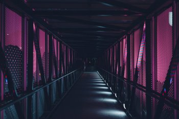
You’ve given this picture a very foreboding look! I’m sure you could sell this to a printer of mystery novels for a cover. I like the use of colour and vignette to add to the atmosphere.
This is interesting. I’ve no idea where it is, but I like the use of the vertical lines at the sides to hold the vision into the leading lines and the fact that you can’t quite make out where they’re leading adds to the mystery.
A very imaginative interpretation of vertical lines and very topical. It’s great to be able to take a photo for the competition, even if not always possible. Nice use of limited depth of field, well done!
More than making up the numbers AFB! Great use of vertical lines. I’d suggest maybe using a little sharpening on the planes but not an easy shot to capture. I like that they’ve got plenty of room to move into and that there's also some interest in the sky but not so much that it detracts.
Those are the most bent vertical lines I’ve ever seen
@MacRy !


Is it the underneath of a structure with supporting beams and is it the lens you’re using that makes them look that shape? However, I really like it—great use of contrast!
Lovely alstromeria
@Hughmac and very well composed and captured. I wouldn’t call them vertical lines I’m afraid, as they go out in all directions, but a lovely picture nontheless.
Plenty of verticals here—in the wooden palings, in the girl and in her hair (well, sort of!). Nice use of light and shade. I wonder what she’s looking at?
I love the use of the road as a vertical, it works perfectly. I thought at first there was traffic crossing a road at the bottom but there doesn’t seem to be anyone in the van so I hope I’m wrong. I like the ghostly figures crossing the road! The only thing I would suggest, is to straighten it a bit as it seems to be leaning slightly towards the left.
Another nice minimalist picture. I like the steel poles against the plain blue sky and the figure adds interest to the structure. To me the lines look as though they were originally diagonal rather than vertical but it’s still a nice picture.
A poignant use of verticals, made all the more so by the fallen leaves and the season. I might suggest the use of a vignette here so the top left corner is a bit darker, but that’s very subjective. Well seen!
So, here we go. It's very difficult when there are two very different pictures that you both think could be first and I looked at them for quite a while wondering which of them to choose. In the end, this is what I've gone with:
3rd: highdefjunkie
2nd: CmdrLaForge
1st: Alexander.Of.Oz
Thanks for a great competition. Over to you Alex!


 Paint Studio
 Spanish Galeon "Andalucia"

 IMG_0056
 IMGL4725

 20140712-_DSC6451


