Hello all, thanks for the diverse contributions. My apologies for taking my time with this, but I have been working a great deal and hence have only just got back to my desk.
I have not included the three photographs that were contributed more than a week after the original post's date-stamp, as this is consistent with the rules. I have however commented on these images.
imac wannabe: I like what this image shows - the product of thousands of hours of hard work and dedication. It looks pretty sharp to me too. I would probably have cropped the image a bit tighter for this purpose because I am not sure that all the blue adds to the composition.
Cheese&Apple: A humorous take perhaps! A good contrast of dark bird and white(ish) snow. Again, perhaps the image would benefit from a slight crop to remove the edge of the mound?
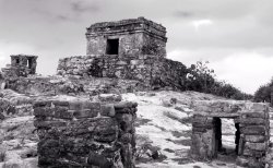
JoeRito: I like the arrangement of the four buildings and the various windows they provide for our visual exploration. A good composition.
MacRy: I would think you have taken a good while over this image working carefully on symmetry and cropping as well as the tonality of the picture. Arguably the contrast is fairly low and there aren't really any highlights but I think this adds to the restfulness of the scene.
Keleko: I've no idea how many times this fellow fired while you were there, but I suspect it was not many. I think I feel that from this perspective in an ideal world there would be less space behind the man and more in front to take in the puff of smoke more fully - of course, if this was the only time he fired you may not have even known the smoke would have been the main event!
jkramerbob: This is probably the most subtle use of selective or partial colouring I have come across. I like the perspective and the concept you have executed here. I do find my eye drawn to the gap between the head on the left and the edge of the frame which distracts a little from the subject. I wonder if that edge could just be cropped off and then the people are even more like landscape elements: hills or mountains and a sort of symmetry is created.
oblomow: An astounding building and one which has been the subject of much 'reconstruction' over the centuries. There is a lot going on, and my eye wanders freely across the frame. I do wonder if the image would be more balanced if the bottom third of the image was removed - you would be left with an image which was about the contrasts and similarities between the ancient building and the modern scaffold.
pmxexperience: another image which brings work from an unfamiliar [to me] culture to us. There is the scaffold which is itself interesting (where are the floors from which the workers work? I see only sparse levels??) and also the two paint colours on an otherwise fairly plain building. I do wonder if, since you couldn't get level with the building to avoid perspective issues, there might have been a stronger image to be had from a more detailed look - perhaps filling the frame with the building and avoiding the sky totally.
Apple fanboy: I think that it is the sign that makes this image: 'laser combat arena' transforms a fairly dull photograph of demolition into a rather humorous and puzzling image - did a game get out of hand? Were the lasers a little too powerful?? It looks as though you used some flash for this shot which seems to have been a good move.
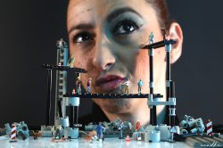
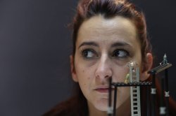
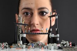
needfx: Entertaining and well executed image. Your model's expression makes the most of the image.
fireman32: Lots of nice shafts of light, which I am sure you have processed to maximise. The photograph feels as though it is sloping slightly, but I have not checked this. I suspect a lurking strange, decaying but charismatic car or similar would make this image, but then, perhaps the emptyness is what you were trying to capture.
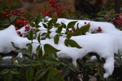
bliggs: I am unsure if you intended this photograph to fit with the theme or just to cheer folk up! It is a nice snowy scene, perhaps it is a little underexposed because of the amount of white?
jodelli: The architect here has done a lot of good work for you by designing such a rhythmic structure. I think to improve it you would either need to lift the people out of shadow or wait until the scene was empty - as it is you can't really see them but they do break up the form of the building.
Winners:
This was hard to break up in some ways but I have to choose...
1st: MacRy - Hard work pays off.
2nd: JoeRito - a photograph worthy of a wall or a history book.
3rd: needfx - props for working on something different.
MacRy to make the next thread.

")