@oblomow A field of grain! Good placement of the horizon, and the brightly contrasting flowers provide a welcome focal point that pop from the field of what appears to be green, growing wheat and the looming gray clouds, a pleasantly surprising disruption of the rest of the image’s cool palette.
@C0ncreteBl0nde A sea of golden grain captured from a speeding car is something we’ve likely all seen before. But there’s so much going on in this photo - the leading lines from strong elements of the image - asphalt, gravel, field, horizon and clouds - that bring the viewer’s eye right-to-left, directly into the mirror where the storyteller has placed themself into the frame as a really pleasant surprise. The slight motion blur helps the sense of speed, and doubles down on the work that those leading lines are doing. And the entire image is overlaid with a cool color cast likely from a backlit landscape shot through auto window glass, which helps provide a visual cohesion to all the elements of the photo. I’m not crazy about the muddy top right corner of the frame, though.
@mollyc When I mentioned film grain being a possible interpretation of this contest’s theme, I was expecting images that really looked crunchy and contrasty that brought me back to my film days. I didn’t expect an image so elegant, though. The pushed film in flat daylight makes the image appear ethereal and misty, almost like a photo shot with infrared film. The plant itself has a delicate appearance that is well suited to this technique. The composition and framing really work well too.
@Snowlover My first thought was “is this bamboo? Isn’t that grass, not a grain?” and then I thought “so what?” The brightly exposed leaves popping out against the almost black background grabbed my attention first, with the strong vertical lines of the stalks bringing my eye through the frame.
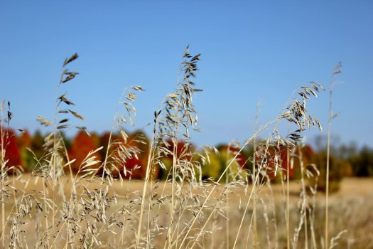
@lkalliance What I pictured in my head when I decided on this theme. Bringing the viewer in so close on a single stalk of golden wheat and keeping the depth of field shallow really makes this photo work. I like the composition with the right two thirds of the frame being negative space, though the wheat stalks on the far left are just a bit too busy, and the light is just a little too flat, to allow the sharp stalk to really pop out.
@OldMacs4Me At first I thought the googly eyes on wood are kind of schlocky and unnecessary, and that this picture is a one trick pony. But as you said, this photo is best viewed at full resolution, and when I brought all of the images into Photo Mechanic for the judging I stopped focusing on the visual gag and I really saw what the photographer saw - the lines and whorls of the grain of the driftwood, and how it reacts to light and shadow and the slight foreshortening from the lens. The “eyes” became less important in the image and I went to all the rest, including that strong black line created by the crack that goes down the middle of the frame. This photo revealed more about itself the more I looked at it, and the grain really told its story.
@mtbdudex Really amazing. I do astrophotography and I know what it’s like to spend a night shooting star trails, and the entire next day doing post. And the fireflies (I assume) add a whole surprising layer to the image. I like the composition, with the home at lower left balancing the energy from the concentric circles that pull the eye toward the top right. Despite the title, though, I am having trouble seeing how this fits in with the contest’s theme - though I appreciate the image itself.
@coolguy4747 The grain of the film really adds a dreamlike quality to the image, and I like how that quality helps to almost put the viewer in the subject’s place. Christmas can be such a noisy, crowded and crazy time, and this image is pretty much the opposite. I appreciate how quiet and still this image is, though some of the background elements are fighting that and they’re a bit distracting.
@_timo_redux_ I wasn’t sure if this was digital noise or film grain, but whatever it is, it’s well controlled. The subject on its own doesn’t do much for me, but the palette and almost misty direction of light make this photo work. It appears to be a long nighttime exposure, with moonlight and artificial lights as the light sources, but I could be wrong (let me know!). Like the photo of the wood grain, this photo benefits from being viewed away from the website.
Thank you all for entering this week’s contest, and for bringing your interpretations to it! The 1st and 2nd place photos stood out to me, but there were several images that I struggled with for third place.
@OldMacs4Me and
@mtbdudex get honorable mentions this week. Not because they’re also-rans, but because they are really good and deserve to be on the podium along with:
3rd
@lkalliance
2nd
@mollyc
1st
@C0ncreteBl0nde


