Got a tip for us?
Let us know
Become a MacRumors Supporter for $50/year with no ads, ability to filter front page stories, and private forums.
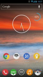
What do you think of this round icon theme?
- Thread starter PollyK
- Start date
- Sort by reaction score
You are using an out of date browser. It may not display this or other websites correctly.
You should upgrade or use an alternative browser.
You should upgrade or use an alternative browser.
I decided to try out a new theme. This one is called Click UI.
Pretty interesting visual presentation...
EDIT: And now that I can see it...I liked it better before.
Pretty interesting visual presentation...
Updated.
What do you think of this round icon theme?

At least when it comes to the round icons.
I like that they are matte though.
Wait what? Why does it need two status bars?
That's because it's a poor photoshop, and an obvious one at that that.
After using this set for almost a week now, I can say this and Miui are my favorite icon set. The screenshot doesn't do these icons justice. The matte finish really is pleasing to the eye.
----------
Yes that's ugly. But it's because the icons are crowded on a small screen. And they don't have the flat matte finish of Click UI. But If you don't like round, then you don't like round.
----------
Yes that's ugly. But it's because the icons are crowded on a small screen. And they don't have the flat matte finish of Click UI. But If you don't like round, then you don't like round.
Register on MacRumors! This sidebar will go away, and you'll see fewer ads.


