Become a MacRumors Supporter for $50/year with no ads, ability to filter front page stories, and private forums.

ozaz

macrumors 68000
Original poster
Feb 27, 2011
1,615
577
I think later this year may be time to finally replace my ageing iPad 2.

In the past, I've never really considered switching from my iPad to an Android tablet because I've always been under the impression that Android is weak when it comes to tablet apps, with many apps just being stretched out phone apps.

However, Android devices do have a couple of features I'd really like in a tablet that iPad doesn't have (and shows no sign of getting in the near future). Specifically,
* multi-user support,
* active digitiser technology (in the Galaxy Note line)

Are Android tablet apps still relatively weak, or is that old information?

Without currently owning an Android tablet, is there any way I can tell if a particular app has been tablet-optimised?
 

mrex

macrumors 68040
Jul 16, 2014
3,458
1,527
europe
Not sure where this comes from that apps are streched from the phone apps. Maybe bad coding skills or really old apps without updates or experience with iphone apps on ipad? Quote from stackoverflow: Android is perfectly designed to be targeted to various devices, its automatic resource selection from res/ folders depending on device's capabilities is big help for you. You can have completely different screen layout for large screens vs small ones, for portrait vs landscape, for tablets vs phones, etc.And your code is written/maintained just once.

I havent seen, for years, apps that cant be downloaded for a tablet and a phone. Google has its own section for tablets, but not sure is it popular, because you dont need to make the same apps for a phone and for a tablet separately.

If you know what apps you definitely need and use daily, you could check how they look with tablets. Many apps on Play store has screenshots/vids to see them and of course people do also reviews.
 
Last edited:

Shuri

macrumors 6502
Nov 23, 2011
330
0
Not sure where this comes from that apps are streched from the phone apps. Maybe bad coding skills or really old apps without updates or experience with iphone apps on ipad? Quote from stackoverflow: Android is perfectly designed to be targeted to various devices, its automatic resource selection from res/ folders depending on device's capabilities is big help for you. You can have completely different screen layout for large screens vs small ones, for portrait vs landscape, for tablets vs phones, etc.And your code is written/maintained just once.

Yeah, so much for theory. But taking the Spotify app it looks like this on Android:
original


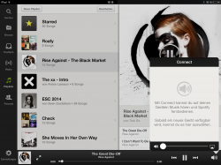
And on the iPad like you can see in the attachment of this post. It's certainly not scaling up, but not that much better. The iPad App just offers more information on one screen.

BUT: Homescreen widgets (which are pointless to me on a phone) make much more sense on a device as big as a tablet, and make up for the missing of dedicated tablet apps to a certain degree.
 

Attachments

  • IMG_0199.PNG
    IMG_0199.PNG
    1.1 MB · Views: 159

zhenya

macrumors 604
Jan 6, 2005
6,931
3,681
Not sure where this comes from that apps are streched from the phone apps. Maybe bad coding skills or really old apps without updates or experience with iphone apps on ipad? Quote from stackoverflow: Android is perfectly designed to be targeted to various devices, its automatic resource selection from res/ folders depending on device's capabilities is big help for you. You can have completely different screen layout for large screens vs small ones, for portrait vs landscape, for tablets vs phones, etc.And your code is written/maintained just once.

I havent seen, for years, apps that cant be downloaded for a tablet and a phone. Google has its own section for tablets, but not sure is it popular, because you dont need to make the same apps for a phone and for a tablet separately.

If you know what apps you definitely need and use daily, you could check how they look with tablets. Many apps on Play store has screenshots/vids to see them and of course people do also reviews.

And this belief is why Android tablet apps continue to be so bad. An app that automatically scales to a wide range of screen sizes is a lot easier for developers, but it is nowhere near as good as apps that are designed to specifically maximize the space and physical size of a specific screen.
 

ozaz

macrumors 68000
Original poster
Feb 27, 2011
1,615
577
I've always been under the impression that Android is weak when it comes to tablet apps, with many apps just being stretched out phone apps.

Not sure where this comes from that apps are streched from the phone apps. Maybe bad coding skills or really old apps without updates or experience with iphone apps on ipad?

I think the terminology I used in my original post wasn't correct. I didn't mean stretched out in the sense of iPhone-only apps running on an iPad.

And on the iPad like you can see in the attachment of this post. It's certainly not scaling up, but not that much better. The iPad App just offers more information on one screen.

I guess scaling up, as used by Shuri, is a better term.

My impression (mainly from reading forums) has always been that there are a lot of Android apps that have just been scaled up for the tablet without much thought put into how to modify the UI of the app to make use of the larger screen size & usage scenarios
 

Jessica Lares

macrumors G3
Oct 31, 2009
9,612
1,057
Near Dallas, Texas, USA
It's going to get significantly better with the new Android Material stuff. The APIs are better designed for taking advantage of the screen, which wasn't the case with the earlier ones.
 

mrex

macrumors 68040
Jul 16, 2014
3,458
1,527
europe
And this some old app (updated on 2011) which definetely is made for phones :D
uzyvetaz.jpg


But it was a year 2011... So I have to disagree. I have been using android for years and I dont practically see bad tablet layouts nowadays.
 

ozaz

macrumors 68000
Original poster
Feb 27, 2011
1,615
577
If you know what apps you definitely need and use daily, you could check how they look with tablets. Many apps on Play store has screenshots/vids to see them and of course people do also reviews.

When I look at the Dropbox app (for example) on the Play store from my laptop browser, all I see are screenshots of phone screens. Does this mean they haven't bothered optimising the app for larger tablet screens? Would the phone layout just be scaled up to larger screens of tablets?

EDIT: Actually, a similar thing goes for the Google Drive app. All I see are portrait orientation screen shots. But I presume Google have optimised their apps for landscape orientation on tablet screens, so perhaps looking at the app on the Play store doesn't really give much indication as to how it will appear on tablets?
 

Shuri

macrumors 6502
Nov 23, 2011
330
0
Does it look so bad? Lucky not for me, took some screenshots:

You missed my point: I wasn't saying that Spotify on Android looks bad because of an old design, which eventually got updated.
As compared to the iPad App, the Android one has so much wasted space.

Look at your first screen where there is the list to navigate: It is made so wide, so it fills out the whole screen. That isn't intelligent design, this is design made by an algorithm, which lays out the app, so it works on different screen sizes.

Same goes for the third picture: Why isn't there a third column like in the iPad app? Do you need the spaces be so big, being left unused?

I understand why it is on Android like this, but it just doesn't work out on a tablet.
 

mrex

macrumors 68040
Jul 16, 2014
3,458
1,527
europe
Look at your first screen where there is the list to navigate: It is made so wide, so it fills out the whole screen. That isn't intelligent design, this is design made by an algorithm, which lays out the app, so it works on different screen sizes.

What is the problem with that layout? You navigate the screen scrolling up/down or the top row scrolling it right or left. Why should it smaller than wide screen?

----------

ozaz said:
Actually, a similar thing goes for the Google Drive app. All I see are portrait orientation screen shots. But I presume Google have optimised their apps for landscape orientation on tablet screens, so perhaps looking at the app on the Play store doesn't really give much indication as to how it will appear on tablets?

Because it works on the same way in tablets. With the tablet you have just more rows/columns than with a phone.
Does this mean they haven't bothered optimising the app for larger tablet screens? Would the phone layout just be scaled up to larger screens of tablets?

Android doesnt work on the same way as iphone apps on ipads. Like in this case, if you see only 2 columns with a phone, a tablets gives you e.g. 5 columns. Like on this way... no scaling...
repe9ehu.jpg
 
Last edited:

ozaz

macrumors 68000
Original poster
Feb 27, 2011
1,615
577
Because it works on the same way in tablets. With the tablet you have just more rows/columns than with a phone.


Android doesnt work on the same way as iphone apps on ipads. Like in this case, if you see only 2 columns with a phone, a tablets gives you e.g. 5 columns. Like on this way... no scaling...

I don't understand. Are you saying you somehow automatically get extra columns on a tablet with no intervention from the developer?

Here is a screenshot I found of the dropbox app on an Android tablet:

Dropbox_Android_tablet_app_screenshot.png


It just looks like a rotated and scaled up phone app (one column) with no usage of the extra screen space on a tablet.

In contrast, the Dropbox app on an iPad makes explicit use of the extra screen space by providing a column on the left to browse your folders and a preview pane on the right:

mzl.bswncwfi.1024x1024-65.jpg
 

mrex

macrumors 68040
Jul 16, 2014
3,458
1,527
europe
I don't understand. Are you saying you somehow automatically get extra columns on a tablet with no intervention from the developer?

Of course not, but Google Drive does. I dont use DropBox, Drive is much way better so I cant check that.
 

ozaz

macrumors 68000
Original poster
Feb 27, 2011
1,615
577
Of course not, but Google Drive does. I dont use DropBox, Drive is much way better so I cant check that.

Ok, so it means the images on the Play store are not sufficient to determine whether an Android app comes with a tablet-optimised UI.

It seems to me the Play store really needs to force developers to provide two sets of images. One set showing how the app looks on a phone, and the other set showing how the app looks on a tablet in both portrait and landscape orientation.

The Google Drive app on Play store only shows portrait orientation images which gives me no idea how it would look on a tablet in landscape mode.
 

Bacong

macrumors 68030
Mar 7, 2009
2,618
1,134
Westland, Michigan
Of course not, but Google Drive does. I dont use DropBox, Drive is much way better so I cant check that.

I don't think you have a single clue what you're talking about or even how to speak English.

The OP was asking if more Android apps are optimized for tablet displays. The answer is not yet. They are moving slowly towards this, yes, but most apps on a tablet are the exact same as phone apps on Android. Topic over.
 

bubbleboil

macrumors member
Apr 19, 2014
80
13
Ok, so it means the images on the Play store are not sufficient to determine whether an Android app comes with a tablet-optimised UI.

It seems to me the Play store really needs to force developers to provide two sets of images. One set showing how the app looks on a phone, and the other set showing how the app looks on a tablet in both portrait and landscape orientation.

The Google Drive app on Play store only shows portrait orientation images which gives me no idea how it would look on a tablet in landscape mode.

There is an option to upload tablet screen shot and phone screen shot when uploading app to play store. This will then be classified as tablet app.

But users are still able download phone apps.

Correct me if I am wrong.
 

mrex

macrumors 68040
Jul 16, 2014
3,458
1,527
europe
Ok, so it means the images on the Play store are not sufficient to determine whether an Android app comes with a tablet-optimised UI.

Not always. This is the layout on my tablet (Google Drive):
su5a2u5u.jpg
 
Last edited:

ozaz

macrumors 68000
Original poster
Feb 27, 2011
1,615
577
Not always. This is the layout on my tablet:
Image

I don't know what I'm supposed to be looking at. All I see is blur.

----------

There is an option to upload tablet screen shot and phone screen shot when uploading app to play store. This will then be classified as tablet app.

But users are still able download phone apps.

Correct me if I am wrong.

At the moment tablet and phone screenshots seem to be mixed together and sometimes one or the other are not provided. My point is I think it would be a good idea to have different sections/filters for phone and tablet screenshots on Store page for the app. So if I wanted to see how the app looked on a phone, I would click a phone filter, and if I wanted to see how the app looked on a tablet I would click on the tablet filter. In this case, absence of tablet-specific screenshots would be a pretty good indicator that the developer has not made a tablet-optimised UI.
 

mrex

macrumors 68040
Jul 16, 2014
3,458
1,527
europe
I don't know what I'm supposed to be looking at. All I see is blur.


Sorry I forgot to say - Google Drive on a tablet. As you can see, there are more columns than on a phone.
My point is I think it would be a good idea to have different sections/filters for phone and tablet screenshots on Store page for the app. So if I wanted to see how the app looked on a phone, I would click a phone filter, and if I wanted to see how the app looked on a tablet I would click on the tablet filter.

I dont know can you browse those section with a browser. (I will check that with my laptop.)

When you go to Play store (android app), you can choose the mode "Optimized for tablets", but as you can see, when watching top selling apps, they works on phone and they are optimized for tablets aswell:

Designed for tablets
ne3ugu3a.jpg


All apps
ymata8eq.jpg


Games... for tablets
2u2unynu.jpg


All apps
u4aqu4ag.jpg
 
Last edited:

ozaz

macrumors 68000
Original poster
Feb 27, 2011
1,615
577
Sorry I forgot to say - Google Drive on a tablet. As you can see, there are more columns than on a phone.

This demonstrates my point. The Play Store page for the Google Drive app does not provide a screenshot for the app in tablet landscape orientation. That the app is in fact tablet-optimised means you can't rely on the Play store images when trying to determine whether or not an app has been tablet-optimised.


When you go to Play store, you can choose the mode "Optimized for tablets", but as you can see, when watching top selling apps, they works on phone and they are optimized for tablets aswell:

Is that mode only available when you are browsing the play store from an Android tablet (I can't find the option from a desktop browser or from the Play store on my Android phone)? The question in my original post was how can I find out which apps are tablet-optimised prior to buying an Android tablet.
 

mrex

macrumors 68040
Jul 16, 2014
3,458
1,527
europe
This demonstrates my point. The Play Store page for the Google Drive app does not provide a screenshot for the app in tablet landscape orientation. That the app is in fact tablet-optimised means you can't rely on the Play store images when trying to determine whether or not an app has been tablet-optimised.

It's up to the developer how much he gives information and differend pics.

Is that mode only available when you are browsing the play store from an Android tablet (I can't find the option from a desktop browser or from the Play store on my Android phone)? The question in my original post was how can I find out which apps are tablet-optimised prior to buying an Android tablet.

I didnt find it from the browser either - not even when I was signed in. It seems to be only avalaible in the app itself.

Things are way much better nowadays than it was couple years ago when a android tablet was a new thing and not so popular yet. Nowadays android tablets sell well but also there are well-selling phablets. If you are looking for just specific apps for a tablet layout using as much as space filled by information there arent many and robably you will be disappointed. Not sure why, but im quessing that people are using same apps with a phone and a tablet, so they might prefer to see the same layout. Does it work always? Nope. Just checked how is the layout of Dropbox nowadays on a tablet. Terrible, they have definitely forgotten tablets. It still looks the same as on a phone, only showing names on the left.
 
Last edited:
Register on MacRumors! This sidebar will go away, and you'll see fewer ads.