Got a tip for us?
Let us know
Become a MacRumors Supporter for $50/year with no ads, ability to filter front page stories, and private forums.
What’s your favourite smartphone design on the market?
- Thread starter max.ine
- Start date
- Sort by reaction score
You are using an out of date browser. It may not display this or other websites correctly.
You should upgrade or use an alternative browser.
You should upgrade or use an alternative browser.
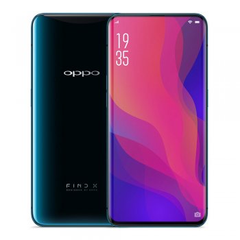
From a purely aesthetic perspective, the Oppo Find X is stunning...such a clean design and closest to having truly bezeless display. That being said, I think functionality is compromised by that design—I’d never want a phone that had to mechanically ‘open and close’ everytime I used it. At some point it’ll become non-functional.
Otherwise, I’d put the OnePlus 6T up next, followed by the iPhone XS.
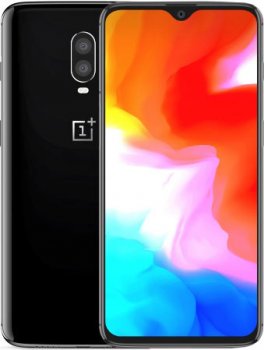
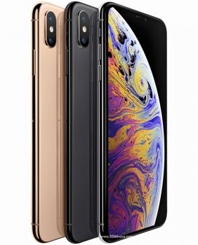
Otherwise, I’d put the OnePlus 6T up next, followed by the iPhone XS.


I didn't think I'd like it so much, but Essential phone is definitely up there. It's a real shame there won't be a sequel.
Galaxy S9 series are top form. I'm actually for a little bezel top/bottom for sensors -- no hidden cameras that rise out of the device for me, and definitely no notches. I'm also a big fan of Samsung's modern and refined edge screens both from an aesthetic point of view and also from an ergonomic point of view. And I've always loved the double-glass sandwich design -- hated the aluminum phase.
Of the notch designs, the OnePlus 6T is definitely the best one. I would not include the iPhone XS. I think a big reason why it might be considered nice is because of how ubiquitous it is -- we see the iconic iPhone design everywhere. I do give Apple credit for its uniformity around the side/bottom bezels, but let's not pretend the notch is pretty. Nor is the back -- that camera bulge is hideous.
Last edited:
iPhone X/XS. Fits well in my hands but screen size is still good. Easy to use with one hand. The new gold color is very interesting because it shifts dramatically in light from a brick of gold to this pinkish white and everything in between. But primarily I like the phone for its compact size.
On the Android side I actually like the Note 9 a fair bit. To me it's the best of the bigass phones and the one handed mode still makes it reasonable to use when you can't use both of your hands. It's not the phone for me but I can still appreciate its thoughtful design.
On the Android side I actually like the Note 9 a fair bit. To me it's the best of the bigass phones and the one handed mode still makes it reasonable to use when you can't use both of your hands. It's not the phone for me but I can still appreciate its thoughtful design.
Anything without a notch right now, although I am glad Huawei are allowing us to disable the stupid thing.Title. I’m mostly interested in hearing people’s thoughts on Android phones, but I wouldn’t fault anyone if they mentioned an iPhone of some kind—the X(s) and Xr have some of my favourite Apple designs in years.
Favorite design right now has to be the LG V30 or Galaxy Note9. I like how the V30 has a simplistic design with rounded corners and edges. While I also like how the Galaxy Note9 managed to fit a proper 6.4inch display with no interruption in its display making it incredibly immersive.
The OPPO Find X is also a beauty, some real innovation there, if only it was available in more places.
Ultimately I am all about ergonomics, and I think the V30 has the best ergonomics. Put a 6.5inch display in this design plus an SPen and I'll be sold.


I like Samsung's resistance to the notch. Putting a notch on a phone is just lazy design.
The Note 8 and 9 is almost perfection in terms of design.
The Note 8 and 9 is almost perfection in terms of design.
Ultimately I am all about ergonomics
Do you mean symmetry?
I ask as, to me, ergonomics in a design sense, means you have a larger screen in a smaller form factor, which is what a well implemented notch gets you.
Putting a notch on a phone is just lazy design.
Many feel the exact opposite - that it's a very efficient design that if done right (no chin), allows many people with smaller hands access to a much bigger screen which they otherwise wouldn't be able to handle on a larger, traditional (some might say dated) phone with top/bottom bezels.
No, I am talking about ergonomics, as in the device is so well built it sits in the hand very well, easy to hold and use without much discomfort, with little compromise to functionality.Do you mean symmetry?
I ask as, to me, ergonomics in a design sense, means you have a larger screen in a smaller form factor, which is what a well implemented notch gets you.
Many feel the exact opposite - that it's a very efficient design that if done right (no chin), allows many people with smaller hands access to a much bigger screen which they otherwise wouldn't be able to handle on a larger, traditional (some might say dated) phone with top/bottom bezels.
I can't think of a single phone with a notch that feels as good as a V30. The Huawei Mate 20 Lite I am reviewing is pretty good, but the notch has ruined notifications, IMO, as it can only fit so many icons in the available space, so function is compromised.
Last edited:
iPhone 4/4S. Nuff said.
Original Moto X. Still love mine with custom wood back.
OnePlus One. Really dig the sandstone back texture and the raised front display. Totally unique. And it's grippy, unlike majority of metal/glass phones today.
Today, every phone looks about the same. Nothing is really that unique anymore, thus some OEMs play with colors instead (Huawei, Oppo, etc).
Register on MacRumors! This sidebar will go away, and you'll see fewer ads.

