Needs work
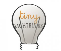
Conceptually, I see what you are trying to do with the filament spelling out "Tiny", but it does not work well here.
If you take options A and B and shrink them down, the legibility of "Tiny" just does not hold up. Good logos should hold up even at smaller sizes and this does not do so well. The font choices also just do not feel right in any of the options, they just do not play well together with what you are trying to do.
James Craner, also made a good point about the light bulb graphic element not being...well, tiny.
You are working against yourself in that you want your filament spelling "Tiny" in the bulb, but to make the word somewhat legible when resized to smaller sizes you make the bulb big. You are trying to make oil and water play well together here.
Option C, is kinda fun, but the font selection does not work together and bulb is far from tiny.
Option D, although still, not the best font selections, it has potential. The font colors work for me. You made the bulb smaller which works, but you are still trying to force the filament spelling "Tiny" idea, you don't need it. Try to make the bulb simple, no faces, no filament spelling "Tiny", just a simple, clean little bulb. Try to make the bulb yellow and black like options B and C, but smaller and minus the face, filament, stuff.
Just some constructive crit from a designer, not bashing your work. Keep working on it.
Have a good one !


")