Become a MacRumors Supporter for $50/year with no ads, ability to filter front page stories, and private forums.

Which logo is best?

  • The first

    Votes: 27 71.1%
  • The second

    Votes: 0 0.0%
  • the third

    Votes: 11 28.9%

  • Total voters
    38

Michael CM1

macrumors 603
Feb 4, 2008
5,682
277
If the third one had different colors (instead of the murky water stuff), it would be the best. The other too look too cartoony. Of course it would help to know what you're making an icon for. Apple's logo is nice, but it would be dumb for the Sunkist people.
 

PlaceofDis

macrumors Core
Jan 6, 2004
19,241
6
i'd think the second would look best if you gave the middle a black color like the other two.
 

mcdj

macrumors G3
Jul 10, 2007
8,970
4,225
NYC
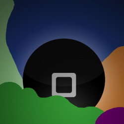
The first sign of trouble with any icon design is if it gives absolutely zero idea of what it is supposed to represent. I can't tell if the black thing is a coffin or what. I assume it's supposed to be an iPhone, but if so, the icon tells me that it's for a program that will make my screen go black.

Icon design is about more than just choosing a gradient style and color scheme. It needs to tell a quick story, summarizing the app, and being instantly recognizable and legible. Unfortunately your icon is none of these.
 

Niiro13

macrumors 68000
Feb 12, 2008
1,719
0
Illinois
The third one's background reminded me of the Vista background...

Anyway, I like the third one the best. First one has more color and life, but it just doesn't really suit as an icon.

Third I think, but first isn't bad.

Don't like that big black rectangle though

That's an iPhone.
 

anti-microsoft

macrumors 68000
Dec 15, 2006
1,665
6
Edinburgh, Scotland
I have created something very ugly but I hope you get the idea:

Instead of having the whole iPhone... just have the home button in your icon...
 

Attachments

  • Untitled-1.png
    Untitled-1.png
    93.5 KB · Views: 58

JamesFoote

macrumors regular
Original poster
Aug 5, 2008
109
0
Thanks again guys!

I think I'm going to make about 6 more designs today and post another poll to decide which one is truly superior.
 

iFerd

macrumors 6502a
Jul 20, 2007
927
0
The first sign of trouble with any icon design is if it gives absolutely zero idea of what it is supposed to represent. I can't tell if the black thing is a coffin or what. I assume it's supposed to be an iPhone, but if so, the icon tells me that it's for a program that will make my screen go black.

Icon design is about more than just choosing a gradient style and color scheme. It needs to tell a quick story, summarizing the app, and being instantly recognizable and legible. Unfortunately your icon is none of these.
I agree - none of the designs suggests to me what the application does.
 

jstanier

macrumors regular
Sep 6, 2008
148
0
Brighton, England.
I think the third one is clearest, however if you could just give the name of the application so we had some idea of what it was about, that would help greatly in the decision :)
 

ryanwarsaw

macrumors 68030
Apr 7, 2007
2,746
2,441
The first sign of trouble with any icon design is if it gives absolutely zero idea of what it is supposed to represent. I can't tell if the black thing is a coffin or what. I assume it's supposed to be an iPhone, but if so, the icon tells me that it's for a program that will make my screen go black.

Icon design is about more than just choosing a gradient style and color scheme. It needs to tell a quick story, summarizing the app, and being instantly recognizable and legible. Unfortunately your icon is none of these.

He really didn't ask about icon design philosophy, he simply asked which one we felt was best.
 

diesel

macrumors 6502a
Aug 3, 2007
807
25
He really didn't ask about icon design philosophy, he simply asked which one we felt was best.


Yet how can anyone say which icon is the "best" when it has to be determined in the context of the planned application in question. hence mcdj has a VALID point.

To ask the original question with no point of reference or context is an exercise in futility.
 

devilot

Moderator emeritus
May 1, 2005
15,584
1
I think I'm going to make about 6 more designs today and post another poll to decide which one is truly superior.
I'm curious to see what they'll look like. :)

Of the three posted here, I'd pick the first, though I think it's a bit busy and undecided in the feeling it gives off-- a bit like what mcdj was mentioning.

Of the 2nd and 3rd icons, there's not enough contrast (in the color and values) for my taste. :eek:
 
Register on MacRumors! This sidebar will go away, and you'll see fewer ads.