Become a MacRumors Supporter for $50/year with no ads, ability to filter front page stories, and private forums.

Zerozal

macrumors 6502
Original poster
Apr 3, 2009
443
4
PA
I'm trying to decide if I want to stick with dark mode or not. I like the idea of dark mode, but something about the implementation just seems...off. Maybe it's because I expect things like the right click menus, dictionary popovers, etc to also be dark but they aren't, and that makes dark mode seem like an unfinished hack.

If you've tried dark mode but went back to normal mode, I'd like to hear your reasoning.

Thanks!
 

tom vilsack

macrumors 68000
Nov 20, 2010
1,880
63
ladner cdn
I went with the none transparent look by turning it off (sys pref/acc/reduce trans)...much perfer not seeing web pages under menu bar while scrolling...also like the cleaner look.
 

paul.opensource

macrumors member
Mar 8, 2009
34
0
San Antonio, Texas
Dark mode

To me the UI changes seem, well, half a$$ed. I am used to Apple having beautiful interfaces and this one seems cheap somehow, like M$ had their had at it or something...I also like dark mode, but the implementation seems incomplete. All of the UI changes seem this way. The system runs fine but looks bad. I went back and forth from dark mode, no transparency, to dark mode with transparency, then finally settled back on the default (no dark mode and transparency) because iStat menus looks bad in dark mode.

I am not happy. :mad:
 

KALLT

macrumors 603
Sep 23, 2008
5,380
3,415
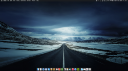
I also wish it would do more than what it does now, but I am currently using the dark mode and I like how the menu bar melts with my wallpaper. The frame of my display is black as well, so it looks quite good.

I don’t like how the Dock looks though. It has this greyish tint rather than the black translucency of the menu bar.

Overall though, I feel that the system has become brighter because of the new UI, a lot more plain white. I feel it’s almost necessary to have a bit more contrast, which is why I prefer the dark mode at this point.
 

Attachments

  • Screen Shot 2014-10-18 at 20.54.40.png
    Screen Shot 2014-10-18 at 20.54.40.png
    2.7 MB · Views: 198

John6Plus

macrumors 6502
Sep 19, 2014
365
41
Holland, MI
I like the dark dock better, but the light menu. The menu would be passable if a couple of my custom items didn't have black hardcoded in them (OneDrive and ClearSky) but they disappear. So I'm sticking with light for now.

I don't mind the look though. I think the new icons look better against a dark background, personally.
 

paul.opensource

macrumors member
Mar 8, 2009
34
0
San Antonio, Texas
I also wish it would do more than what it does now, but I am currently using the dark mode and I like how the menu bar melts with my wallpaper. The frame of my display is black as well, so it looks quite good.

I don’t like how the Dock looks though. It has this greyish tint rather than the black translucency of the menu bar.

Overall though, I feel that the system has become brighter because of the new UI, a lot more plain white. I feel it’s almost necessary to have a bit more contrast, which is why I prefer the dark mode at this point.

Nice desktop! I agree, the implementation of dark mode seems like there should be more: other windows, etc. The dock is a step backwards to me. The trash icon is white and boring and the finder icon almost looks like he is smirking. The red, yellow and green window icons are now just colored blobs instead of having definition. The drive icons are the same way - no definition, or only half of what they had before. Another odd thing: Some finder icons are displayed in the old format and some in the new format/color. My Google drive icon is from Mavericks and so is my Parallels Applications icon.

I do like the brighter, crisp feel, but somehow I can't shake the feeling it looks hobbled together, like it was a rush job almost. At least nothing is broken so far.

----------

I like the dark dock better, but the light menu. The menu would be passable if a couple of my custom items didn't have black hardcoded in them (OneDrive and ClearSky) but they disappear. So I'm sticking with light for now.

I don't mind the look though. I think the new icons look better against a dark background, personally.

Agree, I like the icons better against a dark background. I also have some menu bar display issues with Intego and iStat menus so am staying with light mode and using transparency to "darken" the background some.
 

Erastopic

macrumors regular
Jun 4, 2014
221
46
Norway
I have mixed feelings for Dark mode..

It's hard to explain but on some wallpapers, Dark Mode looks ugly while on others Dark Mode looks better.

But I have always preferred Light Mode since Dark Mode was added in DP3, I like how the Light Mode dock plays with the translucency of the wallpaper.

Dark Mode also feels somewhat too translucent on certain areas of the UI like the Menu Bar drop down menu's.
 

KALLT

macrumors 603
Sep 23, 2008
5,380
3,415
The red, yellow and green window icons are now just colored blobs instead of having definition.
...
I do like the brighter, crisp feel, but somehow I can't shake the feeling it looks hobbled together, like it was a rush job almost. At least nothing is broken so far.

I like the window chrome and the traffic lights. It does fit together. I’ve tried lots of third-party themes in the past and I always returned to the glossy and clunky traffic lights, because the customised versions never felt right. It does work on Yosemite. It really does look crisp, I have been staring at the toolbars and buttons for a while and there is definitely something very appealing and calming about it. Whenever I see remnants of the old UI in non-updated applications, I immediately find it very busy-looking.
 

Thoir

macrumors regular
Apr 24, 2014
103
14
Same here, and I also wish more UI elements were darkened by this setting.

You can darken a little more by going:

Settings, Accessibility, Display, increase contrast.
Or/ and slide the display contrast slider on the same settings screen.

----------

The red, yellow and green window icons are now just colored blobs instead of having definition.

If you hover over the blobs it gives a symbol.
In my settings, the three blobs are all the same grey. (light mode, reduce transparency and increase contrast.)
 

Vapor matt

macrumors regular
Aug 8, 2010
190
0
UK
I agree with the dark mode assessment, after a while it just looks half baked. but might look real sweet on a retina screen. perhaps what it was designed for anyway.


Iam playing with yosemite on a different boot drive just to see and get the feel of it, but i have to say i find myself using mavericks more often as it looks so much better.

time will tell though, i will see how it goes with yosemite
 

S.B.G

Moderator
Staff member
Sep 8, 2010
26,637
10,403
Detroit
I don't mind it. I've been using it on and off through the public beta testing. Right now the MBP is using it and the iMac is not. No real reason or preference though.
 

stridemat

Moderator
Staff member
Apr 2, 2008
11,374
877
UK
I quite like dark mode, however does anyone know of an app that turns on dark mode at a particular time or when the light sensor thinks it is dark enough?
 

S.B.G

Moderator
Staff member
Sep 8, 2010
26,637
10,403
Detroit
I quite like dark mode, however does anyone know of an app that turns on dark mode at a particular time or when the light sensor thinks it is dark enough?

I haven't heard of anything yet. But I bet one could write a script to do it.
 

dannys1

macrumors 68040
Sep 19, 2007
3,794
7,000
UK
Find dark mode weird, there used to be a bug in Mavericks which would turn the menu bar black and it looks like that - most of the icons on my system look wrong on it.

However the rest of Yosemite is utterly beautiful, minimal and tasteful. I've still got a Mavericks system to update which I can't due to music apps not being updated in time and within 45 minutes of using Yosemite it looked cluttered, busy, dirty and out dated.

Everything about Yosemite is beautiful. Shame about the iCloud drive performance and functionality.
 
Register on MacRumors! This sidebar will go away, and you'll see fewer ads.