Got a tip for us?
Let us know
Become a MacRumors Supporter for $50/year with no ads, ability to filter front page stories, and private forums.
Who is responsible for this design?
- Thread starter kybldmstr
- Start date
- Sort by reaction score
You are using an out of date browser. It may not display this or other websites correctly.
You should upgrade or use an alternative browser.
You should upgrade or use an alternative browser.

Heads need to roll for this week. I'm not a fan of Apple Music and the changes to iTunes.
11" Air?
Basically, it looks to me like Apple is chasing the millennial demographic and forsaking the old folk who have been using iTunes since the first iPod rolled off the assembly line. The kids buy more music so we were thrown under the bus for the sake of the profits (been thrown under it for less...). I would like a toggle back to the 'classic' version. The new UI is too busy and god forbid, using it on a 13" screen with a large font that old folks are fond of, I have so much stuff overlapping in the columns it is unusable. I just want my dropdown arrows and words. I don't need graphics. I learned to read English.Like seriously who thought this would be a good design for Connect in iTunes? You have all this landscape to use and Apple insists on fitting the content into this small width of display. Seems like a waste
12" retina MacBook
Must be "optimized" for the smaller screens, mine looks too small on my screen, 13" Air. I actually decided to just turn Connect off on iTunes, I can't see ever having the want to use it.
iTunes --> Preferences --> Parental --> Check under "disable" Apple Music Connect.
Bam, Connect "tab" gone from iTunes.
Rejoice endlessly.
Basically, it looks to me like Apple is chasing the millennial demographic and forsaking the old folk who have been using iTunes since the first iPod rolled off the assembly line. The kids buy more music so we were thrown under the bus for the sake of the profits (been thrown under it for less...). I would like a toggle back to the 'classic' version. The new UI is too busy and god forbid, using it on a 13" screen with a large font that old folks are fond of, I have so much stuff overlapping in the columns it is unusable. I just want my dropdown arrows and words. I don't need graphics. I learned to read English.
I think you mean the generation right after the millennials. I'm 25 (tail end of the generation) and many of us were buying music right as the iTunes Store came out. It was the hip thing to do, as you will.
3 or 4 years younger than I seems very different, although it's more than likely my own bias.
Basically, it looks to me like Apple is chasing the millennial demographic and forsaking the old folk who have been using iTunes since the first iPod rolled off the assembly line. The kids buy more music so we were thrown under the bus for the sake of the profits (been thrown under it for less...). I would like a toggle back to the 'classic' version. The new UI is too busy and god forbid, using it on a 13" screen with a large font that old folks are fond of, I have so much stuff overlapping in the columns it is unusable. I just want my dropdown arrows and words. I don't need graphics. I learned to read English.
The iTunes UI is exactly the same... the only things that are different are the new Apple Music tabs which you can happily ignore.
This seems to be more a case of 'old man yells at cloud'...
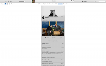
It is two columns. This is an example of the comments on a post by Eminem. My normal Connect feed is two columns but still lots of wasted spaceDo you follow anybody else other than Eminem? It should be two columns.
Register on MacRumors! This sidebar will go away, and you'll see fewer ads.