I mean look at this. Are they blind or what? With cluttered wallpaper like that the text is almost unreadable. One would think that they'll learn a lesson since iOS 7... but no. I wouldn't normally make this thread, but the fact they proudly showing it in the new iPad Pro ad is just mind boggling to me. I guess they are blind.. Or ignorant, tasteless, ego too big to acknowledge a mistake? I want to apologize to all of you, but it makes me seriously mad. I want Apple to make beautiful, yet functional software. The detail like this is an evidence it's not. What do you think?
Got a tip for us?
Let us know
Become a MacRumors Supporter for $50/year with no ads, ability to filter front page stories, and private forums.
Why Apple still sucks at software design??
- Thread starter Feyl
- Start date
-
- Tags
- design ios user interface
- Sort by post date

You are seriously complaining about the wallpaper in a iPad ad?
I think you're being AWFULLY hyperbolic when you say Apple "still sucks at software design." Yeah, they're not perfect but I'd argue they're still on top when it comes to software... and they certainly don't "suck" at it. Let's chill a bit.
The text looks difficult to read in that pic but in reality it is much clearer, more so due to parallax as well.
No it doesn't really look much better in reality.
In fact, the Topic Starter is right in the sense that for details like this, they undermine their own design philosophy to keep things clear, by desperately holding to their other "flat design" philosophy introduced in iOS 7.
Every UI designer knows that in order to make white text readable on a white/light background, you have to add a (very subtile) drop shadow below the text (if you don't want to mess with text borders). In case of the lock screen, they don't add this anymore (unlike in the past) because they want to keep everything flat. In an attempt to solve this, they added some tricks:
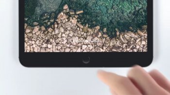
- When you select the lockscreen wallpaper it detects if it's light or dark, and automatically change the lockscreen text color to white or black. In the examlpe of the iPad wallpaper with sea and rocks (that came with iOS 11), you can see this light/dark detection fails and it renders the text white causing it to be unreadable. A very subtile dropshadow would have fixed this.
- Depending upon the the wallpaper overall lightness, iOS also decides to choose between dark or white font of the text below the launch icons on the home screen. This mechanism also fails in a lot of cases. In case of an in-between wallpaper/photo (containing very light parts but also darker), it simply darkens the whole photo when chosen as wallpaper, and keeps the textlabels white. In past iOS the readability of the launch icon text labels was clearly better, due to a subtile dropshadow on the text.
- [EDIT:] The time/date on the lockscreen however, actually DO have a (very subtile) dropshadow in iOS 12. This is visible when you add a background with a light/white top but dark bottom so the font-color is still white. But still strange that they don't seem to apply this on the text at the bottom, which is the subject of the design flaw in this topic...
Luckily Apple nowadays re-introduces subtile drop shadows on some places, to create some depth/UI clarity in iOS. But as long as the flat design continues to be the trending fashion for some more years, it won't go back to iOS 6 style design that had UI drop shadows all over the place.
Personally, I hope that in some years, they will evolve more and go in-between with the UI design. Some aspects of iOS 6 were nice, but a lot of aspects from modern iOS are great too. It actually improved greatly since the first flat (and buggy) UI attempt with iOS 7. Modern UI things like the realtime blur effects are great, while some old things like the glass/gloss effect on icons look hugely outdated now. Also adding a dark-mode to iOS will hugely improve eye strain for a lot of people, caused by the light UI design.
Last edited:
Why do I even open threads like this?
Just my opinion from a design point of view it's probably on the lower end, but from a practical point-of-view it's better that it doesn't standout. I mean most people know what the home button does and for those who don't then it tells them what it does.
Still better than this:
https://gizmodo.com/delightful-google-bug-seemingly-gives-pixel-3-xls-an-ex-1830080828
https://gizmodo.com/delightful-google-bug-seemingly-gives-pixel-3-xls-an-ex-1830080828
Your criticism is invalid, wallpaper is customizable, if you find that font and icons do not contrast well against the background, you can change it.
It would be horrible if you couldn't change the wallpaper.
Except that your criticism is invalid instead, while his is not.
Apple routinely prides iOS as 'the most advanced operating system' in the world. Marketing speech for sure, but everyone knows they hold themselves to a certain quality ever since iPhone OS 1.
Should customers adjust our customisations BASED ON Apple's incoherent design choices, or should Apple design iOS based on a no-brainer consideration for every single colour palette in the world? Of the 2, which do you think should be more likely? Obviously the latter.
The fact that Apple's font is only legible against certain backgrounds is THEIR design flaw, plain and simple. They should have accounted and adjusted for all background colours during the design process, which they clearly haven't.
--
@Feyl, don't mind the Apple defenders in this thread. I agree with your sentiment.
Many folks often come to the defense of Apple's choices without considering what Apple could've done better. The common excuses like 'why are you even bothering about such a small thing' or 'just do something else to mitigate X' or 'nobody cares' are pathetic. Caring about the small things was what made iOS so great in the first place, and over the years, people have forgotten about that and lowered their expectations/demands of standard from Apple. When it comes to Apple, it seems like almost every thing can be forgiven or written off. I wonder why are these people so inclined to cut this trillion dollar company some slack when it comes to the design and usability of their software used on the most common smartphone around the world.
If a design in a software is bad to the extent that a user needs to work around that, then it is just plain shoddy and there shouldn't be any excuses for that. Small or big flaw, it's still a flaw.
People are too busy justifying the greatness of Tim Cook's Apple that they have chosen to look past the degradation in iOS's design over the past few years. iOS used to be the epitome of simplicity, but not anymore. Here are a few examples that people choose to stick their heads in the sand and not talk about:
1. On iPhone 10 brethren, there are two ways to access in the camera in the lockscreen - pressing the on screen button or swipe left to reveal the camera interface. Why do we need 2 different interactions to access camera? This is so open that I can't believe the iOS software team green-lighted this and haven't changed it till now.
2. At your home screen, there are 2 ways to access music controls - by swiping to access control center or by accessing notification center. Again, why 2 different places to do the same thing?
3. 2 different places to access search - widget panel on the left side of your home screen and by swiping down on the home screen. Why is that?
4. What is the rationale for the big ass, left-aligned, titles in 1st party apps? Apple has never explained that. It is purely change for the sake of change, to accommodate the notch that is now occupying the middle of the top section of the screen. If I open messages, I already know I'm in messages. Do I need to be reminded that 'HEY YOU ARE NOW IN MESSAGES' in bold and extra big fonts?
5. No consistency across iOS devices. Control center is accessed up swiping up on iPhone 8 and earlier, but accessed by swiping down on the right top of the screen on the iPhone 10 brethren. Why is that? Why is the new Stocks app on dark mode for iPhone, but white for iPad? Why are some apps in dark mode, while others are in white?
6. 3D Touch, although a touch control with a lot of potential, is not intuitive. How does a user know where he can 3D Touch, and where he cannot? How many iPhone users out there know you can 3D Touch the edge of the screen to access multitasking? How many users know you can 3D Touch the keyboard to use it like a mouse? These are examples of what happens when you implement software design without thinking about making it intuitive.
These are just a few of the many design flaws that are currently present in iOS, and they should not be swept under the carpet just because it's 'Apple's' software. They deserved to be called out for what they are - flaws.
Skimming through all these posts, my takeaway is the old cliche that tastes vary, you can't please everybody. The kind of complains made here represent the inevitable outcome of Apple's "one size fits all" design philosophy first imposed with the advent of OSX (remember back in the OS 9 era when you could skin your Mac with a wide variety of third-party "themes", most of which may have been horrible but you could always find one you loved?) I. m. h. o. personal computers, including mobile devices, are all about empowering the end user, and I should be just as free to decorate the little chunk of hyperspace I inhabit as I am to choose the decor of my living room. Apple ought to be giving us the tools to do this rather than forcing us to see the world through their corporate eyes. This is a vitally important point of personal computing which Apple's current crop of bigwigs refuses to acknowledge. Too much depends on the personal tastes of one key guy in the Apple organization: it used to be the guy who loved leatherette, who then got replaced by John Ives with his mad passion for wimpy pastels. But it's always one guy sitting in one chair who gets to call the shots about what I have to look at, like it or not. This ability to choose is one of the reasons why I vastly prefer Chrome to Safari and whyI use Airmail rather than Mail.
Apple's. The menu doesn't have to take on the color of the background. Have we all forgotten what they used to look like?Oh, really? Whose fault is that I almost cannot distinguish what is highlighted here, mine or Apple's?View attachment 800985
There is no font that is going to look good against that background. No amount of shadow, no amount of glow, no amount of any color will make it stand out AND be consistent with the rest of the UI.
Pick any wallpaper you'd like and everything in this screenshot will remain readable. Enough said.
I think that is a very good point. The first thing I focus on when unlocking an iOS device is the home button. Then I press it and unlock the device. I seriously had to focus on that text to see if it was really there on my iOS devices, usually I unlock the device without ever reading the instructional text.
So, don’t use it on the lockscreen! It’s not the default wallpaper on the lockscreen btw!
Telling you personally don't really need the instruction on the lockscreen, or to use a different wallpaper (than the one provided by Apple), is irrelevant. That is irrelevant to the design flaw as mentioned by topic starter and detailed in my post above.
If that's your solution to every problem, then you still have a problem.So, don’t use it on the lockscreen! It’s not the default wallpaper on the lockscreen btw!
Improving is one thing, saying things just suck all around is another.I share the same thoughts. I use an iPhone and I prefer iOS over Android. Just feel that there are plenty of things that Apple can improve.
All I can say on this example is.. you can’t have this issue on OS X Mavericks. If that’s telling or not is up to you, because everything I say here is apparently wrong.Oh, really? Whose fault is that I almost cannot distinguish what is highlighted here, mine or Apple's?View attachment 800985
Those fonts just appear to be against the worst possible background, if someone asked me to choose the worst possible background, I think I would fail to find something worse than that. Put it against the pure background that have average RGB value of those rocks, and it's gonna stand out.
There is no font that is going to look good against that background. No amount of shadow, no amount of glow, no amount of any color will make it stand out AND be consistent with the rest of the UI.
I am not Apple apologist. I do equal amount of praise and criticism of Apple, based on what they do and how they do. You want my fair criticism? The idiotic move is having to swipe down from the top right corner to bring the Control Center, instead of doing it old way. Why in the name of god has this been changed? OK, I thought "maybe new iPads will have a notch, and this is to account for that?" But no! The new iPads do not have a notch! which makes it even more stupid!
I am just being realistic. This is unnecessary whining, imagining there are problems when there are none.
Not such a bad idea to put a (semitransparent) black stripe there, maybe.First, that's why you have the option to choose different accent color, if the one does not seem appropriate.
Second, the fonts are not contrasting against the wallpaper but against the black stripe which covers the wallpaper.
Although home screen icon labels also always remained readable regardless of the wallpaper. Which is not the case anymore.


I doubt that. Because they used a white font with a black outline in addition to a shadow.Not such a bad idea to put a (semitransparent) black stripe there, maybe.
Maybe, that could be an option.
Although home screen icon labels also always remained readable regardless of the wallpaper. Which is not the case anymore.
If I had the iPad/iPhone with iOS 6 now, I would definitely find some background against which the fonts on certain area of background would be almost illegible.
Wallpaper isn’t the issue here.You are seriously complaining about the wallpaper in a iPad ad?
[doublepost=1540997530][/doublepost]
That’s a bug, not a design.
[doublepost=1540997592][/doublepost]
I don’t know about that, but it doesn’t make the design better, right?There is no text like this on the new iPads.
It's still there on the non-pros, since they do have a home button.There is no text like this on the new iPads.
Well, then why it’s still there?Just my opinion from a design point of view it's probably on the lower end, but from a practical point-of-view it's better that it doesn't standout. I mean most people know what the home button does and for those who don't then it tells them what it does.
You're absolutely right. But as I said it makes me emotional, so sorry about that. They're still on top that's for sure, but they should do much better.I think you're being AWFULLY hyperbolic when you say Apple "still sucks at software design." Yeah, they're not perfect but I'd argue they're still on top when it comes to software... and they certainly don't "suck" at it. Let's chill a bit.
[doublepost=1541019120][/doublepost]
It wasn't a problem untill iOS 7 came out.Change the wallpaper, who uses the native wallpapers anyway? A lot of wallpapers compromise the text on he screen. If the text was black, the same would happon dark wallpapers. No way to make the text perfectly legible under every color and brightness combination
Well, then why it’s still there?
You're absolutely right. But as I said it makes me emotional, so sorry about that. They're still on top that's for sure, but they should do much better.
Dude...
Except for the very title of the thread.To my knowledge nobody here said anything like that.
Which certainly wouldn't make it any better, if not actually even worse on some level.Indeed, to assume otherwise is to conclude that the OP meant the title purely as clickbait.
Maybe off-topic (sorry), but rearranging app icons on the springboard has seemingly become even more frustrating than ever. It’s so difficult just to move an icon without accidentally creating a folder w/another app; pushing it onto an adjacent page and rearranging all the other icons by mistake; etc. I can’t believe that they can’t do better than this (after all this time).
Register on MacRumors! This sidebar will go away, and you'll see fewer ads.